
Styles
| ListBox | ListBoxItem | ItemsPanelTemplate |
|---|---|---|
| ListBoxBaseStyle | ListBoxItemBaseStyle.Small | WrapPanelHorizontalItemsPanelTemplate |
| ListBox.Small | ListBoxItemCustom | WrapPanelVerticalItemsPanelTemplate |
| ListBoxCustom | StackPanelHorizontalItemsPanelTemplate | |
| WrapPanelHorizontalListBox | StackPanelVerticalItemsPanelTemplate | |
| WrapPanelVerticalListBox | ||
| StackPanelHorizontalListBox | ||
| StackPanelVerticalListBox |
Styles (Custom Version)
NOTE
This style is Only Available in Custom Version
| ListBox | ListBoxItem |
|---|---|
| ListBoxModernStyle | ListBoxItemNewStyle |
| ListBoxTransparentStyle | ListBoxModernItemBaseStyle |
| ListBoxModernBaseStyle | ListBoxItemBaseTransparent |
| ListBoxBaseTransparentStyle | ListBoxItemBaseNewStyle |
Attached Property
| Properties | Description |
|---|---|
| IsOddEvenRow | Change Listbox Item Background based on odd and even row Only Custom Version |
| IsNew | Add New Label next to the text Only Custom Version |
| Geometry | Change IsNew Geometry Only Custom Version |
| GeoemtryBrush | Change Geometry Brush Only Custom Version |
| Width | Change Geometry Width Only Custom Version |
| Height | Change Geometry Height Only Custom Version |
ListBoxBaseStyle
ListBox default style is not recommended to use directly, it should always be used by other styles in BasedOn mode.
Example:
<ListBox hc:ListBoxAttach.IsOddEvenRow="True" AlternationCount="2"/>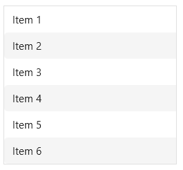
NOTE
Example:
<Style BasedOn = "{StaticResource ListBoxBaseStyle}" TargetType = "ListBox" />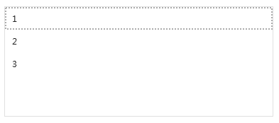
ListBoxCustom : ListBoxBaseStyle
ListBox ListCustomstyle, which retains the basic attribute style of the Listbox, and the data display style is customized by the current user to achieve personalized customization.
NOTE
Example:
    <ListBox Margin="10" ItemsSource="{Binding Datas}"
             Style="{DynamicResource ListBoxCustom}">
        <ListBox.ItemTemplate>
            <DataTemplate>
                <Border BorderThickness="1" BorderBrush="Black" Margin="0,5">
                    <DockPanel LastChildFill="True">
                        <Path DockPanel.Dock="Left" Fill="YellowGreen" Width="20" Margin="10,0,10,0" HorizontalAlignment="Center" Data="{DynamicResource BubbleTailGeometry}"></Path>
                        <TextBlock Padding="10" Text="{Binding Name}"></TextBlock>
                    </DockPanel>
                </Border>
            </DataTemplate>
        </ListBox.ItemTemplate>
    </ListBox>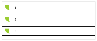
WrapPanelHorizontalListBox : ListBoxCustom
The layout container is WrapPanel, and the display style is horizontal.
NOTE
Example:
    <ListBox Margin="10" ItemsSource="{Binding Datas}"
             Style="{DynamicResource WrapPanelHorizontalListBox}">
        <ListBox.ItemTemplate>
            <DataTemplate>
                <Border BorderThickness="1" BorderBrush="Black" Margin="5,0">
                    <DockPanel LastChildFill="True">
                        <Path DockPanel.Dock="Left" Fill="YellowGreen" Width="20" Margin="10,0,10,0" HorizontalAlignment="Center" Data="{DynamicResource BubbleTailGeometry}"></Path>
                        <TextBlock Padding="10" Text="{Binding Name}"></TextBlock>
                    </DockPanel>
                </Border>
            </DataTemplate>
        </ListBox.ItemTemplate>
    </ListBox>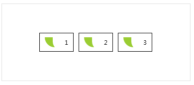
WrapPanelVerticalListBox : ListBoxCustom
The layout container is WrapPanel, and the display style is vertical.
NOTE
Example:
    <ListBox Margin="10" ItemsSource="{Binding Datas}"
             Style="{DynamicResource WrapPanelVerticalListBox}">
        <ListBox.ItemTemplate>
            <DataTemplate>
                <Border BorderThickness="1" BorderBrush="Black" Margin="0,5">
                    <DockPanel LastChildFill="True">
                        <Path DockPanel.Dock="Left" Fill="YellowGreen" Width="20" Margin="10,0,10,0" HorizontalAlignment="Center" Data="{DynamicResource BubbleTailGeometry}"></Path>
                        <TextBlock Padding="10" Text="{Binding Name}"></TextBlock>
                    </DockPanel>
                </Border>
            </DataTemplate>
        </ListBox.ItemTemplate>
    </ListBox>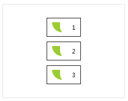
StackPanelHorizontalListBox : ListBoxCustom
The layout container is a StackPanel, and the display style is horizontal.
NOTE
Example:
    <ListBox Margin="10" ItemsSource="{Binding Datas}"
             Style="{DynamicResource StackPanelHorizontalListBox}">
        <ListBox.ItemTemplate>
            <DataTemplate>
                <Border BorderThickness="1" BorderBrush="Black" Margin="5,0">
                    <DockPanel LastChildFill="True">
                        <Path DockPanel.Dock="Left" Fill="YellowGreen" Width="20" Margin="10,0,10,0" HorizontalAlignment="Center" Data="{DynamicResource BubbleTailGeometry}"></Path>
                        <TextBlock Padding="10" Text="{Binding Name}"></TextBlock>
                    </DockPanel>
                </Border>
            </DataTemplate>
        </ListBox.ItemTemplate>
    </ListBox>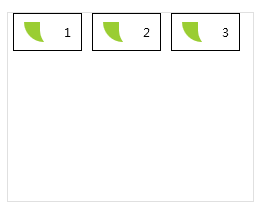
StackPanelVerticalListBox : ListBoxCustom
The layout container is a StackPanel, which displays the style vertically.
NOTE
Example:
    <ListBox Margin="10" ItemsSource="{Binding Datas}"
             Style="{DynamicResource StackPanelVerticalListBox}">
        <ListBox.ItemTemplate>
            <DataTemplate>
                <Border BorderThickness="1" BorderBrush="Black" Margin="0,1">
                    <DockPanel LastChildFill="True">
                        <Path DockPanel.Dock="Left" Fill="YellowGreen" Width="20" Margin="10,0,10,0" HorizontalAlignment="Center" Data="{DynamicResource BubbleTailGeometry}"></Path>
                        <TextBlock Padding="10" Text="{Binding Name}"></TextBlock>
                    </DockPanel>
                </Border>
            </DataTemplate>
        </ListBox.ItemTemplate>
    </ListBox>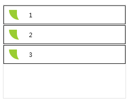
ListBoxModernStyle
NOTE
This style is Only Available in Custom Version
you can use IconElement and ListBoxAttach AttachedProperty
<ListBox Style="{StaticResource ListBoxModernStyle}" Width="200" Margin="32">
    <ListBoxItem Content="Item 1" hc:IconElement.Height="16" hc:IconElement.Width="16" hc:IconElement.Geometry="{StaticResource ConfigGeometry}"/>
    <ListBoxItem Content="Item 2" hc:ListBoxAttach.IsNew="True" hc:IconElement.Height="16" hc:IconElement.Width="16" hc:IconElement.Geometry="{StaticResource ConfigGeometry}"/>
    <ListBoxItem Content="Item 3" hc:ListBoxAttach.IsNew="True" hc:ListBoxAttach.GeoemtryBrush="{DynamicResource WarningBrush}" hc:ListBoxAttach.Geometry="{DynamicResource ClockGeometry}" hc:IconElement.Height="16" hc:IconElement.Width="16" hc:IconElement.Geometry="{StaticResource ConfigGeometry}"/>
</ListBox>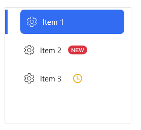
ListBoxTransparentStyle
This style is Only Available in Custom Version
<ListBox Style={StaticResource ListBoxTransparentStyle}/>ListBoxItemNewStyle
This style is Only Available in Custom Version
this style is for Listbox Item with a new geometry icon
<ListBox>
<ListBoxItem Style="{StaticResource ListBoxItemNewStyle}"/>
</ListBox>