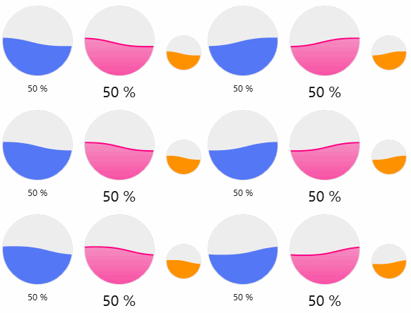
A special effect of the progress bar that can be used to enhance the user experience.
cs
[TemplatePart(Name = ElementWave, Type = typeof(FrameworkElement))]
[TemplatePart(Name = ElementClip, Type = typeof(FrameworkElement))]
public class WaveProgressBar : RangeBase
Attributes
| Property | Description | Default Value | Remarks |
|---|---|---|---|
| Text | Progress text | ||
| ShowText | Whether to show progress text | true | |
| WaveFill | Wave Paint Brush | ||
| WaveThickness | Wave border thickness | 0 | |
| WaveStroke | Wave Border Brush |
Styles
| Style |
|---|
| ProgressBarSuccessWave |
| ProgressBarInfoWave |
| ProgressBarWarningWave |
| ProgressBarDangerWave |
| ProgressBarPrimaryWave |
Case
xml
<StackPanel Orientation="Horizontal" Margin="0,32,0,0">
    <hc:WaveProgressBar Value="{Binding Value,ElementName=SliderDemo}"/>
    <hc:WaveProgressBar Value="{Binding Value,ElementName=SliderDemo}" FontSize="20" Margin="16,0,0,0" WaveThickness="4" WaveStroke="#FFFF0080">
        <hc:WaveProgressBar.WaveFill>
            <LinearGradientBrush EndPoint="0,1" StartPoint="0,0">
                <GradientStop Color="#66FF0080" Offset="0"/>
                <GradientStop Color="#FFFF0080" Offset="1"/>
            </LinearGradientBrush>
        </hc:WaveProgressBar.WaveFill>
    </hc:WaveProgressBar>
    <hc:WaveProgressBar Value="{Binding Value,ElementName=SliderDemo}" Margin="16,0,0,0" ShowText="False" Width="50" Height="50" Style="{StaticResource ProgressBarWarningWave}"/>
</StackPanel>