Styles
| Available Styles |
|---|
| BorderTipPrimary |
| BorderTipDanger |
| BorderTipWarning |
| BorderTipInfo |
| BorderTipSuccess |
| BorderRegion |
| BorderTipBaseStyle |
| BorderVerticallySplitter |
| BorderHorizontallySplitter |
| BorderCircular |
| BorderClip |
| BorderCircularClip |
BorderRegionStyle
This style is used to wrap a control area, with several DropShadowEffect resources in the base xaml definition to make the following effects:
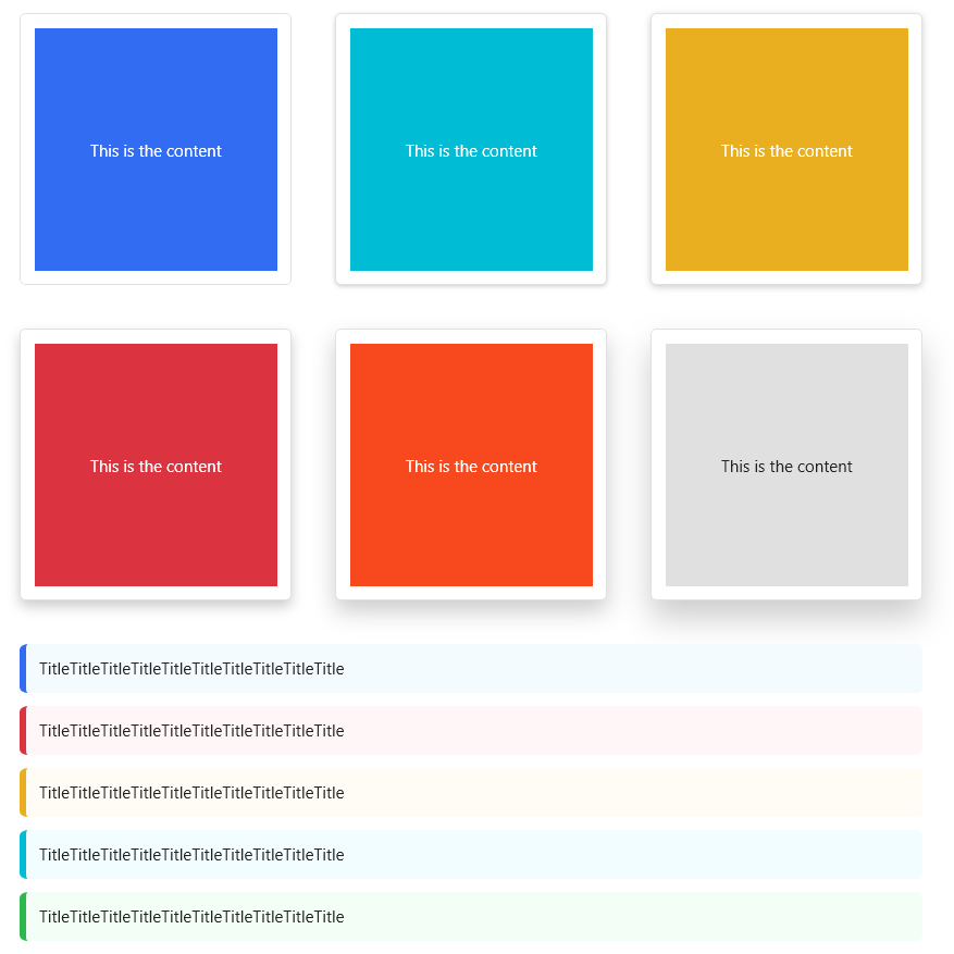
The xaml code for the above effects is as follows:
        <UniformGrid Margin="32,32,0,0" Columns="3" Rows="2">
            <Border Style="{StaticResource BorderRegion}" Width="200" Height="200" Margin="0,0,32,32">
                <Border Background="{DynamicResource PrimaryBrush}">
                    <TextBlock Text="This is the content" VerticalAlignment="Center" HorizontalAlignment="Center" Foreground="White"/>
                </Border>
            </Border>
            <Border Style="{StaticResource BorderRegion}" Width="200" Height="200" Margin="0,0,32,32" Effect="{StaticResource EffectShadow1}">
                <Border Background="{DynamicResource InfoBrush}">
                    <TextBlock Text="This is the content" VerticalAlignment="Center" HorizontalAlignment="Center" Foreground="White"/>
                </Border>
            </Border>
            <Border Style="{StaticResource BorderRegion}" Width="200" Height="200" Margin="0,0,32,32" Effect="{StaticResource EffectShadow2}">
                <Border Background="{DynamicResource WarningBrush}">
                    <TextBlock Text="This is the content" VerticalAlignment="Center" HorizontalAlignment="Center" Foreground="White"/>
                </Border>
            </Border>
            <Border Style="{StaticResource BorderRegion}" Width="200" Height="200"  Margin="0,0,32,32" Effect="{StaticResource EffectShadow3}">
                <Border Background="{DynamicResource DangerBrush}">
                    <TextBlock Text="This is the content" VerticalAlignment="Center" HorizontalAlignment="Center" Foreground="White"/>
                </Border>
            </Border>
            <Border Style="{StaticResource BorderRegion}" Width="200" Height="200"  Margin="0,0,32,32" Effect="{StaticResource EffectShadow4}">
                <Border Background="{DynamicResource AccentBrush}">
                    <TextBlock Text="This is the content" VerticalAlignment="Center" HorizontalAlignment="Center" Foreground="White"/>
                </Border>
            </Border>
            <Border Style="{StaticResource BorderRegion}" Width="200" Height="200"  Margin="0,0,32,32" Effect="{StaticResource EffectShadow5}">
                <Border Background="{DynamicResource BorderBrush}">
                    <TextBlock Text="This is the content" VerticalAlignment="Center" HorizontalAlignment="Center"/>
                </Border>
            </Border>
        </UniformGrid>
Tip: The BorderRegion used in the new version is different from the old version using the BorderRegionStyle.
BorderVerticallySplitter
This style uses a 1 unit width Border to split the horizontally arranged controls.
NOTE
Example:
xml
<StackPanel Height="20" Orientation="Horizontal">
   <Ellipse Margin="5,0" Fill="OrangeRed" Width="20" Height="20"/>
   <Border Style="{StaticResource BorderVerticallySplitter}"/>
   <Ellipse Margin="5,0" Fill="OrangeRed" Width="20" Height="20"/>
   <Border Style="{StaticResource BorderVerticallySplitter}"/>
   <Ellipse Margin="5,0" Fill="OrangeRed" Width="20" Height="20"/>
   <Border Style="{StaticResource BorderVerticallySplitter}"/>
   <Ellipse Margin="5,0" Fill="OrangeRed" Width="20" Height="20"/>
   <Border Style="{StaticResource BorderVerticallySplitter}"/>
   <Ellipse Margin="5,0" Fill="OrangeRed" Width="20" Height="20"/>
</StackPanel>
BorderHorizontallySplitter
This style uses a 1 unit height Border to split the vertically arranged controls.
NOTE
Example:
xml
<StackPanel Width="20">
    <Ellipse Margin="0,5" Fill="OrangeRed" Width="20" Height="20"/>
    <Border Style="{StaticResource BorderHorizontallySplitter}"/>
    <Ellipse Margin="0,5" Fill="OrangeRed" Width="20" Height="20"/>
    <Border Style="{StaticResource BorderHorizontallySplitter}"/>
    <Ellipse Margin="0,5" Fill="OrangeRed" Width="20" Height="20"/>
    <Border Style="{StaticResource BorderHorizontallySplitter}"/>
    <Ellipse Margin="0,5" Fill="OrangeRed" Width="20" Height="20"/>
    <Border Style="{StaticResource BorderHorizontallySplitter}"/>
    <Ellipse Margin="0,5" Fill="OrangeRed" Width="20" Height="20"/>
</StackPanel>
BorderCircular
This style implements a circular border with the addition of the BorderElement.Circular property.
NOTE
Example:
<Border Style="{StaticResource BorderCircular}" Background="OrangeRed" Width="100" Height="100"/>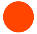
BorderClip
This style adds a cropping function to the 'BorderCircular`, which is often used to display a circular Image.
NOTE
Example:
<Border Style="{StaticResource BorderClip}" Width="100" Height="100">
    <Image Source="/HandyControlDemo;component/Resources/Img/Album/2.jpg"/>
</Border>