
ToggleButtonBaseStyle : ButtonBaseBaseStyle
The default style of the togglebutton is not recommended. It should always be used by other styles in the BasedOn mode.
NOTE
All buttons inheriting this style can use the additional attributes defined in IconElement to control the attributes of the geometry in the button.
NOTE
All buttons inheriting this style can use the BorderElement.CornerRadius additional property to control the rounded corner size of the button.
Related styles
| Name | Inherited from | Description |
|---|---|---|
| ToggleButtonPrimary | ToggleButtonBaseStyle | Primary |
| ToggleButtonSuccess | ToggleButtonBaseStyle | Success |
| ToggleButtonInfo | ToggleButtonBaseStyle | Information |
| ToggleButtonWarning | ToggleButtonBaseStyle | Warning |
| ToggleButtonDanger | ToggleButtonBaseStyle | Danger |
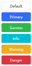
| ToggleButtonDefault | ToggleButtonBaseStyle | Default |
Case:
<StackPanel HorizontalAlignment="Center" VerticalAlignment="Center">
    <ToggleButton MinWidth="100" Content="Default"/>
    <ToggleButton MinWidth="100" Content="Primary" Margin="0,6,0,0" Style="{StaticResource ToggleButtonPrimary}"/>
    <ToggleButton MinWidth="100" Content="Success" Margin="0,6,0,0" Style="{StaticResource ToggleButtonSuccess}"/>
    <ToggleButton MinWidth="100" Content="Info" Margin="0,6,0,0" Style="{StaticResource ToggleButtonInfo}"/>
    <ToggleButton MinWidth="100" Content="Warning" Margin="0,6,0,0" Style="{StaticResource ToggleButtonWarning}"/>
    <ToggleButton MinWidth="100" Content="Danger" Margin="0,6,0,0" Style="{StaticResource ToggleButtonDanger}"/>
</StackPanel>
effect:
ToggleButtonIconBaseStyle : BaseStyle
The togglebutton that only displays icons is not recommended for direct use, and should always be used by other styles as BasedOn.
NOTE
All buttons inheriting this style can use the additional attributes defined in IconElement to control the attributes of the geometry in the button.
NOTE
All buttons inheriting this style can use the BorderElement.CornerRadius additional property to control the rounded corner size of the button.
Related styles
| Name | Inherited from | Description |
|---|---|---|
| ToggleButtonIcon | ToggleButtonIconBaseStyle | Default |
| ToggleButtonIconPrimary | ToggleButtonIconBaseStyle | Primary |
| ToggleButtonIconSuccess | ToggleButtonIconBaseStyle | Success |
| ToggleButtonIconInfo | ToggleButtonIconBaseStyle | Information |
| ToggleButtonIconWarning | ToggleButtonIconBaseStyle | Warning |
| ToggleButtonIconDanger | ToggleButtonIconBaseStyle | Danger |
| ToggleButtonIconTransparent | ToggleButtonIconBaseStyle | Transparent |
Case:
<StackPanel Orientation="Horizontal" HorizontalAlignment="Center" VerticalAlignment="Center">
    <ToggleButton Padding="6" hc:IconElement.Geometry="{StaticResource ClockGeometry}" Style="{StaticResource ToggleButtonIcon}"/>
    <ToggleButton Margin="6,0,0,0" hc:IconElement.Geometry="{StaticResource ClockGeometry}" Style="{StaticResource ToggleButtonIconPrimary}"/>
    <ToggleButton Margin="6,0,0,0" hc:IconElement.Geometry="{StaticResource ClockGeometry}" Style="{StaticResource ToggleButtonIconSuccess}"/>
    <ToggleButton Margin="6,0,0,0" hc:IconElement.Geometry="{StaticResource ClockGeometry}" Style="{StaticResource ToggleButtonIconInfo}"/>
    <ToggleButton Margin="6,0,0,0" hc:IconElement.Geometry="{StaticResource ClockGeometry}" Style="{StaticResource ToggleButtonIconWarning}"/>
    <ToggleButton Margin="6,0,0,0" hc:IconElement.Geometry="{StaticResource ClockGeometry}" Style="{StaticResource ToggleButtonIconDanger}"/>
    <ToggleButton Margin="6,0,0,0" hc:IconElement.Geometry="{StaticResource ClockGeometry}" Style="{StaticResource ToggleButtonIconTransparent}"/>
</StackPanel>
effect:

ToggleButtonSwitchBaseStyle : BaseStyle
Switch-type switching buttons are not recommended for direct use, and should always be used by other styles as BasedOn.
Related styles
| Name | Inherited from |
|---|---|
| ToggleButtonSwitch | ToggleButtonSwitchBaseStyle |
Case:
<StackPanel VerticalAlignment="Center" HorizontalAlignment="Center">
    <ToggleButton Style="{StaticResource ToggleButtonSwitch}"/>
    <ToggleButton Margin="0,6,0,0" IsChecked="True" Style="{StaticResource ToggleButtonSwitch}"/>
</StackPanel>
effect:

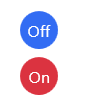
ToggleButtonFlip : BaseStyle
Flip-style togglebutton.
Case:
<StackPanel VerticalAlignment="Center" HorizontalAlignment="Center">
    <ToggleButton BorderThickness="0" IsChecked="True" Style="{StaticResource ToggleButtonFlip}">
        <hc:StatusSwitchElement.CheckedElement>
            <Border Background="{DynamicResource PrimaryBrush}">
                <TextBlock HorizontalAlignment="Center" VerticalAlignment="Center" Text="Off" Foreground="{DynamicResource TextIconBrush}"/>
            </Border>
        </hc:StatusSwitchElement.CheckedElement>
        <Border Background="{DynamicResource DangerBrush}">
            <TextBlock HorizontalAlignment="Center" VerticalAlignment="Center" Text="On" Foreground="{DynamicResource TextIconBrush}"/>
        </Border>
    </ToggleButton>
    <ToggleButton Margin="0,6,0,0" BorderThickness="0" IsChecked="False" Style="{StaticResource ToggleButtonFlip}">
        <hc:StatusSwitchElement.CheckedElement>
            <Border Background="{DynamicResource PrimaryBrush}">
                <TextBlock HorizontalAlignment="Center" VerticalAlignment="Center" Text="Off" Foreground="{DynamicResource TextIconBrush}"/>
            </Border>
        </hc:StatusSwitchElement.CheckedElement>
        <Border Background="{DynamicResource DangerBrush}">
            <TextBlock HorizontalAlignment="Center" VerticalAlignment="Center" Text="On" Foreground="{DynamicResource TextIconBrush}"/>
        </Border>
    </ToggleButton>
</StackPanel>
effect:
ToggleButtonCustom : BaseStyle
This style is recommended if you want to completely customize the content of the button. The content of ToggleButtonCustom is entirely up to you.
Case:
<StackPanel VerticalAlignment="Center" HorizontalAlignment="Center">
    <ToggleButton IsChecked="True" Style="{StaticResource ToggleButtonCustom}" hc:StatusSwitchElement.HideUncheckedElement="True">
        <hc:StatusSwitchElement.CheckedElement>
            <Border Width="80" Height="30" CornerRadius="4" BorderThickness="1" BorderBrush="{DynamicResource BorderBrush}">
                <Ellipse Width="20" Height="20" Fill="{DynamicResource PrimaryBrush}" StrokeThickness="1" Stroke="{DynamicResource BorderBrush}"/>
            </Border>
        </hc:StatusSwitchElement.CheckedElement>
        <Border Width="80" Height="30" CornerRadius="4" BorderThickness="1" BorderBrush="{DynamicResource BorderBrush}">
            <Ellipse Width="20" Height="20" Fill="{DynamicResource BorderBrush}" StrokeThickness="1" Stroke="{DynamicResource BorderBrush}"/>
        </Border>
    </ToggleButton>
    <ToggleButton Margin="0,6,0,0" IsChecked="False" Style="{StaticResource ToggleButtonCustom}" hc:StatusSwitchElement.HideUncheckedElement="True">
        <hc:StatusSwitchElement.CheckedElement>
            <Border Width="80" Height="30" CornerRadius="4" BorderThickness="1" BorderBrush="{DynamicResource BorderBrush}">
                <Ellipse Width="20" Height="20" Fill="{DynamicResource PrimaryBrush}" StrokeThickness="1" Stroke="{DynamicResource BorderBrush}"/>
            </Border>
        </hc:StatusSwitchElement.CheckedElement>
        <Border Width="80" Height="30" CornerRadius="4" BorderThickness="1" BorderBrush="{DynamicResource BorderBrush}">
            <Ellipse Width="20" Height="20" Fill="{DynamicResource BorderBrush}" StrokeThickness="1" Stroke="{DynamicResource BorderBrush}"/>
        </Border>
    </ToggleButton>
</StackPanel>
effect:
