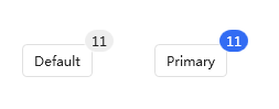
The badge control, as a specific state content badge of other controls, can minimize the invasion of the original control. It can be regarded as a content control. The internal Content is the modified control corresponding to the badge that needs to be displayed. The inheritance relationship is as follows:
public class Badge : ContentControl
Basic attributes
| Property Name | Use |
|---|---|
| Text | Gets or sets the badge display content |
| Value | Get or set display value, support dynamic change of value |
| Status | Gets or sets the type of tag status, Text (Dot), Processing (Dynamic Tag) defaults to text display |
| Maximum | Gets or sets the maximum display value. When the value is displayed, the maximum value is displayed |
| BadgeMargin | Gets or sets the margin of the badge relative to the decorated control |
| ShowBadge | Gets or sets whether to display the flag, the default is True |
In xaml, remember to introduce the handycontrol namespace
xmlns:hc="https://handyorg.github.io/handycontrol"Text and Value
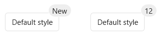
You may be confused when you see the property explanation. Text and Value have the same effect and value. What is the difference? In the markup control, the text and numeric types are distinguished. The numeric types can be dynamically changed and the data statistics displayed. When both are present at the same time, Text is displayed by default.
Case
    <hc:Badge Value="12" Text="New" BadgeMargin="0,-14,-20,0" Height="30">
        <Button Content="Default style"/>
    </hc:Badge>
    <hc:Badge Value="12" BadgeMargin="0,-14,-20,0" Height="30">
        <Button Content="Default style"/>
    </hc:Badge>
effect
Maximum
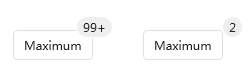
Use the Value property to add the maximum display value to limit the maximum display effect of the badge display
Case
    <hc:Badge Value="100" Maximum="99" BadgeMargin="0,-14,-20,0" Height="30">
        <Button Content="Maximum"/>
    </hc:Badge>
    <hc:Badge Value="2" Maximum="99" BadgeMargin="0,-14,-20,0" Height="30">
        <Button Content="Maximum"/>
    </hc:Badge>
effect
Status
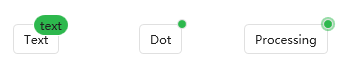
badge status type, divided into three types, default is text display
Case
    <hc:Badge Status="Text" Text="text" Height="30" Margin="32,0,0,0" Style="{DynamicResource BadgeSuccess}">
        <Button Content="Text"/>
    </hc:Badge>
    <hc:Badge Status="Dot" Height="30" Margin="32,0,0,0" Style="{DynamicResource BadgeSuccess}">
        <Button Content="Dot"/>
    </hc:Badge>
    <hc:Badge Status="Processing" Height="30" Margin="32,0,0,0" Style="{DynamicResource BadgeSuccess}">
        <Button Content="Processing" />
    </hc:Badge>
effect
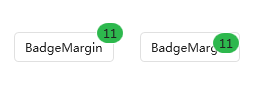
BadgeMargin
BadgeMargin is used to set the margin relative to the decorated control. Generally, this property is not modified. It is recommended to use 0, -14, -20,0
Case
    <hc:Badge Height="30" Value="11" Style="{DynamicResource BadgeSuccess}">
        <Button Content="BadgeMargin" />
    </hc:Badge>
    <hc:Badge Height="30" Value="11" BadgeMargin="30,0,0,0" Style="{DynamicResource BadgeSuccess}">
        <Button Content="BadgeMargin" />
    </hc:Badge>
effect
event
| event | use |
|---|---|
ValueChanged | Trigger event after value change |
Related styles
| Style name | use | Inherited style |
|---|---|---|
| BadgeBaseStyle | Default style, used as BaseOn inheritance | - |
| BadgePrimary | Theme color badge style | BadgeBaseStyle |
| BadgeSuccess | Success color badge style | BadgeBaseStyle |
| BadgeInfo | Information color badge style | BadgeBaseStyle |
| BadgeWarning | Warning color badge style | BadgeBaseStyle |
| BadgeDanger | Anomalous badge style | BadgeBaseStyle |
Case
    <hc:Badge Height="30"  BadgeMargin="0,-14,-20,0" Value="11">
        <Button Content="Default" />
    </hc:Badge>
    <hc:Badge Height="30"  BadgeMargin="0,-14,-20,0" Value="11" Style="{DynamicResource BadgePrimary}">
        <Button Content="Primary" />
    </hc:Badge>
    <hc:Badge Height="30"  BadgeMargin="0,-14,-20,0" Value="11" Style="{DynamicResource BadgeInfo}">
        <Button Content="Info" />
    </hc:Badge>
    <hc:Badge Height="30"  BadgeMargin="0,-14,-20,0" Value="11" Style="{DynamicResource BadgeSuccess}">
        <Button Content="Success" />
    </hc:Badge>
    <hc:Badge Height="30"  BadgeMargin="0,-14,-20,0" Value="11" Style="{DynamicResource BadgeWarning}">
        <Button Content="Warning" />
    </hc:Badge>
    <hc:Badge Height="30"  BadgeMargin="0,-14,-20,0" Value="11" Style="{DynamicResource BadgeDanger}">
        <Button Content="Danger" />
    </hc:Badge>
effect

FAQ
Coordinate offset problem [version less than or equal to 2.4]
Problem Description
When the parent container is not the default arrangement of stackpanel, the badge and decorated control are offset
status quo
    <hc:Badge Height="30"  BadgeMargin="0,-14,-20,0" Value="11">
        <Button Content="Default" />
    </hc:Badge>
    <hc:Badge Height="30"  BadgeMargin="0,-14,-20,0" Value="11" Style="{DynamicResource BadgePrimary}">
        <Button Content="Primary" />
    </hc:Badge>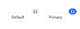
solution
Set the properties VerticalAlignment and HorizontalAlignment in the property Badge to Center
    <hc:Badge Height="30" VerticalAlignment="Center" HorizontalAlignment="Center"  BadgeMargin="0,-14,-20,0" Value="11">
        <Button Content="Default" />
    </hc:Badge>
    <hc:Badge Height="30" VerticalAlignment="Center" HorizontalAlignment="Center"  BadgeMargin="0,-14,-20,0" Value="11" Style="{DynamicResource BadgePrimary}">
        <Button Content="Primary" />
    </hc:Badge>