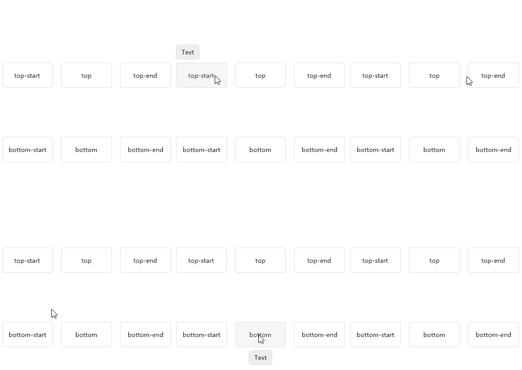
It is often used to display the prompt information when the mouse is hovered.
cs
public class Poptip : AdornerElementAttributes
| Property | Description | Default Value | Remarks |
|---|---|---|---|
| HitMode | Trigger Mode | HitMode.Hover | |
| Content | Reminder content | ||
| ContentTemplate | Prompt content template | ||
| ContentStringFormat | Prompt content text format | ||
| ContentTemplateSelector | Prompt Content Template Selector | ||
| VerticalOffset | Offset | 0 | |
| HorizontalOffset | Offset | 0 | |
| PlacementType | PlacementType.Top | ||
| IsOpen | Whether to open | false | |
| Delay | 1000.0 |
Case
xml
<Button>
    <hc:Poptip.Instance>
        <hc:Poptip Content="Text" PlacementType="TopLeft"/>
    </hc:Poptip.Instance>
</Button>
xml
<ToggleButton hc:Poptip.HitMode="None" hc:Poptip.IsOpen="{Binding IsChecked,RelativeSource={RelativeSource Self}}" hc:Poptip.Content="Text" hc:Poptip.Placement="RightTop"/>