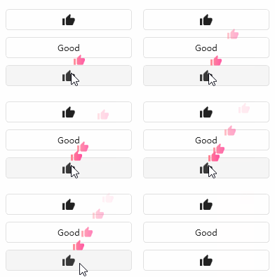
Special click effects can be achieved with the help of floating blocks.
cs
public class FloatingBlock : ControlAttributes
| Property | Description | Default Value | Remarks |
|---|---|---|---|
| ToX | X-axis disappearing position | 0 | |
| ToY | Y-axis disappearing position | -100 | |
| Duration | Animation duration | 2s | |
| HorizontalOffset | Horizontal Offset | 0 | |
| VerticalOffset | Vertical Offset | 0 | |
| ContentTemplate | Floating Content Template | ||
| Content | Floating Content |
Case
xml
<StackPanel Margin="32" VerticalAlignment="Center">
    <Button hc:IconElement.Geometry="{StaticResource ThumbsUpGeometry}" Width="180">
        <hc:FloatingBlock.ContentTemplate>
            <DataTemplate>
                <Path Data="{StaticResource ThumbsUpGeometry}" Fill="{DynamicResource DangerBrush}" Width="16" Height="16"/>
            </DataTemplate>
        </hc:FloatingBlock.ContentTemplate>
    </Button>
    <Button Content="Good" hc:FloatingBlock.Content="Good" Width="180" Margin="0,10,0,0"/>
    <Button hc:IconElement.Geometry="{StaticResource ThumbsUpGeometry}" Width="180" Margin="0,10,0,0" hc:FloatingBlock.Duration="0:0:1" hc:FloatingBlock.VerticalOffset="-20" hc:FloatingBlock.ToX="50" hc:FloatingBlock.ToY="-80">
        <hc:FloatingBlock.ContentTemplate>
            <DataTemplate>
                <Path Data="{StaticResource ThumbsUpGeometry}" Fill="{DynamicResource DangerBrush}" Width="16" Height="16"/>
            </DataTemplate>
        </hc:FloatingBlock.ContentTemplate>
    </Button>
</StackPanel>