
Styles
| Available Styles |
|---|
| DatePicker.Small |
| DatePickerExtend |
| DatePickerExtend.Small |
DatePickerBaseStyle
Native datepicker default style, not recommended for direct use, should always be used by other styles in the BasedOn mode. The native datepicker uses this style by default if no style is set:
- Default style
<DatePicker SelectedDate="{x:Static system:DateTime.Now}"/>
DatePickerExtendBaseStyle : DatePickerBaseStyle
The native datepicker extends the default style and is not recommended for direct use. It should always be used by other styles in the BasedOn mode.
DatePickerExtend : DatePickerExtendBaseStyle
- Title on
<DatePicker SelectedDate="{x:Static system:DateTime.Now}" Style="{StaticResource DatePickerExtend}" hc:InfoElement.Title="This is the title"/>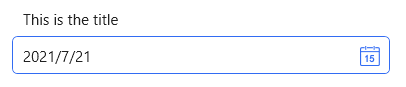
- Title left
<DatePicker SelectedDate="{x:Static system:DateTime.Now}" Width="380" hc:InfoElement.TitleWidth="140" hc:InfoElement.TitlePlacement="Left" Style="{StaticResource DatePickerExtend}" hc:InfoElement.Title="Title on the left"/>
WARNING
When the title is on the left, in order to align the left side of multiple input boxes, you need to set the title width. The title width does not need to be set one by one, and can be set uniformly on the external container.
Title on, with watermark See Combobox
Title is on, with watermark, and is required See Combobox
The title is on, with a watermark, and is required, and a custom required prompt See Combobox
NOTE
you can change datepicker ui culture:
ConfigHelper.Instance.SetLang("en");WARNING
To use Attached Properties (InfoElement), you should set Style to DatePickerExtend