
Attributes
| Name | Use |
|---|---|
| HighlightBrush | Set Control Highlight Color |
| HighlightBackground | Set the highlight background color of the control |
| HighlightBorderBrush | Set the highlight border color of the control |
| HighlightForeground | Set the highlight foreground color of the control |
| Text | Set text content |
| StaysHighlighted |
Use Cases
HighlightBrush Set control highlight color
xml
<UniformGrid Margin="22,22,0,0" Rows="2" Columns="2">
        <RadioButton Margin="10,10,0,0" Background="{DynamicResource SecondaryRegionBrush}"
                     Style="{StaticResource RadioButtonIcon}"
                     Content="RadioButton" IsChecked="True"
                     GroupName="radio1"/>
        <RadioButton Margin="10,10,0,0" BorderThickness="1"
                     Style="{StaticResource RadioButtonIcon}"
                     hc:VisualElement.HighlightBrush="YellowGreen"
                     Content="RadioButton"
                     GroupName="radio2"/>
    </UniformGrid>
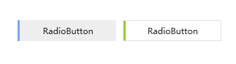
The following screenshot is a set of highlight comparison results when selected. The left picture is the style default color, and the right is the personal custom color.
Text Set text content
It is mainly used to set the auxiliary text of the control. When the control does not have appropriate properties for displaying the text, this additional property can be set in the custom style.
For example: when the custom progress bar needs to display text, it lacks the property of displaying extra text content, and the corresponding text can be displayed through a custom style, with Text as the text content carrying property
Custom style:
xml
<Style x: Key = "ProgressBarBaseStyle" TargetType = "ProgressBar">
    <Setter Property = "hc: VisualElement.Text">
            <Setter.Value>
                ..... ignore code ...
            </Setter.Value>
    </Setter>
    <Setter Property = "Template">
            <Setter.Value>
                <ControlTemplate TargetType = "ProgressBar">
                    <hc:SimplePanel x: Name = "TemplateRoot">
.... ignore code ...
                        <hc:SimplePanel HorizontalAlignment = "Left">
                            .... ignore code ...
                            <TextBlock HorizontalAlignment = "Center" VerticalAlignment = "Center" Foreground = "{DynamicResource TextIconBrush}" Text = "{Binding Path = (hc: VisualElement.Text), RelativeSource = {RelativeSource TemplatedParent}}" />
                        </hc:SimplePanel>
                    </hc:SimplePanel>
                </ControlTemplate>
            </Setter.Value>
        </Setter>
</Style>
Use in xaml:
xml
    <UniformGrid Margin = "22,22,0,0" Rows = "2" Columns = "2">
        <ProgressBar Style = "{DynamicResource ProgressBarDanger}"
                     hc:VisualElement.Text = "This is visual text"
                     Background = "YellowGreen"> </ProgressBar>
    </UniformGrid>
effect:
