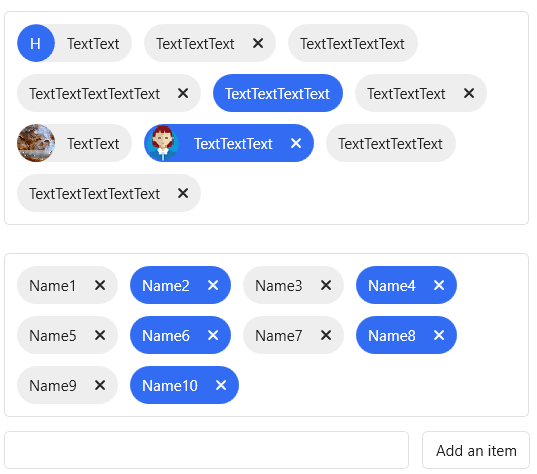
It is used to indicate the item selected by the user. Compared with the text, Tag has additional interaction.
cs
public class Tag : ContentControlAttributes
| Property | Description | Default Value | Remarks |
|---|---|---|---|
| ShowCloseButton | Whether to display the delete (close) button | true | |
| Selectable | Whether to support selection | false | |
| IsSelected | Is selected | false | |
| HeaderTemplate | |||
| HeaderTemplateSelector | |||
| HeaderStringFormat | |||
| TagContainer.ShowCloseButton | |||
| Header |
Events
| Name | Description |
|---|---|
| Selected | Triggered when the label is selected |
| Closing | Triggered when the label is closed |
| Closed | Triggered after the label is closed |
Attributes
| Property | Description | Default Value | Remarks |
|---|---|---|---|
| ShowAddButton | Whether to display the new label button | false | |
| TagMargin | Tag Margin | Thickness(5) |
Events
| Name | Description |
|---|---|
| AddTagButtonClick | Triggered when a tag is added |
Case
xml
<hc:TagContainer Name="Container1" Margin="11" Width="420" Padding="5">
                <hc:Tag Margin="5" ShowCloseButton="False" Content="Text"/>
                <hc:Tag Header="H" hc:TitleElement.Background="{DynamicResource PrimaryBrush}" Margin="5" ShowCloseButton="False" Content="Text"/>
                <hc:Tag Margin="5" Selectable="True" Content="Text"/>
                <hc:Tag Margin="5" ShowCloseButton="False" Content="Text"/>
                <hc:Tag Margin="5" Content="Text"/>
                <hc:Tag Margin="5" IsSelected="True" Selectable="True" ShowCloseButton="False" Content="Text"/>
                <hc:Tag Margin="5" Content="Text"/>
                <hc:Tag Margin="5" ShowCloseButton="False" Content="Text"/>
                <hc:Tag Margin="5" IsSelected="True" Selectable="True" Content="Text"/>
                <hc:Tag Margin="5" ShowCloseButton="False" Content="Text">
                    <hc:Tag.Header>
                        <Image Source="/Resources/Img/Album/1.jpg"/>
                    </hc:Tag.Header>
                </hc:Tag>
                <hc:Tag Margin="5" IsSelected="True" Selectable="True" Content="Text">
                    <hc:Tag.Header>
                        <Image Source="/Resources/Img/Avatar/avatar2.png"/>
                    </hc:Tag.Header>
                </hc:Tag>