
ButtonBaseStyle : ButtonBaseBaseStyle
The default style of the button is not recommended for direct use and should always be used by other styles in the BasedOn mode.
NOTE
All buttons that inherit this style can use the additional properties defined in IconElement to control the properties of the geometry in the button.
NOTE
All buttons that inherit this style can use the BorderElement.CornerRadius attached property to control the fillet size of the button.
NOTE
Example:
<StackPanel Orientation="Horizontal">
 <Button Content="This is a button"/>
 <Button Content="This is a button" Margin="10,0,0,0" hc:BorderElement.CornerRadius="15"/>
  <Button Content="This is a button" Margin="10,0,0,0" hc:IconElement.Geometry="{StaticResource GithubGeometry}"/>
</StackPanel>
ButtonPrimary : ButtonBaseStyle
Main Button
NOTE
Example:
<StackPanel Orientation="Horizontal">
   <Button Style="{StaticResource ButtonPrimary}" Content="This is a button"/>
   <Button Style="{StaticResource ButtonPrimary}" Content="This is a button" Margin="10,0,0,0" hc:BorderElement.CornerRadius="15"/>
   <Button Style="{StaticResource ButtonPrimary}" Content="This is a button" Margin="10,0,0,0" hc:IconElement.Geometry="{StaticResource GithubGeometry}"/>
</StackPanel>
ButtonSuccess : ButtonBaseStyle
Success button
NOTE
Example:
<StackPanel Orientation="Horizontal">
   <Button Style="{StaticResource ButtonSuccess}" Content="This is a button"/>
   <Button Style="{StaticResource ButtonSuccess}" Content="This is a button" Margin="10,0,0,0" hc:BorderElement.CornerRadius="15"/>
   <Button Style="{StaticResource ButtonSuccess}" Content="This is a button" Margin="10,0,0,0" hc:IconElement.Geometry="{StaticResource GithubGeometry}"/>
</StackPanel>
ButtonInfo : ButtonBaseStyle
Information button
NOTE
Example:
<StackPanel Orientation="Horizontal">
  <Button Style="{StaticResource ButtonInfo}" Content="This is a button"/>
  <Button Style="{StaticResource ButtonInfo}" Content="This is a button" Margin="10,0,0,0" hc:BorderElement.CornerRadius="15"/>
  <Button Style="{StaticResource ButtonInfo}" Content="This is a button" Margin="10,0,0,0" hc:IconElement.Geometry="{StaticResource GithubGeometry}"/>
</StackPanel>
ButtonWarning : ButtonBaseStyle
Warning button
NOTE
Example:
<StackPanel Orientation="Horizontal">
    <Button Style="{StaticResource ButtonWarning}" Content="This is a button"/>
    <Button Style="{StaticResource ButtonWarning}" Content="This is a button" Margin="10,0,0,0" hc:BorderElement.CornerRadius="15"/>
    <Button Style="{StaticResource ButtonWarning}" Content="This is a button" Margin="10,0,0,0" hc:IconElement.Geometry="{StaticResource GithubGeometry}"/>
</StackPanel>
ButtonDanger : ButtonBaseStyle
Danger button
NOTE
Example:
<StackPanel Orientation="Horizontal">
    <Button Style="{StaticResource ButtonDanger}" Content="This is a button"/>
    <Button Style="{StaticResource ButtonDanger}" Content="This is a button" Margin="10,0,0,0" hc:BorderElement.CornerRadius="15"/>
    <Button Style="{StaticResource ButtonDanger}" Content="This is a button" Margin="10,0,0,0" hc:IconElement.Geometry="{StaticResource GithubGeometry}"/>
</StackPanel>
ButtonDefault : ButtonBaseStyle
Default button
NOTE
Example:
<StackPanel Orientation="Horizontal">
    <Button Style="{StaticResource ButtonDefault}" Content="This is a button"/>
    <Button Style="{StaticResource ButtonDefault}" Content="This is a button" Margin="10,0,0,0" hc:BorderElement.CornerRadius="15"/>
    <Button Style="{StaticResource ButtonDefault}" Content="This is a button" Margin="10,0,0,0" hc:IconElement.Geometry="{StaticResource GithubGeometry}"/>
</StackPanel>
ButtonIcon : ButtonBaseStyle
This style is recommended if you only want to display the geometry button.
NOTE
Example:
<StackPanel Orientation="Horizontal">
    <Button Style="{StaticResource ButtonIcon}" Foreground="{DynamicResource PrimaryTextBrush}" hc:IconElement.Geometry="{StaticResource UpDownGeometry}"/>
    <Button Style="{StaticResource ButtonIcon}" Background="Black" Foreground="White" hc:BorderElement.CornerRadius="15" hc:IconElement.Geometry="{StaticResource UpDownGeometry}" Margin="10,0,0,0"/>
    <Button Style="{StaticResource ButtonIcon}" BorderThickness="1" BorderBrush="Black" Foreground="{DynamicResource PrimaryTextBrush}" hc:IconElement.Geometry="{StaticResource UpDownGeometry}" Margin="10,0,0,0"/>
</StackPanel>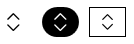
ButtonCustom
This style is recommended if you want to fully customize the content of the button. The content in ButtonCustom is entirely up to you. In addition, you can switch the background with additional properties in BackgroundSwitchElement:
NOTE
Example:
<Button Height="30" Padding="10,0" Background="Black" Foreground="White" Content="This is a button" Style="{StaticResource ButtonCustom}" hc:BackgroundSwitchElement.MouseHoverBackground="Red" hc:BackgroundSwitchElement.MouseDownBackground="PaleVioletRed"/>
Styles
| Style |
|---|
| ButtonPrimary |
| ButtonInfo |
| ButtonDanger |
| ButtonWarning |
| ButtonDefault |
| ButtonSuccess |
| ButtonIcon |
| ButtonIconCircular |
| ButtonDashed |
| ButtonDashedPrimary |
| ButtonDashedSuccess |
| ButtonDashedInfo |
| ButtonDashedWarning |
| ButtonDashedDanger |
| ButtonCustom |
| ButtonGroupItemDefault |
| ButtonGroupItemHorizontalFirst |
| ButtonGroupItemHorizontalLast |
| ButtonGroupItemSingle |
| ButtonGroupItemVerticalFirst |
| ButtonGroupItemVerticalLast |
| ButtonDefault.Small |
| ButtonPrimary.Small |
| ButtonInfo.Small |
| ButtonDanger.Small |
| ButtonWarning.Small |
| ButtonSuccess.Small |
| ButtonIcon.Small |
| ButtonIconCircular.Small |
| ButtonDashed.Small |
| ButtonDashedPrimary.Small |
| ButtonDashedSuccess.Small |
| ButtonDashedInfo.Small |
| ButtonDashedWarning.Small |
| ButtonDashedDanger.Small |