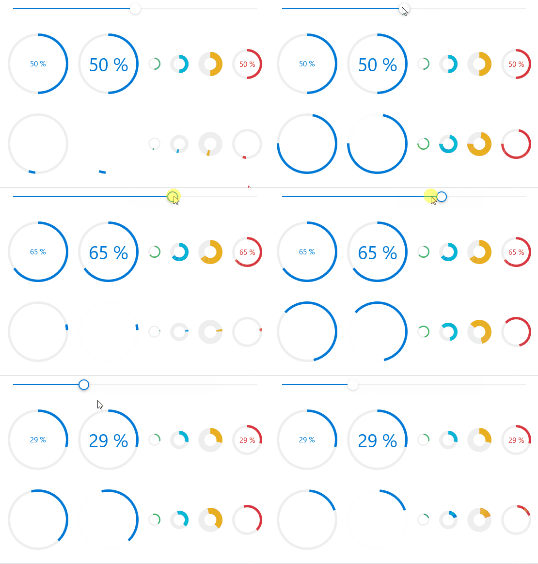
CircleProgressBar Control displays a value in a certain range using a cicular sector that grows clockwise until it becomes a full ring.
cs
[TemplatePart(Name = IndicatorTemplateName, Type = typeof(Arc))]
public class CircleProgressBar : RangeBase
Attributes
| Property | Description | Default Value | Remarks |
|---|---|---|---|
| ArcThickness | Circle thickness | 4 | The default value is provided by the theme |
| ShowText | Whether to display text | true | |
| Text | Text content | <empty> | Progress text |
| IsIndeterminate | false |
Styles
| Style | Description |
|---|---|
| ProgressBarCircleBaseStyle | Default style |
| ProgressBarSuccessCircle | Success style |
| ProgressBarInfoCircle | Info style |
| ProgressBarWarningCircle | Warning style |
| ProgressBarDangerCircle | Danger style |
Case
xml
<StackPanel Orientation="Horizontal" Margin="0,32,0,0">
    <hc:CircleProgressBar Value="{Binding Value,ElementName=SliderDemo}"/>
    <hc:CircleProgressBar Value="{Binding Value,ElementName=SliderDemo}" FontSize="30" Margin="16,0,0,0"/>
    <hc:CircleProgressBar Value="{Binding Value,ElementName=SliderDemo}" Margin="16,0,0,0" ShowText="False" Width="20" Height="20" ArcThickness="2" Style="{StaticResource ProgressBarSuccessCircle}"/>
    <hc:CircleProgressBar Value="{Binding Value,ElementName=SliderDemo}" Margin="16,0,0,0" ShowText="False" Width="30" Height="30" ArcThickness="6" Style="{StaticResource ProgressBarInfoCircle}"/>
    <hc:CircleProgressBar Value="{Binding Value,ElementName=SliderDemo}" Margin="16,0,0,0" ShowText="False" Width="40" Height="40" ArcThickness="10" Style="{StaticResource ProgressBarWarningCircle}"/>
    <hc:CircleProgressBar Value="{Binding Value,ElementName=SliderDemo}" Margin="16,0,0,0" Width="50" Height="50" Style="{StaticResource ProgressBarDangerCircle}"/>
</StackPanel>