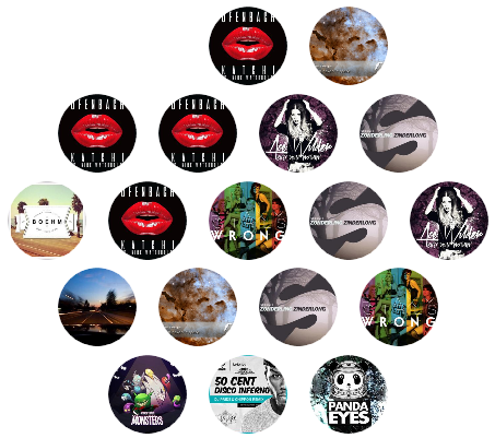
A container that allows child elements to present a honeycomb layout.
cs
public class HoneycombPanel : PanelHoneycomb layout
Other elements will start from the first element and wrap around:
         ●       ●
        (7)     (8)
     ●       ●       ●
    (6)     (1)     (9)
 ●       ●       ●       ...
(5)     (0)     (2)
     ●       ●       ...
    (4)     (3)
Case
xml
<ListBox Background="Transparent" BorderThickness="0" Style="{StaticResource ListBoxCustom}" ItemsSource="{Binding DataList}">
    <ListBox.ItemsPanel>
        <ItemsPanelTemplate>
            <hc:HoneycombPanel hc:PanelElement.FluidMoveBehavior="{StaticResource BehaviorXY200}"/>
        </ItemsPanelTemplate>
    </ListBox.ItemsPanel>
    <ListBox.ItemTemplate>
        <DataTemplate>
            <hc:Gravatar Style="{StaticResource GravatarCircle}" Margin="10" Source="{Binding Content}"/>
        </DataTemplate>
    </ListBox.ItemTemplate>
</ListBox>