
NOTE
Inherited from TitleElement
Attributes
| Name | Use |
|---|---|
| Placeholder | Placeholder (input prompt) |
| Necessary | Required? |
| Symbol | Tag Information |
| ContentHeight | Content Height |
| MinContentHeight | Minimum Content Height |
| MaxContentHeight | Maximum Content Height |
| RegexPattern | Regex Pattern |
| ShowClearButton |
Use Cases
Placeholder
xml
<StackPanel Width="200" VerticalAlignment="Center">
    <hc:SearchBar/>
    <hc:SearchBar hc:InfoElement.Placeholder="请输入查询条件" Style="{StaticResource SearchBarExtend}" Margin="0,16,0,0"/>
</StackPanel>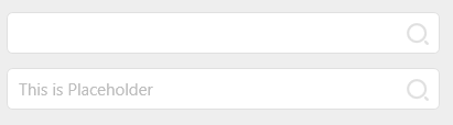
Necessary
xml
     <hc:SearchBar hc:InfoElement.Placeholder="Please enter the query criteria"
                   Hc:InfoElement.Title="Query Condition"
                   Margin="10,10" hc:InfoElement.Necessary="True"
                   Style="{StaticResource SearchBarExtend}"/>
Where hc:InfoElement.Title="query condition" inherited from parent class
effect:

Symbol
xml
     <hc:SearchBar hc:InfoElement.Placeholder="Please enter the content"
               Hc:InfoElement.Title="This item is required" Style="{StaticResource SearchBarExtend}"
               Margin="10,10" hc:InfoElement.Necessary="True"
               Hc:InfoElement.Symbol="x"/>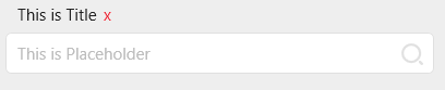
ContentHeight
xml
     <hc:SearchBar hc:InfoElement.Placeholder="Please enter the query criteria"
                   Hc:InfoElement.ContentHeight="50"
                   Hc:InfoElement.Title="Query Condition"
                   Margin="10,10" hc:InfoElement.Necessary="True"
                   Style="{StaticResource SearchBarExtend}"/>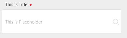
RegexPattern
By setting this attribute, you can customize the verification logic inside the information element to realize error prompts for content outside the specified format.