Attribute
| Name |
|---|
| Layout |
| Orientation |
Style
| Name |
|---|
| ButtonGroupHorizontalUniformItemsPanelTemplate |
| ButtonGroupVerticalUniformItemsPanelTemplate |
| ButtonGroupHorizontalStackItemsPanelTemplate |
| ButtonGroupVerticalStackItemsPanelTemplate |
| ButtonGroupBaseStyle |
RadioGroupItemBaseStyle
Subset RadioButton style base class in ButtonGroup control. It is not recommended to use it directly. It is often used as Item style base class in ButtonGroup. It is also used in conjunction with ButtonGroup control.
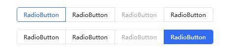
Case:
xml
<!--The internal Item style is automatically attached by the ButtonGroup control-the default is the horizontal item style-->
<hc:ButtonGroup Margin="0,32,0,0">
    <RadioButton Content="RadioButton" IsChecked="True"/>
    <RadioButton Content="RadioButton"/>
    <RadioButton IsEnabled="False" Content="RadioButton"/>
    <RadioButton Content="RadioButton"/>
</hc:ButtonGroup>
<hc:ButtonGroup Margin="0,16,0,0" Style="{StaticResource ButtonGroupSolid}">
    <RadioButton Content="RadioButton"/>
    <RadioButton Content="RadioButton"/>
    <RadioButton IsEnabled="False" Content="RadioButton"/>
    <RadioButton Content="RadioButton" IsChecked="True"/>
</hc:ButtonGroup>
effect:
RadioGroup association style
| Style Key | use | Base class style |
|---|---|---|
| RadioGroupItemDefault | RadioGroupItem default style | RadioGroupItemBaseStyle |
| RadioGroupItemHorizontalFirst | RadioGroupItem horizontal head style (from left to right) | RadioGroupItemBaseStyle |
| RadioGroupItemHorizontalLast | RadioGroupItem horizontal tail style (from left to right) | RadioGroupItemBaseStyle |
| RadioGroupItemSingle | RadioGroupItem single item style | RadioGroupItemBaseStyle |
| RadioGroupItemVerticalFirst | RadioGroupItem vertical header style (from top to bottom) | RadioGroupItemBaseStyle |
| RadioGroupItemVerticalLast | RadioGroupItem vertical tail style (from top to bottom) | RadioGroupItemBaseStyle |
Case:
Single RadioButton style:
xml
<RadioButton Style="{DynamicResource RadioGroupItemSingle}"
                 Margin="0,16,8,0"
                 Content="RadioGroupItemSingle"></RadioButton>
effect:

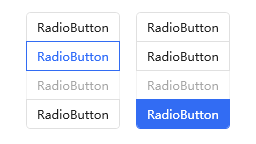
Multiple RadioButton vertical styles:
xml
<StackPanel Orientation="Horizontal" HorizontalAlignment="Center">
    <hc:ButtonGroup Margin="0,16,8,0" Orientation="Vertical">
        <RadioButton Content="RadioButton" IsChecked="True"/>
        <RadioButton Content="RadioButton"/>
        <RadioButton IsEnabled="False" Content="RadioButton"/>
        <RadioButton Content="RadioButton"/>
    </hc:ButtonGroup>
    <hc:ButtonGroup Margin="8,16,0,0" Orientation="Vertical" Style="{StaticResource ButtonGroupSolid}">
        <RadioButton Content="RadioButton"/>
        <RadioButton Content="RadioButton"/>
        <RadioButton IsEnabled="False" Content="RadioButton"/>
        <RadioButton Content="RadioButton" IsChecked="True"/>
    </hc:ButtonGroup>
</StackPanel>
effect: