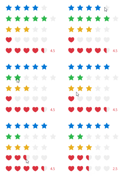
You can use the Rate control when displaying reviews or performing quick grading operations on things.
cs
[DefaultProperty("Items")]
[ContentProperty("Items")]
[TemplatePart(Name = ElementPanel, Type = typeof(Panel))]
public class SimpleItemsControl : Control
cs
public class RegularItemsControl : SimpleItemsControlcs
public class Rate : RegularItemsControlAttributes
| Property | Description | Default Value | Remarks |
|---|---|---|---|
| AllowHalf | Whether to allow half selection | false | |
| AllowClear | Whether to allow clear after clicking again | true | |
| Icon | Icon | ||
| Count | star Total number | 5 | |
| DefaultValue | Default Value | 0 | |
| Value | Current Rating | 0 | |
| Text | Score text | ||
| ShowText | Whether to display the score text | false | |
| IsReadOnly | Is it read-only | false | |
| Value | Current Rating | 0 |
Events
| Name | Description |
|---|---|
| ValueChanged | Triggered when the score changes |
Case
xml
<StackPanel Width="170">
    <hc:Rate Value="2"/>
    <hc:Rate Value="5" Count="6" Margin="0,16,0,0" Foreground="{DynamicResource SuccessBrush}"/>
    <hc:Rate DefaultValue="3" IsReadOnly="True" AllowHalf="True" Margin="0,16,0,0" Foreground="{DynamicResource WarningBrush}"/>
    <hc:Rate DefaultValue="1" AllowClear="False" AllowHalf="True" Margin="0,16,0,0" Foreground="{DynamicResource DangerBrush}" Icon="{StaticResource LoveGeometry}"/>
    <hc:Rate Value="4.5" AllowHalf="True" ShowText="True" Margin="0,16,0,0" Foreground="{DynamicResource DangerBrush}" Icon="{StaticResource LoveGeometry}"/>
</StackPanel>