
Resources and Enums
make sure you have defined resources and enums
xml
<Page.Resources>
    <Style x:Key="PanelStyle"
       TargetType="StackPanel">
    <Setter Property="CornerRadius" Value="8" />
    <Setter Property="Padding" Value="16" />
    <Setter Property="Background" Value="{ThemeResource CardBackgroundFillColorDefaultBrush}" />
    <Setter Property="BorderThickness" Value="1" />
    <Setter Property="BorderBrush" Value="{ThemeResource CardStrokeColorDefaultBrush}" />
    <Setter Property="Orientation" Value="Horizontal" />
    <Setter Property="Spacing" Value="8" />
    <Setter Property="animations:Implicit.HideAnimations" Value="{StaticResource ShowTransitions}" />
</Style>

<animations:ImplicitAnimationSet x:Name="ShowTransitions">
    <animations:OffsetAnimation EasingMode="EaseOut"
                                From="0,24,0"
                                To="0"
                                Duration="0:0:0.4" />
    <animations:OpacityAnimation EasingMode="EaseOut"
                                 From="0"
                                 To="1"
                                 Duration="0:0:0.2" />
</animations:ImplicitAnimationSet>
<animations:ImplicitAnimationSet x:Name="HideTransitions">
    <animations:OffsetAnimation EasingMode="EaseOut"
                                From="0"
                                To="0,24,0"
                                Duration="0:0:0.2" />
    <animations:OpacityAnimation EasingMode="EaseOut"
                                 From="1"
                                 To="0"
                                 Duration="0:0:0.1" />
</animations:ImplicitAnimationSet>

<enum:CheckStatus x:Key="MyChecks">Warning</enum:CheckStatus>

<dev:SwitchConverter x:Key="StatusToColorSwitchConverter"
                     TargetType="enum:CheckStatus">
    <!--  Note: These are reused from the controls namespace from SwitchPresenter  -->
    <dev:Case Content="{ThemeResource SystemFillColorSuccessBrush}"
              Value="Success" />
    <dev:Case Content="{ThemeResource SystemFillColorCautionBrush}"
              Value="Warning" />
    <dev:Case Content="{ThemeResource SystemFillColorCriticalBrush}"
              Value="Error" />
</dev:SwitchConverter>
</Page.Resources>
cs
public enum Animal
{
    Bunny,
    Cat,
    Dog,
    Giraffe,
    Llama,
    Otter,
    Owl,
    Parrot,
    Squirrel
}
public enum CheckStatus
{
    Error,
    Warning,
    Success,
}
public partial class TemplateInformation
{
    public string? Header { get; set; }

    public string? Regex { get; set; }

    public string? PlaceholderText { get; set; }
}
SwitchConverter Brush Example
xml
<StackPanel>
    <ComboBox x:Name="StatusPicker"
                Header="Pick a status"
                SelectedIndex="0">
        <x:String>Success</x:String>
        <x:String>Warning</x:String>
        <x:String>Error</x:String>
    </ComboBox>
    <TextBlock Text="This is it, this is the demo:" />
    <TextBlock FontWeight="SemiBold"
                Foreground="{x:Bind StatusPicker.SelectedItem, Converter={StaticResource StatusToColorSwitchConverter}, Mode=OneWay}"
                Text="{x:Bind StatusPicker.SelectedItem, Mode=OneWay}" />
</StackPanel>
SwitchPresenter Template Example
xml
<StackPanel>
    <ComboBox x:Name="Lookup"
                Margin="0,0,0,8"
                Header="Look up reservation"
                SelectedIndex="0">
        <x:String>Confirmation Code</x:String>
        <x:String>E-ticket number</x:String>
        <x:String>Mileage Plan number</x:String>
    </ComboBox>
    <!--  SwitchPresenter binds to a value  -->
    <dev:SwitchPresenter Value="{x:Bind Lookup.SelectedItem, Mode=OneWay}">

        <!--  We define a common UI template for the data we want to display  -->
        <dev:SwitchPresenter.ContentTemplate>
            <DataTemplate x:DataType="enum:TemplateInformation">
                <StackPanel>
                    <TextBox Name="CodeValidator"
                                dev:TextBoxExtensions.Regex="{x:Bind Regex, Mode=OneWay}"
                                Header="{x:Bind Header, Mode=OneWay}"
                                PlaceholderText="{x:Bind PlaceholderText, Mode=OneWay}" />
                    <TextBlock Text="Thanks for entering a valid code!"
                                Visibility="{Binding (dev:TextBoxExtensions.IsValid), ElementName=CodeValidator}" />
                </StackPanel>
            </DataTemplate>
        </dev:SwitchPresenter.ContentTemplate>

        <!--  And use the value to transform our data into an object we'll use as the context for our UI  -->

        <dev:Case IsDefault="True"
                    Value="Confirmation Code">
            <enum:TemplateInformation Header="Confirmation code"
                                        PlaceholderText="6 letters"
                                        Regex="^[a-zA-Z]{6}$" />
        </dev:Case>
        <dev:Case Value="E-ticket number">
            <enum:TemplateInformation Header="E-ticket number"
                                        PlaceholderText="10 or 13 numbers"
                                        Regex="(^\d{10}$)|(^\d{13}$)" />
        </dev:Case>
        <dev:Case Value="Mileage Plan number">
            <enum:TemplateInformation Header="Mileage Plan #"
                                        PlaceholderText="Mileage Plan (12 digits)"
                                        Regex="(^\d{12}$)" />
        </dev:Case>
    </dev:SwitchPresenter>
</StackPanel>
SwitchPresenter Loading Example
xml
<StackPanel>
    <ToggleSwitch x:Name="LoadingState"
            Header="IsLoading" />
    <dev:SwitchPresenter Grid.Row="1"
                            HorizontalAlignment="Center"
                            TargetType="x:Boolean"
                            Value="{x:Bind LoadingState.IsOn, Mode=OneWay}">
        <dev:Case Value="True">
            <StackPanel HorizontalAlignment="Center"
                        animations:Implicit.HideAnimations="{StaticResource HideTransitions}"
                        animations:Implicit.ShowAnimations="{StaticResource ShowTransitions}"
                        Orientation="Vertical"
                        Spacing="8">
                <ProgressRing IsActive="{x:Bind LoadingState.IsOn, Mode=OneWay}" />
                <TextBlock HorizontalAlignment="Center"
                            Foreground="{ThemeResource TextFillColorSecondaryBrush}"
                            Style="{StaticResource CaptionTextBlockStyle}"
                            Text="Fetching data.." />
            </StackPanel>
        </dev:Case>
        <dev:Case Value="False">
            <TextBlock HorizontalAlignment="Center"
                        animations:Implicit.HideAnimations="{StaticResource HideTransitions}"
                        animations:Implicit.ShowAnimations="{StaticResource ShowTransitions}"
                        TextAlignment="Center"
                        TextWrapping="WrapWholeWords">
                <Run FontWeight="SemiBold"
                        Text="Content has loaded" />
                <LineBreak />
                <Run Text="Lorem ipsum dolor sit amet, consectetur adipiscing elit, sed do eiusmod tempor incididunt ut labore et dolore magna aliqua." />
            </TextBlock>
        </dev:Case>
    </dev:SwitchPresenter>
</StackPanel>
SwitchPresenter Content Example
xml
<StackPanel>
    <RadioButtons x:Name="radio"
                Header="Options">
        <RadioButton Content="Square"
                        Tag="square" />
        <RadioButton Content="Circle"
                        Tag="circle" />
        <RadioButton Content="Rect"
                        Tag="rect" />
    </RadioButtons>
    <dev:SwitchPresenter Grid.Row="1"
                            Value="{Binding SelectedItem.Tag, ElementName=radio}">
        <dev:Case Value="square">
            <StackPanel animations:Implicit.HideAnimations="{StaticResource HideTransitions}"
                        animations:Implicit.ShowAnimations="{StaticResource ShowTransitions}"
                        Style="{StaticResource PanelStyle}">

                <Border Width="24"
                        Height="24"
                        Background="{ThemeResource AccentFillColorDefaultBrush}" />
                <TextBlock VerticalAlignment="Center"
                            Text="This is the Square panel" />
            </StackPanel>
        </dev:Case>
        <dev:Case Value="circle">
            <StackPanel animations:Implicit.HideAnimations="{StaticResource HideTransitions}"
                        animations:Implicit.ShowAnimations="{StaticResource ShowTransitions}"
                        Style="{StaticResource PanelStyle}">

                <Ellipse Width="24"
                            Height="24"
                            Fill="{ThemeResource AccentFillColorDefaultBrush}" />
                <TextBlock VerticalAlignment="Center"
                            Text="This is the Circle panel" />
            </StackPanel>
        </dev:Case>
        <dev:Case Value="rect">
            <StackPanel animations:Implicit.HideAnimations="{StaticResource HideTransitions}"
                        animations:Implicit.ShowAnimations="{StaticResource ShowTransitions}"
                        Style="{StaticResource PanelStyle}">
                <Rectangle Width="48"
                            Height="24"
                            Fill="{ThemeResource AccentFillColorDefaultBrush}" />
                <TextBlock VerticalAlignment="Center"
                            Text="This is the Rectangle panel" />
            </StackPanel>
        </dev:Case>
    </dev:SwitchPresenter>
</StackPanel>
SwitchPresenter Value Example
xml
<StackPanel>
    <ComboBox x:Name="AnimalPicker"
                    Header="Pick an Animal"
                    ItemsSource="{dev:EnumValues Type=enum:Animal}"
                    SelectedIndex="0" />
    <dev:SwitchPresenter Padding="16"
                            TargetType="enum:Animal"
                            Value="{x:Bind AnimalPicker.SelectedItem, Mode=OneWay}">
        <dev:Case Value="Bunny">
            <TextBlock FontSize="32"
                        Text="🐇" />
        </dev:Case>
        <dev:Case Value="Cat">
            <TextBlock FontSize="32"
                        Text="🐈" />
        </dev:Case>
        <dev:Case Value="Dog">
            <TextBlock FontSize="32"
                        Text="🐕" />
        </dev:Case>
        <dev:Case Value="Giraffe">
            <TextBlock FontSize="32"
                        Text="🦒" />
        </dev:Case>
        <dev:Case Value="Llama">
            <TextBlock FontSize="32"
                        Text="🦙" />
        </dev:Case>
        <dev:Case Value="Otter">
            <TextBlock FontSize="32"
                        Text="🦦" />
        </dev:Case>
        <dev:Case Value="Owl">
            <TextBlock FontSize="32"
                        Text="🦉" />
        </dev:Case>
        <dev:Case Value="Parrot">
            <TextBlock FontSize="32"
                        Text="🦜" />
        </dev:Case>
        <dev:Case Value="Squirrel">
            <TextBlock FontSize="32"
                        Text="🐿" />
        </dev:Case>
    </dev:SwitchPresenter>
</StackPanel>
WARNING
If you encounter an error when running in AOT/Trim mode, please make the following changes:
xml
<ComboBox x:Name="AnimalPicker"
          Header="Pick an Animal"
          ItemsSource="{x:Bind Items, Mode=OneWay}" />
cs
public ObservableCollection<Animal> Items
{
    get { return (ObservableCollection<Animal>)GetValue(ItemsProperty); }
    set { SetValue(ItemsProperty, value); }
}

public static readonly DependencyProperty ItemsProperty =
    DependencyProperty.Register(nameof(Items), typeof(ObservableCollection<Animal>), typeof(SwitchPresenterPage), new PropertyMetadata(new ObservableCollection<Animal>(Enum.GetValues<Animal>())));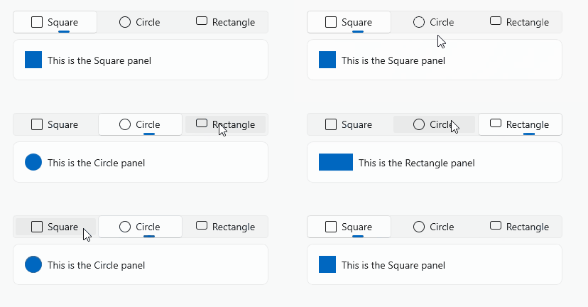
Demo
you can run demo and see this feature.