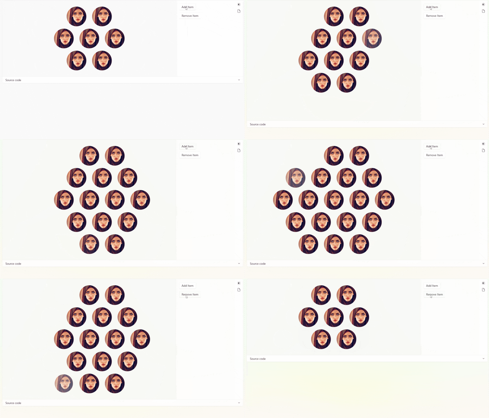
A container that allows child elements to present a honeycomb layout.
Honeycomb layout
Other elements will start from the first element and wrap around:
         ●       ●
        (7)     (8)
     ●       ●       ●
    (6)     (1)     (9)
 ●       ●       ●       ...
(5)     (0)     (2)
     ●       ●       ...
    (4)     (3)
Example
xml
<ListView ItemsSource="{x:Bind PictureList, Mode=OneWay}"
            SelectionMode="None">
    <ListView.ItemsPanel>
        <ItemsPanelTemplate>
            <dev:HoneycombPanel />
        </ItemsPanelTemplate>
    </ListView.ItemsPanel>
</ListView>
Demo
you can run demo and see this feature.