Attributes
| Property | Description | Default Value | Remarks |
|---|---|---|---|
| FlexGrow | Item | ||
| Order | Item | ||
| FlexShrink | Item | ||
| FlexBasis | Item | ||
| AlignSelf | Item | ||
| FlexDirection | Panel | ||
| FlexWrap | Panel | ||
| JustifyContent | Panel | ||
| AlignItems | Panel | ||
| AlignContent | Panel |
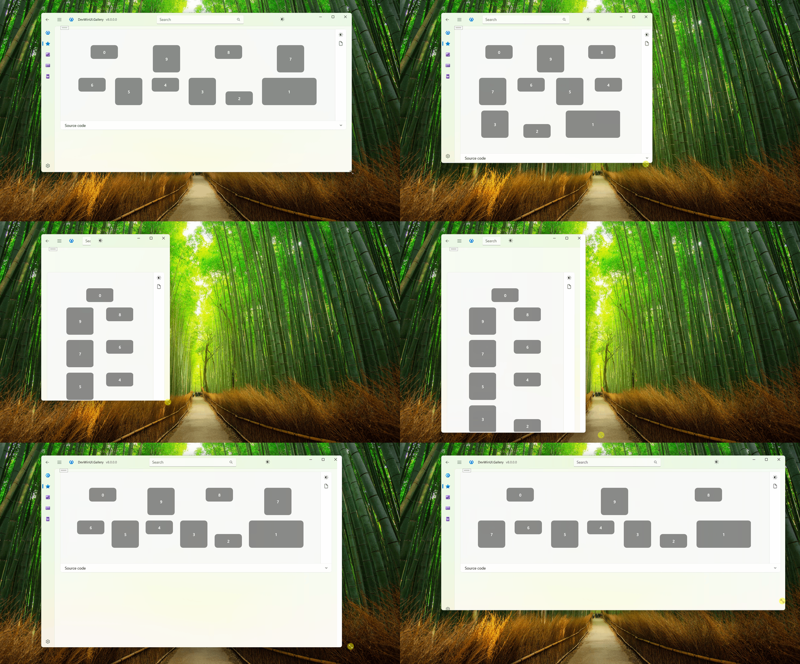
Example
xml
<Page.Resources>
    <Style TargetType="Border">
        <Setter Property="Width" Value="100" />
        <Setter Property="Background" Value="{ThemeResource ControlAAFillColorDefaultBrush}" />
        <Setter Property="Margin" Value="10" />
        <Setter Property="CornerRadius" Value="10" />
    </Style>
    <Style BasedOn="{StaticResource BaseTextBlockStyle}"
            TargetType="TextBlock">
        <Setter Property="HorizontalAlignment" Value="Center" />
        <Setter Property="VerticalAlignment" Value="Center" />
        <Setter Property="Foreground" Value="White" />
    </Style>
</Page.Resources>

<dev:FlexPanel Margin="32"
                AlignContent="SpaceBetween"
                AlignItems="FlexStart"
                FlexDirection="RowReverse"
                FlexWrap="WrapReverse"
                JustifyContent="SpaceAround">
    <Border Height="50"
            dev:FlexPanel.Order="99">
        <TextBlock Text="0" />
    </Border>
    <Border Height="100"
            dev:FlexPanel.FlexBasis="200">
        <TextBlock Text="1" />
    </Border>
    <Border Height="50"
            dev:FlexPanel.AlignSelf="FlexEnd">
        <TextBlock Text="2" />
    </Border>
    <Border Height="100">
        <TextBlock Text="3" />
    </Border>
    <Border Height="50">
        <TextBlock Text="4" />
    </Border>
    <Border Height="100">
        <TextBlock Text="5" />
    </Border>
    <Border Height="50">
        <TextBlock Text="6" />
    </Border>
    <Border Height="100">
        <TextBlock Text="7" />
    </Border>
    <Border Height="50">
        <TextBlock Text="8" />
    </Border>
    <Border Height="100">
        <TextBlock Text="9" />
    </Border>
</dev:FlexPanel>
Demo
you can run demo and see this feature.