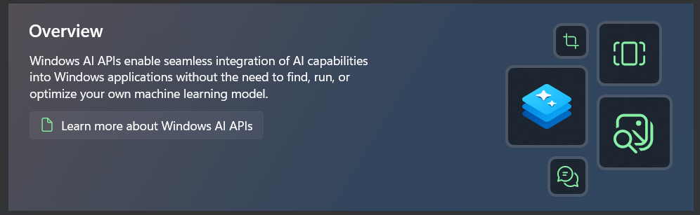
Attributes
| Property |
|---|
| ImageContent |
| ActionContent |
| Title |
| Description |
Example
xml
<dev:OverviewPageHeader Title="Overview"
Background="{ThemeResource CardGradient2Brush}"
Description="Windows AI APIs enable seamless integration of AI capabilities into Windows applications without the need to find, run, or optimize your own machine learning model.">
<dev:OverviewPageHeader.ActionContent>
<Button AutomationProperties.Name="Learn more about Windows AI APIs">
<Button.Content>
<StackPanel Orientation="Horizontal"
Spacing="8">
<FontIcon FontSize="16"
Foreground="{ThemeResource AccentTextFillColorPrimaryBrush}"
Glyph="" />
<TextBlock Text="Learn more about Windows AI APIs" />
</StackPanel>
</Button.Content>
</Button>
</dev:OverviewPageHeader.ActionContent>
<dev:OverviewPageHeader.ImageContent>
<Grid Margin="24,8,24,16">
<Grid Margin="0,62,0,0"
Padding="16"
HorizontalAlignment="Left"
VerticalAlignment="Top"
Style="{StaticResource GlassAcrylicGridStyle}">
<Image Width="56"
Source="ms-appx:///Assets/Svgs/WCRAPI.svg" />
</Grid>
<Grid Margin="48,166,0,0"
Padding="8"
HorizontalAlignment="Left"
VerticalAlignment="Top"
Style="{StaticResource GlassAcrylicGridStyle}">
<FontIcon FontSize="24"
Foreground="{ThemeResource AccentTextFillColorPrimaryBrush}"
Glyph="" />
</Grid>
<Grid Margin="104,96,0,0"
Padding="16"
HorizontalAlignment="Left"
VerticalAlignment="Top"
Style="{StaticResource GlassAcrylicGridStyle}">
<FontIcon FontSize="48"
Foreground="{ThemeResource AccentTextFillColorPrimaryBrush}"
Glyph="" />
</Grid>
<Grid Margin="104,12,0,0"
Padding="16"
HorizontalAlignment="Left"
VerticalAlignment="Top"
Style="{StaticResource GlassAcrylicGridStyle}">
<FontIcon FontSize="36"
Foreground="{ThemeResource AccentTextFillColorPrimaryBrush}"
Glyph="" />
</Grid>
<Grid Margin="54,14,0,0"
Padding="8"
HorizontalAlignment="Left"
VerticalAlignment="Top"
Style="{StaticResource GlassAcrylicGridStyle}">
<FontIcon FontSize="18"
Foreground="{ThemeResource AccentTextFillColorPrimaryBrush}"
Glyph="" />
</Grid>
</Grid>
</dev:OverviewPageHeader.ImageContent>
</dev:OverviewPageHeader>Demo
you can run demo and see this feature.