
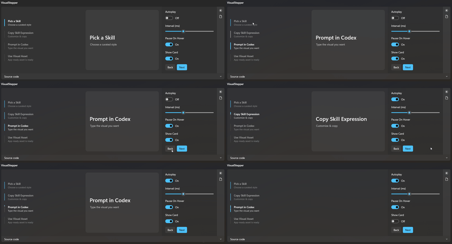
A vertical step list with an animated progress rail and a crossfading detail card. Steps advance automatically or on demand, and each step can show its own card content.
Usage
<dev:VisualStepper Height="320" Autoplay="False" Interval="2500" PauseOnHover="True" ShowCard="True">
<dev:VisualStepper.Steps>
<dev:VisualStepperStep Title="Pick a Skill" Description="Choose a curated style" />
<dev:VisualStepperStep Title="Copy Skill Expression" Description="Customize & copy" />
<dev:VisualStepperStep Title="Prompt in Codex" Description="Type the visual you want" />
<dev:VisualStepperStep Title="Use Visual Asset" Description="App-ready asset is ready" />
</dev:VisualStepper.Steps>
</dev:VisualStepper>Properties
| Property | Type | Default | Description |
|---|---|---|---|
Steps | ObservableCollection<VisualStepperStep> | empty | The steps shown in the list. |
SelectedIndex | int | 0 | Index of the active step. Values outside the range are clamped. |
Autoplay | bool | true | Fills the active step's rail over Interval, then advances to the next step and wraps to the first after the last. |
Interval | double | 2500 | Time in milliseconds each step stays active during autoplay. Minimum effective value is 100. |
PauseOnHover | bool | true | Pauses autoplay while the pointer is over the control or it has keyboard focus. |
ShowCard | bool | true | Shows or hides the detail card beside the step list. |
CardTemplate | DataTemplate? | built-in template | Template used to render the card. Its data context is a VisualStepperItem. |
InactiveStepOpacity | double | 0.55 | Opacity of steps that are not active. |
TrackBrush | Brush? | VisualStepperTrackBrush | Brush of the rail behind each step. |
ProgressBrush | Brush? | VisualStepperProgressBrush | Brush of the filled portion of the rail. |
DescriptionForeground | Brush? | VisualStepperDescriptionForegroundBrush | Foreground of each step's description. |
Events
| Event | Signature | Description |
|---|---|---|
StepChanged | TypedEventHandler<VisualStepper, int> | Raised when the active step changes. The argument is the new index. |
VisualStepperStep
| Property | Type | Description |
|---|---|---|
Title | string | Step title. |
Description | string? | Optional secondary text. Hidden when empty. |
Content | object? | Optional payload for use in a custom card template. |
VisualStepperStep implements INotifyPropertyChanged, so changing a property while the control is loaded updates the row immediately.
VisualStepperItem
The data context of the card template.
| Property | Type | Description |
|---|---|---|
Index | int | Zero-based index of the step. |
Step | VisualStepperStep | The step the card represents. |
Custom card template
Use x:DataType and x:Bind so the template stays AOT-friendly.
<dev:VisualStepper>
    <dev:VisualStepper.CardTemplate>
        <DataTemplate x:DataType="dev:VisualStepperItem">
            <Border Padding="24" Background="{ThemeResource CardBackgroundFillColorDefaultBrush}" CornerRadius="12">
                <StackPanel Spacing="8">
                    <TextBlock Style="{ThemeResource SubtitleTextBlockStyle}" Text="{x:Bind Step.Title, Mode=OneWay}" />
                    <ContentPresenter Content="{x:Bind Step.Content, Mode=OneWay}" />
                </StackPanel>
            </Border>
        </DataTemplate>
    </dev:VisualStepper.CardTemplate>
</dev:VisualStepper>
Navigation
Set SelectedIndex from code, for example from Back and Next buttons:
private void OnNext(object sender, RoutedEventArgs e) => Stepper.SelectedIndex++;

private void OnBack(object sender, RoutedEventArgs e) => Stepper.SelectedIndex--;
Clicking a step also selects it.
Keyboard
| Key | Action |
|---|---|
Down, Right | Next step |
Up, Left | Previous step |
Home | First step |
End | Last step |
Styling
Override these theme resources to restyle the control:
| Resource | Default |
|---|---|
VisualStepperTrackBrush | DividerStrokeColorDefaultBrush |
VisualStepperProgressBrush | AccentFillColorDefaultBrush |
VisualStepperDescriptionForegroundBrush | TextFillColorSecondaryBrush |
High contrast uses SystemColorGrayTextColorBrush, SystemColorHighlightColorBrush and SystemColorWindowTextColorBrush.
Template parts
| Part | Type |
|---|---|
PART_Root | Grid |
PART_StepsPanel | StackPanel |
PART_CardHost | Grid |
PART_CardA | ContentPresenter |
PART_CardB | ContentPresenter |
Accessibility
Each step exposes its title as the automation name, its description as help text, its position in the set, and current as the item status when active. The control is a tab stop and supports system focus visuals.
NOTE
- With
Autoplayoff, the active step's rail is shown fully filled. - With fewer than two steps, autoplay does not run.
- Setting
ShowCardtofalsecollapses the card column and its spacing.
Demo
you can run demo and see this feature.