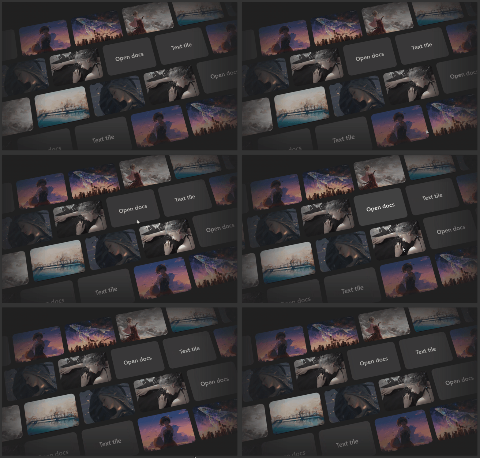
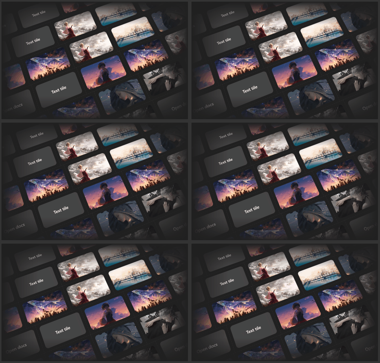
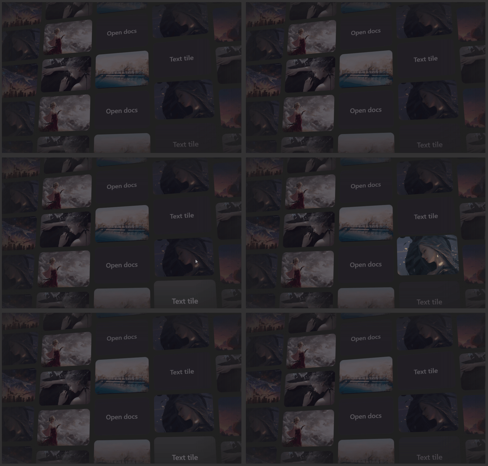
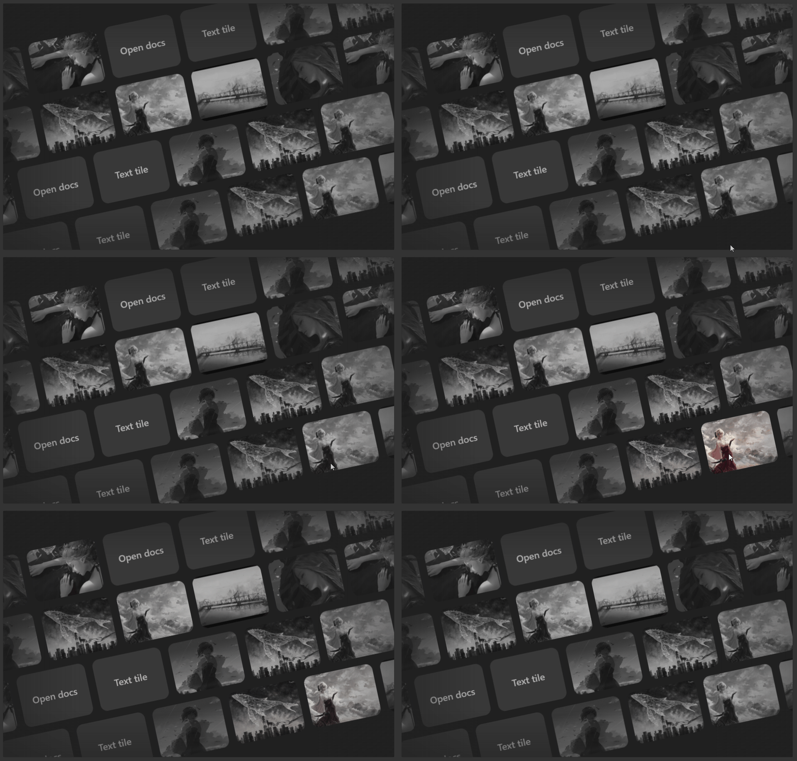
MotionWall is a Win2D-powered control that renders an animated, scrolling wall of image and text tiles. Tiles move along parallel lanes (a marquee), and the whole wall can be tilted, turned and rolled in 3D with perspective. It also supports pointer-driven effects (spotlight, parallax, pointer tilt), optional interactivity (click, keyboard navigation, lift on hover), and soft edge fading.
Contents
- Quick start
- Supplying items
- MotionWallItem
- Properties
- Events
- Enums
- Interaction model
- Presets
- Behavior notes
- Tips and gotchas
Quick start
XAML
<dev:MotionWall Height="500"
                Background="{ThemeResource SolidBackgroundFillColorBaseBrush}"
                Lanes="4"
                Speed="40">
    <dev:MotionWallItem Source="ms-appx:///Assets/1.jpg" Title="Photo 1" />
    <dev:MotionWallItem Source="ms-appx:///Assets/2.jpg" Title="Photo 2" />
    <dev:MotionWallItem Source="ms-appx:///Assets/3.jpg" Title="Photo 3" />
</dev:MotionWall>
Code-behind
Wall.ItemsSource = new List<object?>
{
    new MotionWallItem { Source = "ms-appx:///Assets/1.jpg", Title = "Photo 1" },
    new MotionWallItem { Source = "ms-appx:///Assets/2.jpg", Title = "Photo 2" },
    new MotionWallItem { Text = "Open docs", Title = "Opens the docs", Href = new Uri("https://example.com") }
};

Wall.IsInteractive = true;
Wall.TileInvoked += (s, e) => Debug.WriteLine($"Invoked #{e.Index}");
Supplying items
Tiles come from either ItemsSource or the Items collection.
- If
ItemsSourceis set to anIEnumerable(other thanstring), it is used andItemsis ignored. - Otherwise the
Itemscollection (the XAML content property) is used. - If the source implements
INotifyCollectionChanged(for exampleObservableCollection<T>), the wall refreshes automatically when the collection changes. - The item list is repeated cyclically to fill every lane, so a small set of items still fills the wall.
How each item is interpreted
| Item | Result |
|---|---|
null | Empty tile (background color only) |
MotionWallItem with a non-empty Source | Image tile |
MotionWallItem with only Text | Text tile |
MotionWallItem with neither | Empty tile (still carries Title) |
string that looks like an image | Image tile |
string that does not look like an image | Text tile |
| Any other object | Text tile using the object's string conversion (invariant culture) |
A string "looks like an image" if it starts with http://, https://, ms-appx:, ms-appdata: or file:, or ends with .png, .jpg, .jpeg, .gif, .bmp, .webp, .tif or .tiff (a query string is ignored when checking the extension).
Source resolution
Supported schemes are http, https, ms-appx, ms-appdata and file. A relative value such as Assets/1.jpg or /Assets/1.jpg is resolved to ms-appx:///Assets/1.jpg.
Images are scaled to cover the tile (uniform-to-fill, centered crop). Identical sources are loaded once and the rendered tile is shared. If an image fails to load, the tile is drawn with the tile background (and its Text, if any).
Wall.ItemsSource = new object?[]
{
    "Assets/1.jpg",
    "https://example.com/photo.png",
    "Plain text tile",
    42,
    null
};
MotionWallItem
A convenience data class for tiles that need a title, link or tag.
| Property | Type | Description |
|---|---|---|
Source | string? | Image location. When set, the tile is an image tile. |
Text | string? | Text drawn centered on the tile when there is no image (or the image failed to load). |
Title | string? | Tooltip shown while the tile is hovered (requires IsInteractive). |
Href | Uri? | Opened with the system launcher when the tile is invoked. |
Tag | object? | Free-form data for your own use; available through TileInvoked. |
Properties
All properties are dependency properties and can be bound or styled.
Items
| Property | Type | Default | Description |
|---|---|---|---|
ItemsSource | object? | null | Data source for tiles. Takes precedence over Items. |
Items | ObservableCollection<object?> | empty | Inline items. Read-only property; also the XAML content. |
Layout
| Property | Type | Default | Description |
|---|---|---|---|
Orientation | Orientation | Horizontal | Horizontal: lanes are rows and tiles scroll left/right. Vertical: lanes are columns and tiles scroll up/down. |
Lanes | int | 4 | Number of visible lanes. Minimum effective value is 1. |
AddEdgeLanes | bool | false | Adds one extra lane on each side (2 total). Useful with tilt and roll so the corners of the rotated wall are not empty. |
ItemsPerLane | int | 0 | Number of tiles in one lane's repeat cycle. 0 means automatic. |
ItemDistribution | MotionWallDistribution | Shifted | How items are assigned to lanes. See Enums. |
Gap | double | 16 | Space between tiles and between lanes, in DIPs. When tile size is automatic, the gap is capped at half the lane size. |
TileWidth | double | NaN | Tile width. NaN or a value <= 0 means automatic. |
TileHeight | double | NaN | Tile height. NaN or a value <= 0 means automatic. |
TileAspectRatio | double | 1.5 | Width / height used when one dimension is automatic. Minimum effective value is 0.1. |
TileCornerRadius | double | 12 | Tile corner radius. Clamped to half of the smaller tile dimension. Changing it re-renders all tiles. |
How tile size is determined
- Horizontal: if
TileHeightis automatic, it is derived from the control height divided byLanes(minus the gap, and adjusted for roll and tilt). Width isTileHeight * TileAspectRatiounlessTileWidthis set. - Vertical: if
TileWidthis automatic, it is derived from the control width divided byLanes. Height isTileWidth / TileAspectRatiounlessTileHeightis set. - Setting both
TileWidthandTileHeightgives fixed-size tiles regardless of control size.
When the size changes, tiles are re-rendered after a short debounce (150 ms) so resizing stays smooth. In the meantime the existing tiles are scaled.
Motion
| Property | Type | Default | Description |
|---|---|---|---|
Speed | double | 40 | Scroll speed in DIPs per second. Negative values are treated as 0. |
LoopDuration | double | 0 | Seconds for one lane loop. When greater than 0, it overrides Speed (speed becomes loop length / duration). |
Direction | MotionWallDirection | Alternate | Direction of travel per lane. See Enums. |
Variance | double | 0 | How much lane speeds differ from each other. 0 keeps all lanes identical. |
VarianceStyle | MotionWallVarianceStyle | Random | How variance is applied. See Enums. |
RandomStart | bool | true | Gives each lane a pseudo-random starting offset (deterministic per lane) instead of all lanes starting aligned. |
PauseOnHover | bool | false | Pauses all lanes while the pointer is over the wall. |
MaxFrameRate | int | 60 | Target frame rate. Values > 0 use a fixed time step; <= 0 uses a variable time step (as fast as the canvas allows). |
Speed changes ease in and out smoothly when lanes pause or resume.
3D perspective
The wall is laid out on a flat stage and transformed with a perspective projection.
| Property | Type | Default | Description |
|---|---|---|---|
Tilt | double | 18 | Rotation around the X axis in degrees (leaning back or forward). |
Turn | double | 0 | Rotation around the Y axis in degrees (turning left or right). |
Roll | double | -12 | Rotation around the Z axis in degrees (rotating in the plane of the screen). |
Perspective | double | 1200 | Camera distance. Smaller values give stronger perspective. NaN uses an automatic value (1.6 x the larger control side). A value <= 0 disables perspective. |
Depth | double | 0 | Pushes the wall away from the viewer along Z. |
Set Tilt, Turn and Roll to 0 for a flat, screen-aligned wall.
Interaction
| Property | Type | Default | Description |
|---|---|---|---|
IsInteractive | bool | false | Enables hit testing, focus, click/tap, keyboard navigation, hover highlight, lift and tooltips. See Interaction model. |
Lift | double | 48 | How far a hovered or focused tile rises toward the viewer along Z. Only when IsInteractive is true. |
Spotlight | double | 0.6 | Radius of the pointer spotlight, as a fraction of the larger control side (scaled by 0.35). 0 disables it. Tiles near the pointer are lit; others are dimmed. |
Dim | double | 0.35 | How much unlit tiles are dimmed (0 to 1). Applies when Spotlight > 0 or IsInteractive is true. |
Parallax | double | 0.5 | Lanes shift horizontally (or vertically) with the pointer position, in alternating directions. 0 disables it. |
PointerTilt | double | 0 | Tilts the whole wall toward the pointer, up to 10 degrees multiplied by this value. 0 disables it. |
Spotlight, parallax and pointer tilt track the pointer anywhere over the app's content, not just over the control, and fade out when the pointer leaves.
Appearance
| Property | Type | Default | Description |
|---|---|---|---|
TileBackground | Brush? | null | Fill behind each tile. Only SolidColorBrush is supported; any other value is treated as transparent. Changing it re-renders tiles. |
TileForeground | Brush? | null | Text color for text tiles. Only SolidColorBrush is supported. When null, text is drawn transparent, so set this when using text tiles. |
Grayscale | bool | false | Renders image tiles in grayscale. Lit tiles (spotlight, hover, focus) blend back to color. Changing it re-renders tiles. |
OverlayColor | Brush? | null | Tint drawn over tiles that are not lit. Only SolidColorBrush is supported. |
OverlayOpacity | double | 0 | Strength of the overlay (0 to 1). Has no effect until OverlayColor is set. |
ShowLines | bool | false | Draws dashed grid lines along lane and tile boundaries. |
LineBrush | Brush? | null | Color of the grid lines. Only SolidColorBrush is supported; when null, lines are transparent, so set this together with ShowLines. |
The standard Background property is also used (see Edge fade).
Edge fade
| Property | Type | Default | Description |
|---|---|---|---|
FadeEdges | bool | true | Fades the wall out toward the control edges. |
EdgeFadeSize | double | 0.2 | Width of the fade as a fraction of the control size per side. Clamped to 0 to 0.5. |
EdgeFadeStrength | double | 0.75 | How strongly the edges are faded (0 to 1). 0 disables the fade. |
EdgeFadeColor | Color? | null | Color the edges fade into. When null, see below. |
The fade is rendered in one of two ways:
- Color overlay. Used when
EdgeFadeColoris set, or when it isnullandBackgroundis a fully opaqueSolidColorBrush. Gradients in that color are drawn over the edges. This is the cheapest option and matches the page color exactly. - Alpha mask. Used otherwise (for example a transparent or non-solid background). The wall itself becomes transparent toward the edges so whatever is behind the control shows through.
Events
TileInvoked
public event EventHandler<MotionWallTileEventArgs>? TileInvoked;Raised when a tile is clicked, tapped, or activated from the keyboard (Enter or Space). Only fires while IsInteractive is true.
MotionWallTileEventArgs:
| Property | Type | Description |
|---|---|---|
Item | object? | The original item from ItemsSource or Items (for example your MotionWallItem). |
Index | int | Index of the item in the source list. |
If the invoked item is a MotionWallItem with an Href, the link is also opened with Launcher.LaunchUriAsync after the event is raised.
Wall.TileInvoked += (sender, e) =>
{
    if (e.Item is MotionWallItem item)
    {
        StatusText.Text = $"#{e.Index}: {item.Title ?? item.Text}";
    }
};
Enums
MotionWallDirection
| Value | Description |
|---|---|
Alternate | Even lanes move toward the start, odd lanes toward the end. |
AlternateReverse | Even lanes move toward the end, odd lanes toward the start. |
Start | All lanes move toward the start (left, or up when vertical). |
End | All lanes move toward the end (right, or down when vertical). |
MotionWallDistribution
| Value | Description |
|---|---|
Shifted | Each lane shows the full item list, offset from the previous lane. Every lane repeats all items. |
Interleaved | Items are dealt out across lanes in turn (lane 0 gets item 0, lane 1 gets item 1, and so on), so each lane shows a different subset and items are not duplicated across lanes. |
MotionWallVarianceStyle
| Value | Description |
|---|---|
Random | Each lane gets a different speed multiplier (never below 20% of the base speed). |
Stepped | Lanes cycle through three speed steps, each slower than the last. |
Interaction model
Set IsInteractive="True" to turn the wall into a focusable, clickable control. When it is off, the control is not a tab stop and ignores hit testing (the pointer-driven visual effects still work).
| Input | Behavior |
|---|---|
| Pointer hover | Highlights the tile under the pointer, lifts it by Lift, pauses its lane, shows Title as a tooltip. |
| Click / tap | Raises TileInvoked for the hovered tile and opens its Href if present. |
| Tab | Focuses the wall. Keyboard focus starts on the first item. |
| Left / Up | Moves focus to the previous item (wraps around). |
| Right / Down | Moves focus to the next item (wraps around). |
| Home / End | Moves focus to the first / last item. |
| Enter / Space | Invokes the focused item. |
The focused tile is the visible instance of that item closest to the center of the control. It receives the same highlight and lift as a hovered tile. Focus rendering is suppressed when focus comes from a pointer press.
Hover tooltips come from
MotionWallItem.Title. Plain strings and other objects have no title.
Presets
The gallery page ships three presets that are useful starting points.
Marquee
<dev:MotionWall Lanes="4"
                AddEdgeLanes="True"
                ItemsPerLane="6"
                Gap="24"
                TileAspectRatio="1.7778"
                LoopDuration="40"
                Variance="0.15"
                VarianceStyle="Stepped"
                Tilt="18"
                Roll="-22"
                Perspective="1000"
                Spotlight="0"
                Parallax="0"
                Dim="0"
                ShowLines="True"
                EdgeFadeStrength="1">
</dev:MotionWall>
DriftWall
<dev:MotionWall Orientation="Vertical"
                Lanes="5"
                TileWidth="200"
                TileHeight="132"
                Gap="18"
                TileCornerRadius="14"
                Speed="42"
                Variance="0.45"
                ItemDistribution="Interleaved"
                Tilt="16"
                Turn="-14"
                Roll="0"
                Depth="120"
                IsInteractive="True"
                Lift="64"
                PointerTilt="0.6"
                Spotlight="0"
                Parallax="0"
                Dim="0.45"
                OverlayOpacity="0.42"
                EdgeFadeStrength="0.6">
</dev:MotionWall>
GridMotion
<dev:MotionWall Lanes="4"
                TileAspectRatio="1.33"
                Gap="16"
                TileCornerRadius="14"
                Speed="24"
                Tilt="0"
                Roll="-12"
                Parallax="0.5"
                Spotlight="0.6"
                Dim="0.35"
                Grayscale="True"
                EdgeFadeStrength="0.5">
</dev:MotionWall>
For the Marquee grid lines and DriftWall overlay to be visible, also set
LineBrushandOverlayColorto aSolidColorBrush.
Full example
<Border Height="500"
        BorderBrush="{ThemeResource CardStrokeColorDefaultBrush}"
        BorderThickness="1"
        CornerRadius="{ThemeResource ControlCornerRadius}">
    <dev:MotionWall x:Name="Wall"
                    Background="{ThemeResource SolidBackgroundFillColorBaseBrush}"
                    IsInteractive="True"
                    Lanes="4"
                    Speed="30"
                    PauseOnHover="True"
                    Grayscale="True"
                    TileBackground="#22808080"
                    TileForeground="White"
                    LineBrush="#33FFFFFF"
                    OverlayColor="Black"
                    OverlayOpacity="0.3" />
</Border>public sealed partial class GalleryPage : Page
{
public GalleryPage()
{
InitializeComponent();
Wall.ItemsSource = new List<object?>
{
new MotionWallItem { Source = "ms-appx:///Assets/1.jpg", Title = "Photo 1" },
new MotionWallItem { Source = "ms-appx:///Assets/2.jpg", Title = "Photo 2" },
new MotionWallItem { Text = "Open docs", Title = "Opens the docs", Href = new Uri("https://example.com") },
new MotionWallItem { Text = "Text tile", Title = "Plain text tile" }
};
Wall.TileInvoked += OnTileInvoked;
}
private void OnTileInvoked(object? sender, MotionWallTileEventArgs e)
{
var title = e.Item is MotionWallItem item ? item.Title ?? item.Text : null;
Debug.WriteLine($"Invoked #{e.Index}: {title}");
}
}Binding to an observable collection
public ObservableCollection<MotionWallItem> Photos { get; } = new();<dev:MotionWall ItemsSource="{x:Bind Photos}" />Adding or removing entries updates the wall automatically.
Behavior notes
- Rendering. Each distinct item is rendered once into an offscreen tile image. The animation then only repositions those images, which keeps per-frame cost low even with many lanes.
- Idle and visibility. The canvas pauses when the control is unloaded or scrolled out of view. It also pauses when nothing is moving (for example
Speed="0"with no active pointer effects) and resumes when needed. - Theme changes. Settings are re-read and tiles are re-rendered when the actual theme changes, so theme-bound brushes stay correct.
- Background changes. Changes to a
SolidColorBrushbackground color are tracked live, so animated or theme-resource backgrounds keep the edge fade matching. - Unbounded layout. If the control is measured with infinite width or height, it falls back to
MinWidth/MinHeight, or to 640 x 360. - Tile re-render triggers. Tiles are rebuilt when items change, when
TileCornerRadius,Grayscale,TileBackgroundorTileForegroundchange, when the theme changes, when Win2D recreates its resources, and when the computed tile size changes. - Pointer tracking. Pointer handlers are attached to the window content root (with handled events included), so effects follow the pointer even over other elements on top of the wall.
Tips and gotchas
- Text tiles look empty.
TileForegrounddefaults tonull, which draws transparent text. Set aSolidColorBrushforTileForeground(and optionallyTileBackground). - Grid lines and overlay do nothing.
LineBrushandOverlayColordefault tonull. Set them to aSolidColorBrush. - Only solid brushes.
TileBackground,TileForeground,OverlayColor,LineBrushandBackground(for the fade) are read asSolidColorBrush. Gradient or image brushes are treated as transparent. - Hover, tooltips and clicks need
IsInteractive. Without it there is no hit testing, noTileInvoked, and no tooltips. - Dim without Spotlight or interaction has no effect. Dimming only applies when
Spotlight > 0orIsInteractiveis on. - Visible corners with rotation. When
Roll,TiltorTurnare strong, enableAddEdgeLanesso the rotated wall still covers the corners. - Image failures are silent. A tile whose image cannot be loaded renders as a plain tile; check the
Sourcescheme and that the asset is included in the package. - Few items, many lanes. With
Shifteddistribution every lane repeats all items. UseInterleavedif you want each lane to carry different items. - Frame rate. Lower
MaxFrameRateto reduce GPU use on large walls.LoopDurationis handy when you want a predictable loop time independent of tile size.
Demo
you can run demo and see this feature.