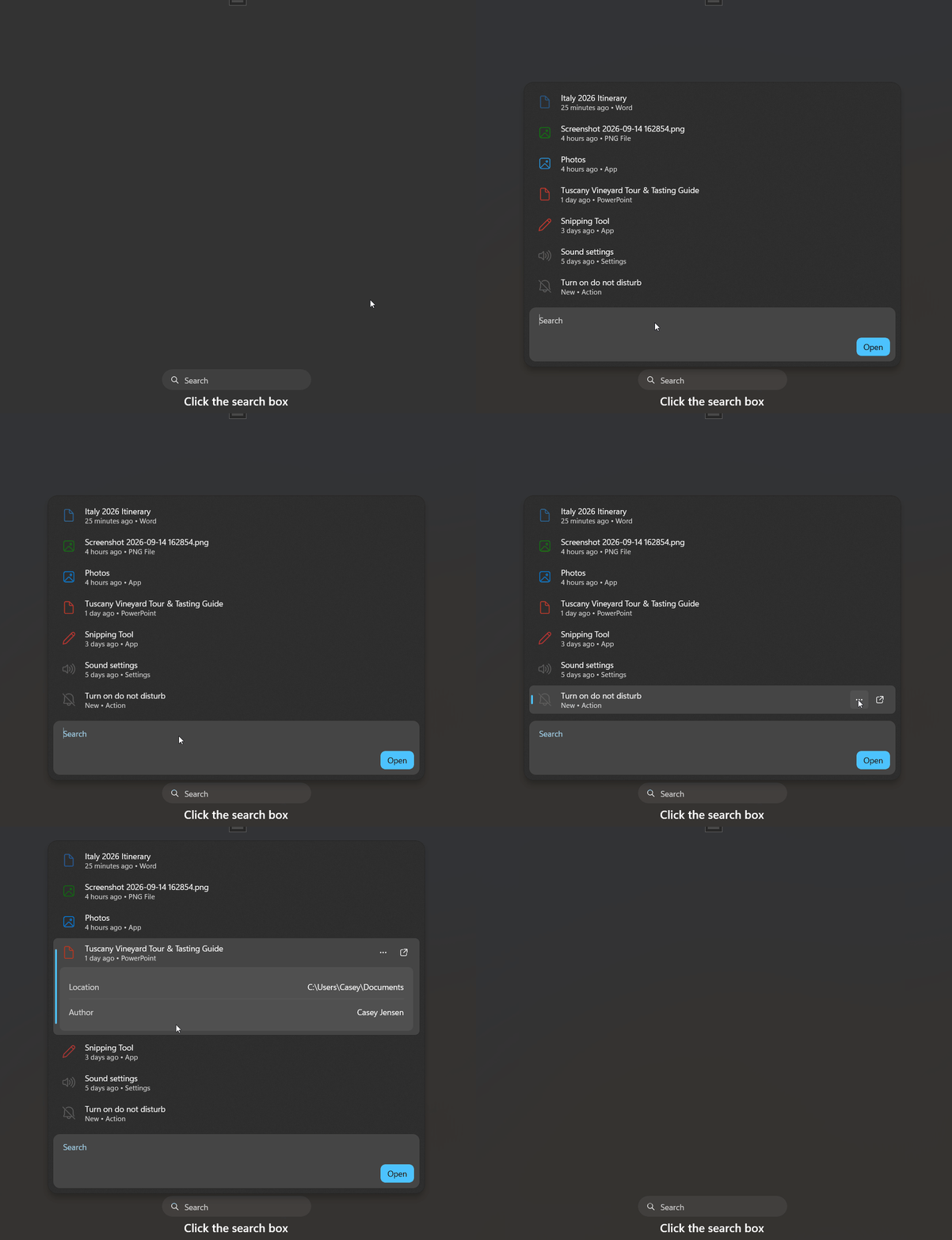
SearchBox is a pill-shaped search trigger that opens a flyout with a query editor, a result list and an Open button. The control does not filter anything by itself: it raises QueryChanged, and your code fills Results.
Basic usage
<dev:SearchBox x:Name="Search"
               Width="260"
               MenuItemInvoked="Search_MenuItemInvoked"
               PlaceholderText="Search"
               QueryChanged="Search_QueryChanged"
ResultInvoked="Search_ResultInvoked" />Search.Results.Add(new SearchResultItem
{
Title = "Italy 2026 Itinerary",
Subtitle = "25 minutes ago • Word",
Glyph = "\uE8A5",
IconBrush = new SolidColorBrush(Microsoft.UI.ColorHelper.FromArgb(255, 43, 87, 154)),
Details = new List<SearchBoxDetailRow>
{
new("Location", @"C:\Users\Casey\Documents"),
new("Author", "Casey Jensen")
}
});
private void Search_QueryChanged(object sender, SearchEventArgs e)
{
Search.Results.Clear();
foreach (var item in _all.Where(i => i.Title.Contains(e.Query, StringComparison.OrdinalIgnoreCase)))
{
Search.Results.Add(item);
}
}
private void Search_ResultInvoked(object sender, SearchResultEventArgs e)
{
StatusText.Text = e.Item != null ? $"Opened: {e.Item.Title}" : $"Search: {e.Query}";
}Properties
| Property | Type | Default | Description |
|---|---|---|---|
PlaceholderText | string | "Search" | Text shown on the trigger button and as the editor placeholder. |
QueryText | string | "" | Current query. Setting it updates the editor. |
ShowPreviousSearch | bool | false | Keeps the query when the flyout closes. When false, the query is cleared and QueryChanged is raised with an empty string. |
FlyoutWidth | double | 640 | Width of the flyout content. |
ResultsMaxHeight | double | 560 | Maximum height of the result list. |
ConstrainToAppBounds | bool | false | Keeps the flyout and item menus inside the app window. |
FlyoutPlacement | FlyoutPlacementMode | Bottom | Flyout placement. Auto opens below the trigger when there is room, otherwise above. |
ItemTemplate | DataTemplate | built-in template | Template used for each result. |
NoResultsText | string | "No results found" | Title shown when the query has no results. |
NoResultsDescription | string | "Try a different search term" | Description shown under the no-results title. |
Results | ObservableCollection<SearchResultItem> | empty | Items shown in the list. |
DefaultMenuItems | ObservableCollection<SearchMenuItem> | empty | Menu used by the More button for items that have no MenuItems of their own. |
Events
| Event | Arguments | Raised when |
|---|---|---|
QueryChanged | SearchEventArgs (Query) | The query text changes, or the query is cleared on close. |
ResultInvoked | SearchResultEventArgs (Item, Query) | A result is opened by Enter, double tap, the Open button or the item's open action. Item is null when nothing is selected, so you can treat it as a plain search for Query. |
MenuItemInvoked | SearchMenuItemEventArgs (Item, MenuItem) | A command in an item's More menu is clicked. |
The flyout closes after ResultInvoked.
Methods
| Method | Description |
|---|---|
Show() | Opens the flyout. |
Hide() | Closes the flyout. |
Result items
SearchResultItem
| Property | Type | Description |
|---|---|---|
Title | string | Primary text. Also used as the accessible name of the row. |
Subtitle | string | Secondary text. |
Glyph | string | Icon glyph. Defaults to "\uE8A5". |
IconBrush | Brush? | Icon color. When null, the accent text color is used. |
Preview | ImageSource? | Image shown in the details panel of the selected item. |
Details | IList<SearchBoxDetailRow> | Name and value rows shown in the details panel of the selected item. |
MenuItems | IList<SearchMenuItem> | Item-specific More menu. Falls back to DefaultMenuItems when empty. |
Payload | object? | Your own data attached to the item. |
IsSelected | bool | Selection state, maintained by the control. |
The details panel is shown only for the selected item, and only when it has a Preview or at least one detail row.
SearchBoxDetailRow
new SearchBoxDetailRow("File Size", "812 KB")SearchMenuItem
| Property | Type | Description |
|---|---|---|
Text | string | Command text. |
Glyph | string? | Optional icon glyph. |
Tag | object? | Identifier you can check in MenuItemInvoked. |
IsSeparator | bool | Renders a separator instead of a command. |
Action | Action<SearchResultItem>? | Callback run before MenuItemInvoked is raised. |
Search.DefaultMenuItems.Add(new SearchMenuItem { Text = "Open", Glyph = "\uE8E5", Tag = "open" });
Search.DefaultMenuItems.Add(new SearchMenuItem { IsSeparator = true });
Search.DefaultMenuItems.Add(new SearchMenuItem { Text = "Remove from list", Glyph = "\uE74D", Tag = "remove" });

private void Search_MenuItemInvoked(object sender, SearchMenuItemEventArgs e)
{
    if (e.MenuItem.Tag as string == "remove")
    {
        _all.Remove(e.Item);
        Refill(Search.QueryText);
    }
}
Keyboard
| Key | Action |
|---|---|
| Down / Up | Moves the selection through the results. |
| Enter | Opens the selected result, or raises ResultInvoked with a null item when nothing is selected. |
| Escape | Closes the flyout. |
Customization
Custom item template
ItemTemplate replaces the built-in row. The More and Open buttons of the default template are part of that template, so a custom template provides its own actions.
<dev:SearchBox ItemTemplate="{StaticResource MyResultTemplate}" />Text resources
Button texts are resources, so they can be changed or localized without code.
| Key | Default | Used for |
|---|---|---|
SearchBoxOpenButtonText | Open | The Open button in the flyout. |
SearchBoxItemMoreText | More options | Name and tooltip of the More button on a row. |
SearchBoxItemOpenText | Open | Name and tooltip of the Open button on a row. |
Define the same key in a dictionary closer to the control than the library defaults, such as a page or parent element Resources. A definition in App.xaml may not take priority over the library's own dictionary.
Style resources
Sizing, spacing and corner radii are resources and can be overridden the same way.
| Key | Default |
|---|---|
SearchBoxTriggerCornerRadius | 18 |
SearchBoxFlyoutCornerRadius | 16 |
SearchBoxEditorCornerRadius | 12 |
SearchBoxItemCornerRadius | 8 |
SearchBoxOpenButtonCornerRadius | 8 |
SearchBoxDetailsCornerRadius | 8 |
SearchBoxTriggerPadding | 14,0 |
SearchBoxFlyoutPadding | 8 |
SearchBoxItemMargin | 0,0,0,2 |
SearchBoxItemPadding | 12,8 |
SearchBoxDetailsMargin | 12,0,12,8 |
SearchBoxDetailsPadding | 16,12 |
SearchBoxNoResultsPadding | 24,40 |
SearchBoxTriggerMinHeight | 36 |
SearchBoxTriggerMinWidth | 200 |
SearchBoxTriggerIconSize | 14 |
SearchBoxEditorHeight | 96 |
SearchBoxItemIconSize | 22 |
SearchBoxItemActionSize | 32 |
SearchBoxPreviewMaxHeight | 190 |
SearchBoxSelectedItemBackgroundBrush | ControlSolidFillColorDefaultBrush (highlight in high contrast) |
Template parts
A custom ControlTemplate for SearchBox should provide these named parts.
| Part | Type |
|---|---|
PART_TriggerButton | Button with a Flyout |
PART_SearchTextBox | TextBox |
PART_ResultsList | ListView |
PART_OpenButton | Button |
PART_NoResultsPresenter | FrameworkElement |
Accessibility
- The editor takes its accessible name from
PlaceholderText. - The More and Open buttons on each row have accessible names and tooltips.
- Rows are announced by
Title. - The no-results message is a polite live region.
NOTE
- Fill
ResultsfromQueryChanged; the control never filters on its own. - Reuse the same
SearchResultIteminstances when refilling, so selection state stays consistent. - The query is cleared on close unless
ShowPreviousSearchistrue, andQueryChangedis raised for that clear.
Demo
you can run demo and see this feature.