
SidebarView is a WinUI navigation sidebar adapted from the Files app. It hosts a virtualized, flat list of SidebarItem rows, supports tree and grouped expansion, three display modes, a resizable pane, drag and drop (including reordering), flyouts for compact mode, and UI Automation.
Table of Contents
- Architecture Overview
- Types at a Glance
- Quick Start
- Data Model
- SidebarView
- SidebarItem
- Display Modes
- Expansion Behavior
- Selection
- Drag and Drop
- Context Menus
- Pane Resizing
- Visual States Reference
- Template Parts
- Theme Resources
- Accessibility
- Implementation Notes
- Troubleshooting
Architecture Overview
The sidebar renders a flat list. Hierarchy is expressed through FlatSidebarItem.Depth, not through nested controls. Only compact-mode flyouts render children as nested SidebarItem instances.
Data flow:
- The host supplies a flat collection of
FlatSidebarItemthroughMenuItemsSource. ItemsRepeaterrealizes aSidebarItemper entry usingItemTemplate.MenuItemsHost_ElementPreparedassignsOwnerand callsHandleItemChange.SidebarItemsubscribes to the model'sPropertyChangedand childrenCollectionChanged, and mirrors presentation data whenUseItemPresentationistrue.- User interaction raises events on
SidebarView.
Types at a Glance
| Type | Kind | Purpose |
|---|---|---|
SidebarView | UserControl | The sidebar host: pane, resizer, content area |
SidebarItem | Control | A single row (also used in flyouts and for static footer items) |
FlatSidebarItem | class | Per-row wrapper carrying depth, opacity, and section-gap state |
ISidebarItemModel | interface | Contract for item data |
ISidebarItemPresentationModel | interface | Optional presentation contract (text, tooltip, icon, decorator) |
SidebarDisplayMode | enum | Minimal, Compact, Expanded |
SidebarExpanderStyle | enum | Tree, Group |
SidebarItemDropPosition | enum | Top, Bottom, Center |
ItemInvokedEventArgs | record | Payload for ItemInvoked |
ItemContextInvokedArgs | record | Payload for ItemContextInvoked |
ItemDragOverEventArgs | record | Payload for ItemDragOver, supports deferrals |
ItemDroppedEventArgs | record | Payload for ItemDropped |
SidebarItemAutomationPeer | peer | Invoke, ExpandCollapse, SelectionItem |
SidebarViewAutomationPeer | peer | Selection |
Quick Start
1. Implement the model
public sealed class NavItem : ISidebarItemModel, ISidebarItemPresentationModel
{
    private bool _isExpanded = true;

    public string? Text { get; init; }
    public object? ToolTip { get; init; }
    public FrameworkElement? IconElement { get; init; }
    public FrameworkElement? ItemDecorator { get; init; }
    public string? Path { get; init; }

    public ObservableCollection<NavItem>? ChildItems { get; init; }
    public object? Children => ChildItems;

    public bool IsExpanded
    {
        get => _isExpanded;
        set
        {
            if (_isExpanded == value)
                return;
            _isExpanded = value;
            PropertyChanged?.Invoke(this, new(nameof(IsExpanded)));
        }
    }

    public event PropertyChangedEventHandler? PropertyChanged;
}
2. Build the flat list
var items = new ObservableCollection<FlatSidebarItem>
{
    new(pinnedHeader, depth: 0),
    new(documents, depth: 0),
    new(downloads, depth: 0),
    new(drivesHeader, depth: 0) { HasExpandedPredecessor = true },
};

Sidebar.MenuItemsSource = items;
3. Declare the control
<controls:SidebarView x:Name="Sidebar"
                      DisplayMode="Expanded"
                      OpenPaneLength="260"
                      CanResizePane="True"
                      ExpanderStyle="Tree"
                      ItemInvoked="Sidebar_ItemInvoked"
                      ItemContextInvoked="Sidebar_ItemContextInvoked">
    <Frame x:Name="ContentFrame" />
</controls:SidebarView>
InnerContent is the ContentProperty, so child markup becomes the main content area.
4. Handle events
private void Sidebar_ItemInvoked(object? sender, ItemInvokedEventArgs e)
{
    if (sender is SidebarItem { Item: NavItem item })
        Navigate(item);
}
sender is the SidebarItem that was invoked. SelectedItem has already been updated by the time the event fires.
Built-In Feeding (For Lazy Users)
public ObservableCollection<SidebarItemModel> Items { get; } = new()
{
    new SidebarItemModel { Text = "Home", Path = "C:\\Fonts", IconImage = "Home" },
    new SidebarItemModel
    {
        Text = "Folder",
        Children = new()
        {
            new SidebarItemModel { Text = "SubFolder1", Path = "C:\\Folder\\SubFolder1", IconImage = "Folder" },
            new SidebarItemModel { Text = "SubFolder2", Path = "C:\\Folder\\SubFolder2", IconImage = "Folder" }
        }
    },
    new SidebarItemModel { Text = "Drive", Path = "D:\\Drive", IconImage = "CloudDrive" }
};

public SidebarViewMenuSource SidebarViewItems { get; }
public SideBarViewPage()
{
    InitializeComponent();
    SidebarViewItems = new SidebarViewMenuSource(Items);
}
Data Model
ISidebarItemModel
| Member | Type | Description |
|---|---|---|
Children | object? | Child collection. A non-null value marks the item as a group header. Implement INotifyCollectionChanged to react to changes. |
IsExpanded | bool (get/set) | Whether children are visible. |
Path | string? | Path used for drag and drop. |
HasUnrealizedChildren | bool (default false) | Renders as expandable even when Children is empty, for lazy loading. |
IsLeafWithChildren | bool (default false) | Keeps regular row styling and click behavior while still being expandable. Intended for tree-view folders. |
CanReorder | bool (default false) | Allows drag-reorder with top/bottom drop zones. |
The interface also extends INotifyPropertyChanged. Raising PropertyChanged with null or an empty string refreshes the entire row.
Properties that the row reacts to by name:
Text,ToolTip,IconElement,ItemDecoratorIsExpandedHasUnrealizedChildren,IsLeafWithChildrenChildren
ISidebarItemPresentationModel
| Member | Type | Maps to |
|---|---|---|
Text | string? | SidebarItem.Text and the automation id |
ToolTip | object? | SidebarItem.ToolTip |
IconElement | FrameworkElement? | SidebarItem.Icon |
ItemDecorator | FrameworkElement? | SidebarItem.Decorator |
Implement this on the model when UseItemPresentation is true. The default item template sets it to true.
FlatSidebarItem
| Member | Description |
|---|---|
Item | The wrapped ISidebarItemModel |
Depth | Tree depth, used as NestingLevel |
RowOpacity | Opacity applied to icon, text, chevron, and decorator. Selection and hover fills stay at full opacity. Useful for dimming hidden items. |
HasExpandedPredecessor | When true, SectionGapMargin becomes 0,12,0,0 to separate sections |
SectionGapMargin | Computed margin. Changes raise PropertyChanged. |
Constructor:
public FlatSidebarItem(ISidebarItemModel item, int depth, double rowOpacity = 1.0)Depth and RowOpacity are fixed at construction. Rebuild the wrapper to change them.
SidebarView
Dependency properties
| Property | Type | Default | Description |
|---|---|---|---|
DisplayMode | SidebarDisplayMode | Expanded | Current display mode |
InnerContent | UIElement | null | Main content beside the pane (content property) |
SidebarContent | UIElement | null | Content placed behind header, items, and footer inside the pane |
Header | UIElement | null | Pane header |
Footer | UIElement | null | Pane footer |
PaneBackgroundBrush | Brush | null | Background behind pane and content |
IsPaneOpen | bool | false | Pane visibility in Minimal mode |
OpenPaneLength | double | 240 | Pane width in Expanded mode |
NegativeOpenPaneLength | double | -240 | Maintained automatically by OpenPaneLength, used by animations |
CanResizePane | bool | true | Enables the resizer |
SelectedItem | ISidebarItemModel | null | The selected model |
MenuItemsSource | object | null | Source for the flat item list |
HoverToOpenDelay | TimeSpan | TimeSpan.Zero | Hover time before a dragged-over item is invoked. Zero disables. |
HoverToExpandDelay | TimeSpan | TimeSpan.Zero | Hover time before a dragged-over item expands. Zero disables. |
ExpanderStyle | SidebarExpanderStyle | Tree | Expander presentation |
ItemTemplate | DataTemplate | built-in | Template for rows |
CLR property
| Property | Type | Default | Description |
|---|---|---|---|
SupportsExpansion | bool | false | Not a dependency property. When false, the chevron column collapses for every row. Set true for hierarchical sidebars. |
VerticalScrollOffset | double (read-only) | Current vertical scroll offset |
Methods
| Method | Description |
|---|---|
ScrollToVerticalOffset(double offset) | Scrolls the item list without animation |
Events
| Event | Args | Raised when |
|---|---|---|
ItemInvoked | ItemInvokedEventArgs | A row is clicked, activated with Enter, or invoked via automation |
ItemContextInvoked | ItemContextInvokedArgs | Context is requested on a row, or on empty space (Item is null) |
ItemDragOver | ItemDragOverEventArgs | Data is dragged over a row |
ItemDropped | ItemDroppedEventArgs | Data is dropped on a row |
Event payloads
public record ItemInvokedEventArgs(PointerUpdateKind PointerUpdateKind);
public record ItemContextInvokedArgs(object? Item, Point Position);
public record ItemDragOverEventArgs(object DropTarget, DataPackageView DroppedItem,
    SidebarItemDropPosition dropPosition, DragEventArgs RawEvent);
public record ItemDroppedEventArgs(object DropTarget, DataPackageView DroppedItem,
    SidebarItemDropPosition dropPosition, DragEventArgs RawEvent);
ItemDragOverEventArgs.DeferUntil(Task) keeps the drag-over open until the task completes, which allows asynchronous inspection of dragged data before setting AcceptedOperation.
Events fire with sender set to the SidebarItem for ItemInvoked and ItemContextInvoked, and to the SidebarView for ItemDragOver and ItemDropped. The drop target model is in the args.
SidebarItem
SidebarItem can be used inside SidebarView through the item template, or declared statically (for example, in Footer).
Dependency properties
| Property | Type | Default | Description |
|---|---|---|---|
Owner | SidebarView? | null | Hosting view. Set by the repeater or parent row. Static items resolve it via a visual-tree walk. |
Item | ISidebarItemModel? | null | Bound model |
IsSelected | bool | false | Selection state |
IsExpanded | bool | true | Expansion state. Synced to the model when UseItemPresentation is true. |
NestingLevel | int | 0 | Depth, drives IndentWidth |
IndentWidth | double | 0 | Computed from nesting level (16 px per level) |
ContentOpacity | double | 1.0 | Dims icon, text, chevron, and decorator only |
IsInFlyout | bool | false | Marks rows rendered inside a compact-mode flyout |
UseItemPresentation | bool | false | Pulls text, tooltip, icon, and decorator from the model |
UseReorderDrop | bool | false | Enables top/bottom reorder drop zones. Computed in HandleItemChange. |
Icon | FrameworkElement? | null | Row icon |
Decorator | FrameworkElement? | null | Trailing decoration (for example, an eject button) |
DisplayMode | SidebarDisplayMode | Expanded | Mirrors the owner's mode |
Text | string | null | Row label |
ToolTip | object? | null | Explicit tooltip |
CLR properties
| Property | Description |
|---|---|
HasChildren | true when Children is a non-empty list, or HasUnrealizedChildren is true |
IsGroupHeader | true when Item.Children is non-null |
CollapseEnabled | true unless the display mode is Compact |
Tooltip behavior
A tooltip is resolved as follows:
- The explicit
ToolTip, if set. - Otherwise,
Textwhen the label is hidden (compact mode, outside a flyout) or trimmed. - Otherwise, none.
Keyboard
| Key | Action |
|---|---|
Enter | Invoke the row |
Right | Expand if the row has children and is collapsed |
Left | Collapse if the row has children and is expanded |
Click behavior
| Row type | Row click | Chevron click | Double-tap |
|---|---|---|---|
| Group header | Toggles expansion (or opens flyout in compact mode); no selection | Toggles expansion | Ignored |
| Leaf with children | Invokes and selects | Toggles expansion | Toggles expansion |
| Regular leaf | Invokes and selects | n/a | n/a |
Left and middle mouse button releases trigger a click. Other buttons do not.
Display Modes
public enum SidebarDisplayMode { Minimal, Compact, Expanded }| Mode | Behavior |
|---|---|
Expanded | Pane width equals OpenPaneLength. Items can expand and collapse. |
Compact | Pane width is SidebarCompactOpenPaneLength (56). Only icons show. Group headers with children open a flyout. |
Minimal | Pane is hidden. Setting IsPaneOpen = true slides it over the content with a shadow and a light-dismiss layer. |
Notes:
- Entering
MinimalforcesIsPaneOpen = false. - Items in a flyout (
IsInFlyout = true) never enter theCompactvisual state, so their text stays visible. - The resizer is hidden in
Minimalmode and whenCanResizePaneisfalse.
Expansion Behavior
Expander styles
| Style | Description |
|---|---|
Tree | Chevron on the left, rows indented by NestingLevel * 16 |
Group | Section headings with a right-aligned chevron and muted, small heading text. Indent is max(0, NestingLevel - 1) * 16. |
Chevron rotation
| State | Tree | Group |
|---|---|---|
| Expanded | 90° | -90° |
| Collapsed | 0° | 90° |
Row types and their expansion states
| Condition | State applied |
|---|---|
SupportsExpansion is false | NoExpansion |
| No children list, or compact mode | NoExpansion / GroupNoExpansion |
| Empty children, regular header | NoChildren / GroupNoChildren |
| Empty children, leaf with children | NoExpansion / GroupNoExpansion |
| Has children, leaf with children | LeafWithChildren |
| Has children, tree style | Expanded / Collapsed |
| Has children, group style | GroupExpanded / GroupCollapsed |
Lazy loading
Return true from HasUnrealizedChildren for an item whose children load on first expansion. Raise PropertyChanged for HasUnrealizedChildren once loading completes, and for Children if the collection instance changes.
Selection
SidebarView.SelectedItemholds the selected model.- Selection is broadcast to every realized row from the dependency property callback, so rows that were prepared but not yet loaded cannot hold stale state.
- Static
SidebarIteminstances outside the repeater (such as footer items) use a per-row property-changed callback instead. - Group headers are never selected, unless they are leaves with children.
- When
SelectedItemis a child of a collapsed group, the group header shows the selection indicator. - A row selected inside a flyout closes the flyout.
Drag and Drop
Drag source
A row is draggable when Item.Path is one of:
- A rooted file system path
- A path starting with
Shell:(case-insensitive) - A path starting with
::{
Drag data provided:
Text: the pathStorageItems: the folder, when the path is an existing directory (via a data provider)- Requested operation:
Move | Copy | Link
Drop target
Every row accepts drops on its ElementBorder. The drop position is determined as follows:
| Condition | Result |
|---|---|
UseReorderDrop is false | Always Center |
Reorder drag in progress (IsReorderDragActive) | Top half → Top, bottom half → Bottom |
| Other drags, top 20% | Top |
| Other drags, bottom 20% | Bottom |
| Other drags, middle | Center |
UseReorderDrop is true when the item is not a group header, is draggable, and CanReorder is true.
Handling drag over
Set AcceptedOperation and mark the event handled on RawEvent. The row only shows drop feedback when the event is handled and the operation is not None.
Sidebar.ItemDragOver += (s, e) =>
{
    e.RawEvent.AcceptedOperation = DataPackageOperation.Move;
    e.RawEvent.Handled = true;
};

Sidebar.ItemDropped += async (s, e) =>
{
    if (e.dropPosition == SidebarItemDropPosition.Center)
        await MoveIntoAsync(e.DropTarget, e.DroppedItem);
    else
        await ReorderAsync(e.DropTarget, e.DroppedItem, e.dropPosition);
};
For asynchronous checks:
Sidebar.ItemDragOver += (s, e) =>
{
    e.DeferUntil(EvaluateAsync(e));
};
Drop visuals
| Position | Visual state |
|---|---|
Center | DragOnTop (accent outline around the row) |
Top | DragInsertAbove (accent line at the top) |
Bottom | DragInsertBelow (accent line at the bottom) |
First-frame masking
The first drag-over frame of a drag session is ignored for visuals. A session is considered warm if the previous drag-over on the owning view occurred within 500 ms. This avoids flicker when a drag first enters the sidebar.
Hover timers
While a drag hovers over the center of a row:
| Timer | Enabled when |
|---|---|
Hover to expand (HoverToExpandDelay) | Delay is greater than zero, row has children, and expansion is allowed |
Hover to open (HoverToOpenDelay) | Delay is greater than zero, drop is accepted, row is not selected, and it is not a pure group header |
Timers stop on drag leave and on drop.
Context Menus
ItemContextInvoked is raised for:
- Rows, with
Itemset to the row model. - Empty areas of the scroll viewer, with
Itemset tonull.
Position is relative to the row (or the view for empty areas). The event is marked handled so the default context behavior does not run.
Sidebar.ItemContextInvoked += (s, e) =>
{
    var flyout = BuildMenu(e.Item);
    flyout.ShowAt((FrameworkElement)s!, new FlyoutShowOptions { Position = e.Position });
};
Pane Resizing
The resizer is a 4 px wide element on the right edge of the pane with a horizontal-resize cursor.
| Interaction | Result |
|---|---|
| Drag below 200 px | Switches to Compact |
| Drag above 200 px | Switches to Expanded and sets OpenPaneLength |
| Double-tap | Toggles Expanded and Compact |
Space / Enter in Expanded | Switches to Compact |
Space / Enter / Right in Compact | Switches to Expanded |
Left / Right in Expanded | Resizes by 1 px (5 px with Ctrl) |
The pane column has a maximum width of 480. Resizing is disabled when CanResizePane is false.
Visual States Reference
SidebarView
| Group | States |
|---|---|
DisplayModes | Expanded, Compact, MinimalCollapsed, MinimalExpanded |
ResizerStates | ResizerNormal, ResizerPointerOver, ResizerPressed |
Transitions between Compact/Expanded and the minimal states animate the pane translation over 0.35 s with a spline of 0.1,0.9 0.2,1.0.
SidebarItem
| Group | States |
|---|---|
ExpansionStates | NoExpansion, NoChildren, Expanded, Collapsed, LeafWithChildren, GroupNoExpansion, GroupNoChildren, GroupExpanded, GroupCollapsed |
ExpansionIconStates | ExpandedIconNormal, ExpandedIconPressed, CollapsedIconNormal, CollapsedIconPressed, and the Group prefixed equivalents |
SelectionStates | Unselected, Selected |
PointerStates | Normal, NormalSelected, PointerOver, PointerOverSelected, Pressed, PressedSelected, DragOnTop |
DragInsertStates | DragInsertNone, DragInsertAbove, DragInsertBelow |
DisplayModes | NonCompact, Compact |
OwnerExpansionSupport | OwnerSupportsExpansion, OwnerDoesNotSupportExpansion |
State changes on rows are played without transitions, except drag and icon rotation states, to avoid animation churn during virtualization.
Template Parts
| Name | Type | Purpose |
|---|---|---|
RootPanel | Grid | Root, max width 48 in compact mode |
ElementBorder | Border | Pointer and drag target, 32 px tall |
ElementGrid | Grid | Visual row surface, tooltip owner, flyout anchor |
SelectionIndicator | Rectangle | Accent bar |
ChevronContainer | Border | Chevron click target |
ExpandCollapseChevron | FontIcon | Chevron glyph (E76C) |
ChevronColumnDefinition | ColumnDefinition | 16 px chevron column |
IconPresenter | ContentPresenter | Row icon |
ItemNameTextBlock | TextBlock | Row label, trimmed with ellipsis |
ItemDecoratorPresenter | ContentPresenter | Trailing decorator, 28 px wide |
DragTargetIndicator | Rectangle | Insert line |
DragOnTopIndicator | Border | Drop-into outline |
FlyoutChildrenPresenter | ItemsRepeater | Children inside the compact flyout |
Parts used by code and hooked on template application: ElementBorder, ChevronContainer, FlyoutChildrenPresenter, ItemNameTextBlock, ElementGrid.
Theme Resources
Defined in SidebarStyles.xaml:
| Key | Value | Use |
|---|---|---|
SidebarOpenPaneLength | 300 | Minimal mode pane width |
SidebarNegativeOpenPaneLength | -300 | Minimal slide offset |
SidebarCompactOpenPaneLength | 56 | Compact pane width |
SidebarNegativeCompactOpenPaneLength | -56 | Compact slide offset |
SidebarEjectButtonStyle | Style | 24 × 24 borderless button for decorators |
Merge SidebarStyles.xaml into application resources so the default SidebarItem style resolves.
Accessibility
SidebarItemAutomationPeer
| Aspect | Value |
|---|---|
| Control type | ListItem |
| Name | SidebarItem.Text |
| Patterns | Invoke, SelectionItem, ExpandCollapse (only when collapse is enabled) |
| Expand state | Expanded, Collapsed, or LeafNode |
| Size of set | Number of siblings in the parent's Children or the view's MenuItemsSource |
| Position in set | Index of the row's DataContext in that collection, plus one |
SidebarViewAutomationPeer
| Aspect | Value |
|---|---|
| Pattern | Selection |
CanSelectMultiple | false |
IsSelectionRequired | true |
GetSelection | The container of the selected item, when known |
Each row's AutomationId is set to the model's Text when presentation is in use.
Implementation Notes
- Owner assignment.
MenuItemsHost_ElementPreparedsetsOwnerdirectly. A visual-tree search can find the wrongSidebarViewwhen a sidebar is nested inside another sidebar'sInnerContent, and recycled containers can carry a stale owner. - Template-time wiring. Handlers on template parts are attached in
OnApplyTemplate, guarded byisTemplateWired.Loadedcan fire before template parts exist. - Owner-level wiring. Property-changed subscriptions to the owner are attached once per container, guarded by
isWiredUp. IfOwneris stillnullonLoaded, wiring is retried on the nextLoaded. - Recycling.
HandleItemChangeruns on every realization and on everyLoaded. It resubscribes to the model, refreshes presentation, resets selection, and recomputes drag capability. - Section headers vs. leaves. Recycled containers reset
IsSelectedtofalsewhen bound to a header, preventing a stale selected paint. - Flyout rows. Rows in a flyout inherit
Ownerfrom the parent row and mirror selection state inFlyoutChildrenPresenter_ElementPrepared. - Flyout exceptions.
ShowAttachedFlyoutandGetAttachedFlyoutcan throwArgumentExceptionbefore the template is applied. These are swallowed. - COM exceptions. Drag data access and deferral completion catch
COMExceptionbecause the underlying drag session can end mid-operation. - Unhandled property changes.
SidebarItem.OnPropertyChangedwrites unhandled property names to the debug output. - Width setter.
OpenPaneLengthupdatesNegativeOpenPaneLengthin its CLR setter, so assigning it from XAML or code keeps both in sync, while setting it throughSetValuedirectly does not update the negative value.
Troubleshooting
| Symptom | Likely cause | Fix |
|---|---|---|
| Rows have no chevron | SupportsExpansion is false | Set SupportsExpansion = true |
| Chevron present but never rotates | Model IsExpanded change not raising PropertyChanged | Raise PropertyChanged for IsExpanded |
| Group header does not expand on click | Row is a leaf with children | Click the chevron, or toggle IsExpanded in code |
| Multiple rows appear selected | SelectedItem not reference-equal to the row's model | Use the same instance in SelectedItem and the item list |
| Section headings lack spacing | HasExpandedPredecessor not set | Set it on the flat item following an expanded section |
| Depth indent changes don't apply | Depth is immutable on FlatSidebarItem | Create a new wrapper |
| Drop feedback never shows | ItemDragOver doesn't set AcceptedOperation and Handled | Set both on RawEvent |
| Drag does not start | Path is not rooted, Shell:, or ::{ | Provide a supported path |
| Compact flyout does not open | Item Children is null or empty | Provide a non-empty children collection |
| Default style not applied | SidebarStyles.xaml not merged, or its local: namespace does not point to DevWinUI | Merge the dictionary and confirm the xmlns:local mapping targets the SidebarItem type |
| Hover-to-open does nothing | Delay properties default to zero | Set HoverToOpenDelay and HoverToExpandDelay |
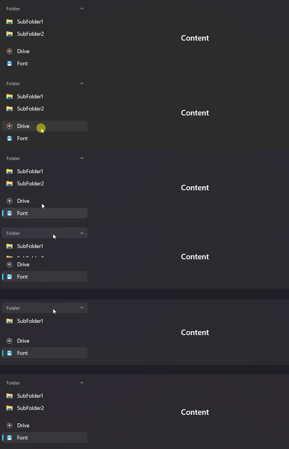
Demo
you can run demo and see this feature.