
Property
| Name |
|---|
| Items |
| DefaultActiveIndex |
| ExpandedFlex |
| CollapsedFlex |
| Gap |
| ReduceMotion |
| CardCornerRadius |
| TitleForeground |
| ScrimBrush |
| FocusBrush |
Related Types
| Name | Description |
|---|---|
| ExpandingCardItem | Item with Source (image uri string), Alt and Title. |
Example
xml
<dev:ExpandingCards DefaultActiveIndex="1" Height="360">
    <dev:ExpandingCardItem Title="Mountains" Alt="Snowy peaks" Source="ms-appx:///Assets/mountains.jpg" />
    <dev:ExpandingCardItem Title="Forest" Alt="Pine forest" Source="ms-appx:///Assets/forest.jpg" />
    <dev:ExpandingCardItem Title="Coast" Alt="Rocky coast" Source="ms-appx:///Assets/coast.jpg" />
</dev:ExpandingCards>
NOTE
Items is the content property. The active card expands when hovered (mouse and pen) or tapped, and returns to the last tapped or keyboard-selected card when the pointer leaves. Use the arrow keys, Home and End to change the active card.
WARNING
ExpandedFlex and CollapsedFlex are relative weights (defaults 5.4 and 1). ExpandedFlex should be greater than CollapsedFlex.
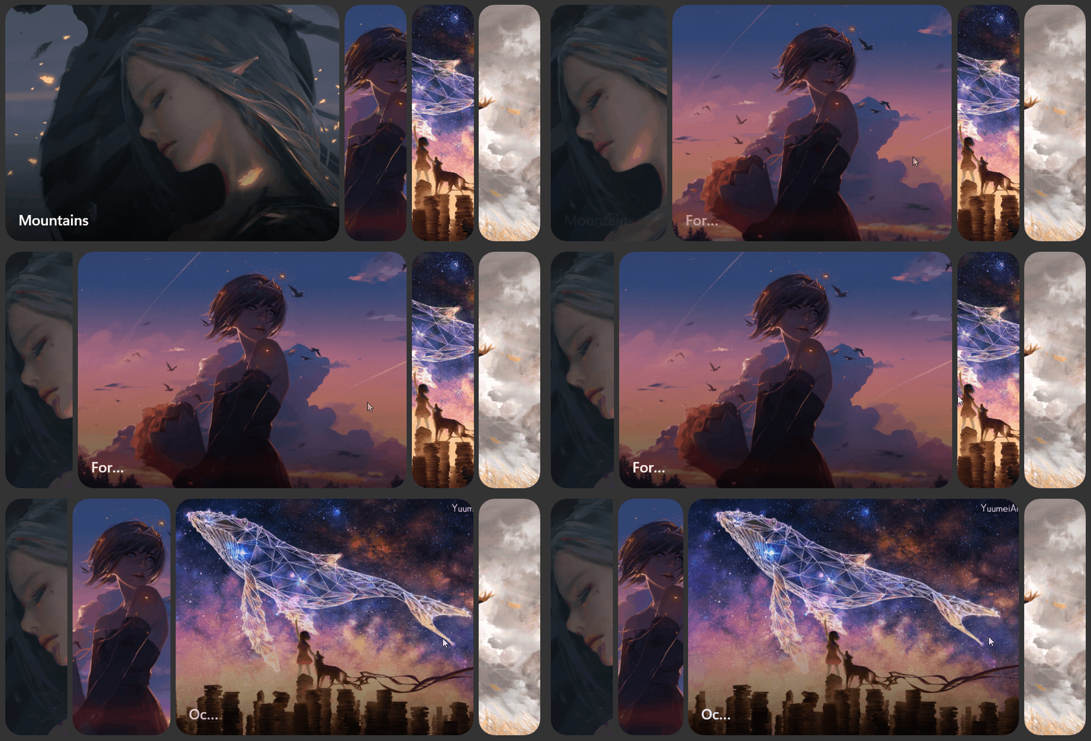
Demo
you can run demo and see this feature.