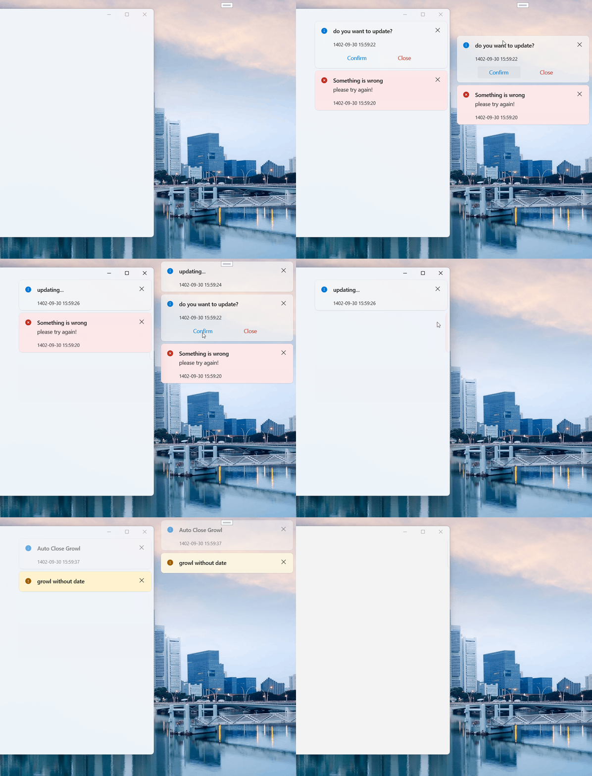
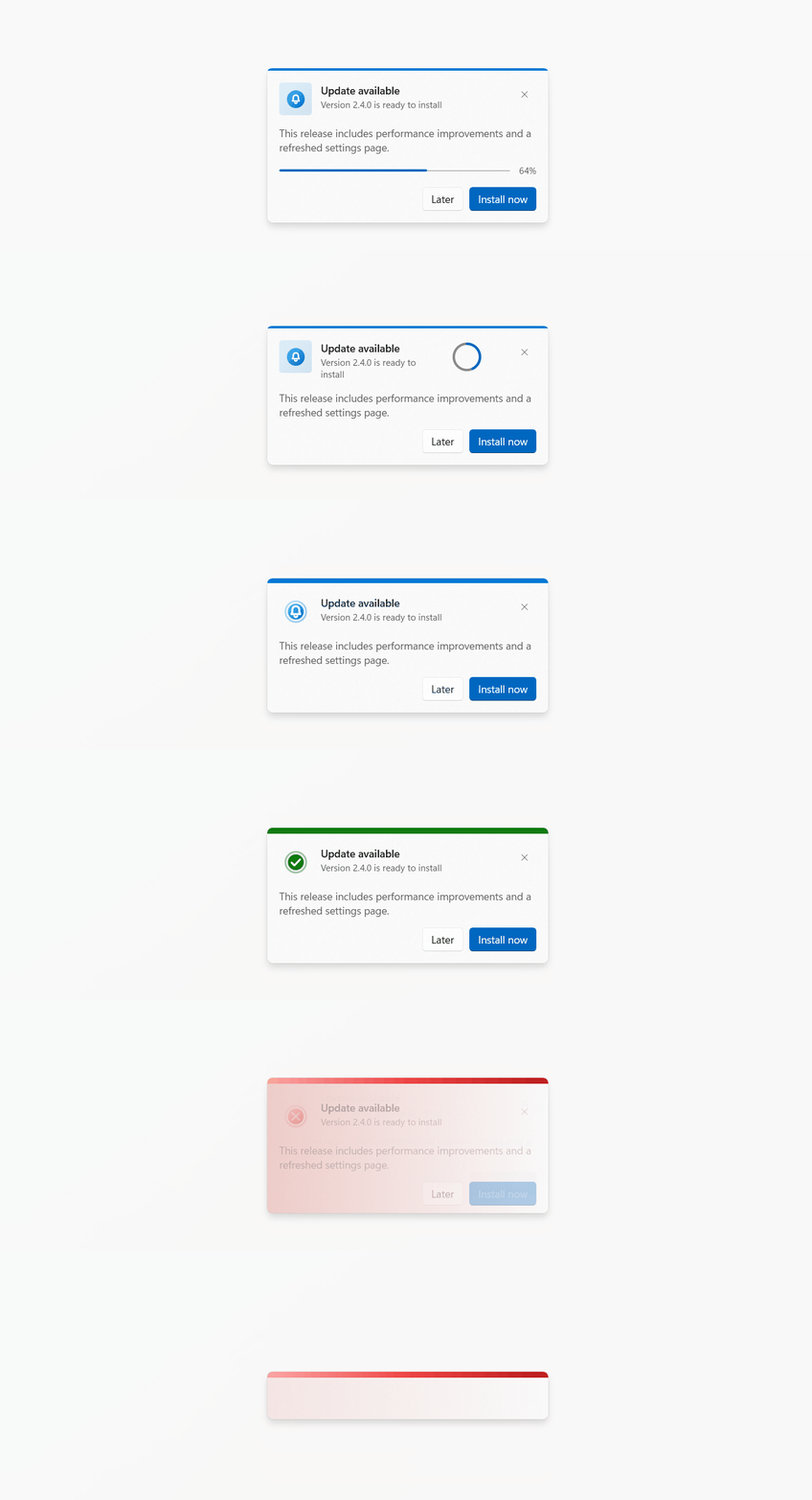
Growl
Growl shows notification cards in a host (in-app) or in transparent always-on-top windows (global, outside your app window). It supports severities, color styles, progress, countdown, stacking, animations, sounds and live updates through a handle.
Table of contents
- Concepts
- Quick start
- Setting up hosts
- Showing notifications
- GrowlOptions reference
- GrowlHandle
- GrowlCard reference
- GrowlHost reference
- Global (outside the app window) notifications
- Enums
- Animations
- Layout modes
- Sounds
- Recipes
- Styling and template parts
- Warnings and gotchas
- Source layout
Concepts
| Type | Role |
|---|---|
Growl | Static entry point. Finds a registered host and shows notifications in it. |
GrowlHost | Control that contains the cards. Has six panels, one per GrowlPosition. |
GrowlCard | The notification control itself. Can also be used standalone in XAML. |
GrowlOptions | Describes one notification. Passed to Show. |
GrowlHandle | Returned by Show. Lets you update, close, and await a notification. |
GrowlGlobal | Settings and entry point for notifications shown outside the app window. |
Quick start
1. Add a host as the last child of your root layout so it overlays everything:
<Page xmlns:dev="using:DevWinUI">
    <Grid>
        <Frame x:Name="ContentFrame" />
        <dev:GrowlHost HostKey="main" />
    </Grid>
</Page>
2. Show a notification:
Growl.ShowSuccess("Saved", "Your changes were saved.");The host registers itself when it loads. The first registered host is the default.
Setting up hosts
In XAML
<dev:GrowlHost
    HostKey="main"
    DefaultPosition="BottomRight"
    LayoutMode="Stacked"
    DefaultShowAnimation="Slide"
    DefaultCloseAnimation="Fade"
    MaxVisiblePerPosition="4" />
In code
Growl.Register(MainHost, "main");
Growl.Register(MainHost, "main", isDefault: true);
Growl.SetDefault(MainHost);
Growl.Unregister(MainHost);
Growl.Unregister("main");
Host registry API (Growl)
| Member | Description |
|---|---|
DefaultHost | The explicitly set default host, otherwise the first registered host, otherwise null. |
Register(host, key = null, isDefault = false) | Registers a host. Passing key sets host.HostKey. Registering a key already used by another host replaces that host's registration. |
Unregister(host) / Unregister(key) | Removes a host from the registry. |
SetDefault(host) | Registers the host and marks it as default. |
GetHost(key = null) | Host by key, or the default host when key is null. Returns null if not found. |
GetHost(XamlRoot) | Host that lives in the given XamlRoot. Useful in multi-window apps. |
Hosts auto-register on Loaded and auto-unregister on Unloaded. The registry holds weak references, so it never keeps a host alive.
Multiple windows
Each window needs its own host. Target a specific one with a key or a XamlRoot:
Growl.Show(options, hostKey: "settings-window");
Growl.GetHost(window.Content.XamlRoot)?.ShowInfo("Hello");
Showing notifications
Shortcut methods
Five severities, each with six overloads:
| Severity | Methods |
|---|---|
| Success | ShowSuccess |
| Warning | ShowWarning |
| Error | ShowError |
| Info | ShowInfo |
| Attention | ShowAttention |
Growl.ShowError(string title);
Growl.ShowError(string title, bool canClose, GrowlCardAutoClose autoClose);
Growl.ShowError(string title, string subTitle);
Growl.ShowError(string title, string subTitle, bool canClose, GrowlCardAutoClose autoClose);
Growl.ShowError(string title, string subTitle, object? message);
Growl.ShowError(string title, string subTitle, object? message, bool canClose, GrowlCardAutoClose autoClose);
Generic form:
Growl.Show(GrowlCardSeverity severity, string title, string subTitle, object? message, bool canClose, GrowlCardAutoClose autoClose);The autoClose parameter is a GrowlCardAutoClose. Overloads without it use GrowlCardAutoClose.None. A card auto-closes only if its own severity is included, so Growl.ShowError("Failed", true, GrowlCardAutoClose.Default) stays open while Growl.ShowSuccess("Saved", true, GrowlCardAutoClose.Default) closes. See Auto-close severity.
Shortcuts always use the default host and default option values. For another host, use GrowlHost.ShowX or Growl.Show(options, hostKey).
Method families
| Suffix | Example | Scope | Thread |
|---|---|---|---|
| none | ShowSuccess | In-app, default host | UI thread only |
Global | ShowSuccessGlobal | Outside the app window | UI thread only |
Async | ShowSuccessAsync | In-app | Any thread, returns Task<GrowlHandle> |
GlobalAsync | ShowSuccessGlobalAsync | Outside the app window | Any thread, returns Task<GrowlHandle> |
Other entry points:
GrowlHandle handle = Growl.Show(GrowlOptions options, string? hostKey = null);
Task<GrowlHandle> task = Growl.ShowAsync(GrowlOptions options, string? hostKey = null);
options.Scope = GrowlScope.Global routes to GrowlGlobal.Show.
Clearing
Growl.ClearAll();
Growl.ClearAll("main");
Growl.ClearAllHosts();
ClearAllHosts() clears every registered host and all global windows.
GrowlOptions reference
All shortcut methods build a GrowlOptions for you. Use it directly for full control.
Content
| Property | Type | Default | Description |
|---|---|---|---|
Title | string | "" | Main text. |
SubTitle | string | "" | Secondary text. |
Message | object? | null | Body content. Can be a string or any UI element. |
ActionContent | object? | null | Content shown in the action area, for example buttons. |
Severity | GrowlCardSeverity | Attention | Drives color, icon glyph and the default sound. |
Icon
| Property | Type | Default | Description |
|---|---|---|---|
Icon | IconElement? | null | Custom icon. null shows the severity glyph. |
IconStyle | GrowlCardIconStyle | Filled | Filled, Outline, or Ring. |
ShowIconContainer | bool | true | Shows the shape behind the icon. |
IconBackground | Brush? | null | Overrides the container background. |
IconForeground | Brush? | null | Overrides the glyph color. |
IconBorderBrush | Brush? | null | Overrides the container border. |
Appearance
| Property | Type | Default | Description |
|---|---|---|---|
ColorStyle | GrowlCardColorStyle? | null | null uses the host's DefaultColorStyle. |
DisplayMode | GrowlCardDisplayMode | Card | Card or full-width Banner. |
Width | double? | null | Fixed card width. |
ShowIndicator | bool | true | Shows the colored indicator bar. |
IndicatorPlacement | GrowlCardIndicatorPlacement | Top | Top, Left, Right, Bottom. |
ShowGradientBackground | bool | false | Severity-tinted gradient background. |
GradientIntensity | GrowlCardGradientIntensity | Normal | Normal or Light. |
ShowCloseButton | bool | true | Shows the close button. |
SentTimeVisibility | GrowlCardSentTimeVisibility | Hidden | Visible, Hidden, OnHover. |
SentAt | DateTimeOffset? | null | Time shown as "5m", "3h" and so on. null means creation time. |
Behavior
| Property | Type | Default | Description |
|---|---|---|---|
AutoClose | GrowlCardAutoClose | None | Severities that close after AutoCloseDuration. Flags, so values can be combined. See Auto-close severity. |
AutoCloseDuration | TimeSpan | 5 s | Auto-close delay. |
PauseAutoCloseOnPointerOver | bool | true | Pauses the countdown while the pointer is over the card. |
CloseOnInvoke | bool | false | Closes the card when it is tapped. |
Invoked | Action<GrowlHandle>? | null | Called when the card is tapped. |
Key | string? | null | De-duplication key. See Keys. |
Countdown
| Property | Type | Default | Description |
|---|---|---|---|
CountdownSeverity | GrowlCardCountdownSeverity | Default | Color source for the countdown bar. |
CountdownColorStyle | GrowlCardCountdownColorStyle | Default | Default follows the card's ColorStyle. |
Progress
| Property | Type | Default | Description |
|---|---|---|---|
ShowProgress | bool | false | Shows the progress element. |
ProgressType | GrowlCardProgressType | Bar | Bar or Ring. |
Progress | double | 0 | Current value. The maximum is 100 unless you change ProgressMaximum through Configure. |
IsProgressIndeterminate | bool | false | Indeterminate mode. Hides the percent text. |
Placement and sound
| Property | Type | Default | Description |
|---|---|---|---|
Scope | GrowlScope | InApp | InApp or Global. |
Position | GrowlPosition? | null | null uses the host's DefaultPosition (global: GrowlGlobal.DefaultPosition). |
Monitor | GrowlMonitor? | null | Global only. null uses GrowlGlobal.DefaultMonitor. |
ShowAnimation | GrowlShowAnimation? | null | null uses the host default. |
CloseAnimation | GrowlCloseAnimation? | null | null uses the host default. |
Sound | GrowlSound? | null | null uses the host's DefaultSound. |
SoundUri | Uri? | null | Custom sound file. When set and Sound is null, sound mode becomes Auto. |
Escape hatch
| Property | Type | Description |
|---|---|---|
Configure | Action<GrowlCard>? | Runs on the card after all options are applied. Use it for any GrowlCard property that has no matching option. |
Options not mapped to the card automatically (set them in Configure): CountdownPlacement, ShowCountdown, ShowCountdownText, ProgressMaximum, IsProgressError, IsProgressPaused, ShowIcon, ShowTitle, ShowSubTitle, ShowContent, ShowActionContent, ShowProgressText, IndicatorThickness, SentTimeFormatter.
Growl.Show(new GrowlOptions
{
    Title = "Upload",
    ShowProgress = true,
    ProgressType = GrowlCardProgressType.Ring,
    Configure = card =>
    {
        card.ProgressMaximum = 200;
        card.CountdownPlacement = GrowlCardCountdownPlacement.Top;
    }
});
GrowlHandle
Returned by every Show. It controls one notification after it has been shown.
| Member | Description |
|---|---|
Host | The GrowlHost showing the card. |
Card | The underlying GrowlCard. |
Position | Position the card was placed at. |
Key | The key from the options, or empty. |
IsShown | true while the card is on screen. false while queued behind MaxVisiblePerPosition. |
IsClosed | true after the card is closed. |
ClosedTask | Task that completes when the card closes. |
Closed | Event raised when the card closes. |
Invoked | Event raised when the card is tapped. |
Close() | Closes the card, with the close animation. |
WaitForCloseAsync(ct) | Awaits closing. Cancelable. |
Update(...) | Updates content. See below. |
Update(Action<GrowlCard>) | Runs any action on the card. |
Update
handle.Update(
    title: "Downloading",
    subTitle: "3 of 10 files",
    message: null,
    severity: GrowlCardSeverity.Info,
    progress: 30,
    isProgressIndeterminate: false,
    showProgress: true,
    restartAutoClose: false);
Only the arguments you pass are applied. Update and Close are safe from any thread: they marshal to the card's dispatcher and do nothing once the card is closed.
handle.Update(card =>
{
    card.IsProgressError = true;
    card.Severity = GrowlCardSeverity.Error;
});
GrowlCard reference
GrowlCard is a ContentControl. Content is the message body. All properties below are dependency properties unless marked otherwise.
Content and icon
| Property | Type | Default |
|---|---|---|
Title | string | "" |
SubTitle | string | "" |
Content | object? | null |
ActionContent | object? | null |
Icon | IconElement? | null |
IconStyle | GrowlCardIconStyle | Filled |
ShowIconContainer | bool | true |
IconBackground / IconForeground / IconBorderBrush | Brush? | null |
Visibility toggles
All default to true: ShowIcon, ShowTitle, ShowSubTitle, ShowContent, ShowCloseButton, ShowActionContent, ShowCountdown, ShowCountdownText, ShowProgressText, ShowIndicator.
ShowProgress and ShowGradientBackground default to false.
Style
| Property | Type | Default |
|---|---|---|
Severity | GrowlCardSeverity | Attention |
ColorStyle | GrowlCardColorStyle | Solid |
DisplayMode | GrowlCardDisplayMode | Card |
IndicatorPlacement | GrowlCardIndicatorPlacement | Top |
IndicatorThickness | double | 3 |
GradientIntensity | GrowlCardGradientIntensity | Normal |
Auto-close and countdown
| Property | Type | Default |
|---|---|---|
AutoClose | GrowlCardAutoClose | None |
AutoCloseDuration | TimeSpan | 5 s |
PauseAutoCloseOnPointerOver | bool | true |
CountdownSeverity | GrowlCardCountdownSeverity | Default |
CountdownColorStyle | GrowlCardCountdownColorStyle | Default |
CountdownPlacement | GrowlCardCountdownPlacement | Default |
A card auto-closes only when its current Severity is included in AutoClose. Changing Severity at runtime (for example through handle.Update) starts or stops the timer accordingly. The countdown bar shows when the card's severity is included in AutoClose and ShowCountdown is true; the remaining-time text also needs ShowCountdownText. With CountdownPlacement.Default the bar sits at the bottom, or at the top when the indicator is at the bottom.
Progress
| Property | Type | Default |
|---|---|---|
ShowProgress | bool | false |
ProgressType | GrowlCardProgressType | Bar |
Progress | double | 0 |
ProgressMaximum | double | 100 |
IsProgressIndeterminate | bool | false |
IsProgressError | bool | false |
IsProgressPaused | bool | false |
The percent text is Progress / ProgressMaximum, clamped to 0–100%.
Sent time
| Member | Type | Default | Description |
|---|---|---|---|
SentTimeVisibility | GrowlCardSentTimeVisibility | Hidden | Visible, Hidden, OnHover. |
SentAt | DateTimeOffset? | null | null means the card's creation time. |
SentTimeFormatter | Func<DateTimeOffset, string>? | null | Not a dependency property. Replaces the default text. |
Default text: now, 5m, 3h, 2d, 1w, 2mo, 1y. It refreshes every 30 seconds while the card is loaded.
State
| Member | Description |
|---|---|
IsOpen | true shows the card, false hides it (Visibility.Collapsed). Default true. Kept in sync with Visibility. |
CloseOnInvoke | Plain property, default false. Closes the card when tapped. |
Methods
| Method | Description |
|---|---|
Open() | Sets IsOpen = true. |
Close() | Closes the card, running the close animation if the host set one. Otherwise sets IsOpen = false. |
Events
| Event | Raised when |
|---|---|
Opened | IsOpen becomes true. |
Closed | IsOpen becomes false. |
Invoked | The card is tapped, but not when the tap lands on a button, TextBox, ToggleSwitch or Slider inside it. |
Severity change animation
Changing Severity (and other visual properties at the same time) cross-fades the old content with the new one, animates the height change and morphs the indicator color. If Severity is unchanged, updates apply immediately without that transition.
Standalone use
A GrowlCard works without a host:
<dev:GrowlCard
    x:Name="Card"
    Title="Update available"
    SubTitle="Version 2.0"
    Severity="Info"
    AutoClose="Default"
    Closed="Card_Closed">
    <dev:GrowlCard.ActionContent>
        <Button Content="Install" />
    </dev:GrowlCard.ActionContent>
</dev:GrowlCard>Card.Open();GrowlHost reference
Properties
| Property | Type | Default | Description |
|---|---|---|---|
HostKey | string | "" | Registry key. Changing it updates the registry. |
DefaultPosition | GrowlPosition | TopRight | Position used when options have none. |
Spacing | double | 8 | Gap between cards. |
MaxVisiblePerPosition | int | 0 | 0 means unlimited. Extra notifications queue and appear as others close. |
LayoutMode | GrowlHostLayoutMode | List | List or Stacked. |
NewestOnTop | bool | false | List mode ordering. |
StackPeekHeight | double | 14 | Visible strip of each stacked card behind the front one. |
StackVisibleDepth | int | 3 | Number of cards visible in a collapsed stack. |
StackExpandOnHover | bool | true | Expands the stack while the pointer is over it. |
DefaultShowAnimation | GrowlShowAnimation | Slide | |
DefaultCloseAnimation | GrowlCloseAnimation | Fade | |
AnimationDuration | TimeSpan | 300 ms | Base duration for all animations. |
DefaultColorStyle | GrowlCardColorStyle | Solid | Used when options have no ColorStyle. |
ScrollBarVisibility | ScrollBarVisibility | Auto | Vertical scrollbar of each position panel. |
DefaultSound | GrowlSound | None | Used when options have no Sound. |
Padding | Thickness | 24 | Space between the screen edge and the cards. |
Methods
| Method | Description |
|---|---|
Show(GrowlOptions) | Shows a notification. UI thread only. |
Show(severity, title, subTitle, message, canClose, autoClose) | Generic shortcut. |
ShowSuccess / ShowWarning / ShowError / ShowInfo / ShowAttention | Same six overloads as on Growl. |
Clear(GrowlPosition) | Closes all notifications at one position. |
ClearAll() | Closes all notifications in this host. |
Behavior
- Notifications shown before the host template is applied are queued and appear once it is.
- Notifications beyond
MaxVisiblePerPositionstay queued (IsShown == false) and appear in order. - In
Listmode, when a card closes, the cards after it slide into the gap. - Setting
LayoutModeorNewestOnTopre-orders existing cards.
Global notifications
Notifications outside your app window, for example when the app is minimized.
Growl.Show(new GrowlOptions
{
    Title = "Download complete",
    Severity = GrowlCardSeverity.Success,
    Scope = GrowlScope.Global,
    Monitor = GrowlMonitor.Cursor
});

Growl.ShowSuccessGlobal("Done", "Export finished.");
How it works: for each combination of monitor and position, GrowlGlobal creates one transparent, borderless, always-on-top window hosting a GrowlHost. The window resizes to fit its cards, sits in the monitor's work area, stays out of Alt+Tab, and closes itself when it has no notifications left.
GrowlGlobal settings
Settings apply to all open global windows immediately and to windows created later.
| Property | Type | Default |
|---|---|---|
DefaultPosition | GrowlPosition | BottomRight |
DefaultMonitor | GrowlMonitor | Primary |
ContentPadding | Thickness | 24 |
Spacing | double | 8 |
MaxVisiblePerPosition | int | 0 |
LayoutMode | GrowlHostLayoutMode | List |
NewestOnTop | bool | false |
StackPeekHeight | double | 14 |
StackVisibleDepth | int | 3 |
StackExpandOnHover | bool | true |
DefaultShowAnimation | GrowlShowAnimation | Slide |
DefaultCloseAnimation | GrowlCloseAnimation | Fade |
AnimationDuration | TimeSpan | 300 ms |
DefaultColorStyle | GrowlCardColorStyle | Solid |
ScrollBarVisibility | ScrollBarVisibility | Hidden |
DefaultSound | GrowlSound | None |
DispatcherQueue | DispatcherQueue? | set on first Show |
ConfigureHost | Action<GrowlHost>? | null |
ConfigureHost runs once for each newly created global window, after the settings above are applied.
GrowlGlobal.DefaultPosition = GrowlPosition.TopRight;
GrowlGlobal.DefaultMonitor = GrowlMonitor.Cursor;
GrowlGlobal.LayoutMode = GrowlHostLayoutMode.Stacked;
GrowlGlobal.ConfigureHost = host => host.MaxVisiblePerPosition = 3;
GrowlGlobal methods
| Method | Description |
|---|---|
Show(GrowlOptions) | Shows a global notification. UI thread only. |
ClearAll() | Closes all global notifications. |
Shutdown() | Closes every global window. |
Enums
| Enum | Values |
|---|---|
GrowlCardSeverity | Attention, Success, Warning, Error, Info |
GrowlCardAutoClose | None, Attention, Success, Warning, Error, Info, Default, All (flags) |
GrowlCardColorStyle | Solid, Gradient, Vivid, Rainbow |
GrowlCardDisplayMode | Card, Banner |
GrowlCardIconStyle | Filled, Outline, Ring |
GrowlCardIndicatorPlacement | Top, Left, Right, Bottom |
GrowlCardGradientIntensity | Normal, Light |
GrowlCardProgressType | Bar, Ring |
GrowlCardSentTimeVisibility | Visible, Hidden, OnHover |
GrowlCardCountdownSeverity | Default, FollowCardSeverity, Attention, Success, Warning, Error, Info |
GrowlCardCountdownColorStyle | Default, Solid, Gradient, Vivid, Rainbow |
GrowlCardCountdownPlacement | Default, Top, Bottom |
GrowlPosition | TopLeft, TopCenter, TopRight, BottomLeft, BottomCenter, BottomRight |
GrowlHostLayoutMode | List, Stacked |
GrowlShowAnimation | None, Fade, Slide, Push, Scale, Snap |
GrowlCloseAnimation | None, Fade, Slide, Push, Scale, Snap |
GrowlSound | None, Auto, Default, Information, Warning, Error, Question |
GrowlScope | InApp, Global |
GrowlMonitor | Primary, Cursor |
Color styles
- Solid: flat severity color.
- Gradient and Vivid: severity-specific gradients.
- Rainbow: multicolor indicator and icon, independent of severity.
The countdown bar follows the card's ColorStyle when CountdownColorStyle is Default. If you pick a specific CountdownSeverity together with a Rainbow style, the countdown falls back to Vivid.
Auto-close severity
GrowlCardAutoClose is a [Flags] enum that selects which severities auto-close.
| Value | Meaning |
|---|---|
None | No severity auto-closes. |
Attention, Success, Warning, Error, Info | A single severity. |
Default | Attention | Success | Info. |
All | Every severity. |
Combine values with |, for example GrowlCardAutoClose.Warning | GrowlCardAutoClose.Error. In XAML, use AutoClose="Success, Info".
Countdown severity
Default: neutral warning-colored bar from the template.FollowCardSeverity: matches the card's severity color.Attention,Success,Warning,Error,Info: fixed color.
Animations
DefaultShowAnimation and DefaultCloseAnimation on the host (or ShowAnimation / CloseAnimation per notification) accept:
| Value | Effect |
|---|---|
None | No animation. |
Fade | Opacity transition. |
Slide | Slides in from or out toward the host's edge. |
Push | Pushes in or out from the edge, a stronger move than Slide. |
Scale | Scales in or out. |
Snap | A layered disintegration effect built from a bitmap capture of the card. |
Notes:
- All durations derive from
AnimationDuration. Snapis the heaviest effect. It takes about 3×AnimationDurationto show and about 5× to close, and it renders the card into temporary layers. Prefer the lighter ones for frequent notifications.- In global windows the window stays alive slightly longer than the animation so nothing is clipped.
Layout modes
List
Cards are arranged in a column per position with Spacing between them. NewestOnTop controls ordering.
Stacked
Cards pile up like a deck. The front card is full size, the ones behind it are scaled down and peek out by StackPeekHeight, up to StackVisibleDepth cards. Hovering the stack expands it when StackExpandOnHover is true.
<dev:GrowlHost
    LayoutMode="Stacked"
    StackPeekHeight="14"
    StackVisibleDepth="3"
    StackExpandOnHover="True" />
Auto-close countdowns are suspended for cards hidden behind the front card of a collapsed stack. While the stack is expanded, cards with PauseAutoCloseOnPointerOver stay suspended.
In stacked mode, the insertion edge is fixed by the position: new cards go to the front for top positions and to the end for bottom positions. NewestOnTop has no effect.
Sounds
Growl.Show(new GrowlOptions
{
    Title = "Build failed",
    Severity = GrowlCardSeverity.Error,
    Sound = GrowlSound.Auto
});| Value | Behavior |
|---|---|
None | Silent. |
Auto | Chosen from severity: Info plays the information sound, Warning the exclamation sound, Error the error sound. Success and Attention play the standard beep. |
Default | Standard system beep. |
Information / Warning / Error / Question | The matching system sound. |
Set SoundUri to play your own file. A custom sound plays through MediaPlayer.
The sound plays when the card actually appears, not when it is queued. Playback failures are swallowed silently.
Recipes
Progress that updates from a background task
var handle = Growl.Show(new GrowlOptions
{
    Title = "Downloading",
    ShowProgress = true,
    Position = GrowlPosition.TopRight
});

await Task.Run(async () =>
{
    for (int i = 0; i <= 100; i += 10)
    {
        handle.Update(progress: i, subTitle: $"{i}%");
        await Task.Delay(200);
    }
});

handle.Update(title: "Done", severity: GrowlCardSeverity.Success, showProgress: false, restartAutoClose: true);
handle.Close();
Keys: update instead of duplicate
When Key is set and a card with that key is already open in the same host, the existing card is updated instead of a new one being created:
Growl.Show(new GrowlOptions { Key = "sync", Title = "Syncing…", ShowProgress = true, IsProgressIndeterminate = true });
Growl.Show(new GrowlOptions { Key = "sync", Title = "Sync complete", Severity = GrowlCardSeverity.Success });
Only Title, SubTitle, Message, Severity, Progress, IsProgressIndeterminate and ShowProgress are applied to the existing card, and its auto-close timer restarts. See the gotchas for side effects.
Action buttons
Growl.Show(new GrowlOptions
{
    Title = "File deleted",
    Severity = GrowlCardSeverity.Warning,
    ActionContent = new Button { Content = "Undo" }
});
Clicks on buttons inside the card do not trigger Invoked or CloseOnInvoke.
React to taps and closing
var handle = Growl.Show(new GrowlOptions
{
    Title = "New message",
    CloseOnInvoke = true,
    Invoked = h => OpenInbox()
});

handle.Closed += (_, _) => Log("closed");
await handle.WaitForCloseAsync();
Auto-close with a countdown
Growl.Show(new GrowlOptions
{
    Title = "Saved",
    Severity = GrowlCardSeverity.Success,
    AutoClose = GrowlCardAutoClose.Success,
    AutoCloseDuration = TimeSpan.FromSeconds(4),
    CountdownSeverity = GrowlCardCountdownSeverity.FollowCardSeverity
});
Auto-close by severity
Growl.Show(new GrowlOptions
{
    Title = "Saved",
    Severity = GrowlCardSeverity.Success,
    AutoClose = GrowlCardAutoClose.Default
});

Growl.Show(new GrowlOptions
{
    Title = "Connection lost",
    Severity = GrowlCardSeverity.Error,
    AutoClose = GrowlCardAutoClose.All & ~GrowlCardAutoClose.Error
});

Growl.Show(new GrowlOptions
{
    Title = "Low disk space",
    Severity = GrowlCardSeverity.Warning,
    AutoClose = GrowlCardAutoClose.Warning | GrowlCardAutoClose.Error
});
The second card stays open because Error is excluded. The first and third close after AutoCloseDuration.
Banner
Growl.Show(new GrowlOptions
{
    Title = "You are offline",
    DisplayMode = GrowlCardDisplayMode.Banner,
    Position = GrowlPosition.TopCenter,
    Severity = GrowlCardSeverity.Warning
});
Custom icon and colors
Growl.Show(new GrowlOptions
{
    Title = "Pinned",
    Icon = new FontIcon { Glyph = "\uE840" },
    IconStyle = GrowlCardIconStyle.Ring,
    ColorStyle = GrowlCardColorStyle.Rainbow
});
From a background thread
var handle = await Growl.ShowSuccessAsync("Imported", "42 items");
handle.Update(subTitle: "43 items");
Show on a specific host
Growl.Show(options, hostKey: "main");
Growl.GetHost("main")?.ShowInfo("Hello");
Configure the default host for the whole app
var host = Growl.GetHost("main")!;
host.LayoutMode = GrowlHostLayoutMode.Stacked;
host.DefaultColorStyle = GrowlCardColorStyle.Vivid;
host.DefaultSound = GrowlSound.Auto;
host.MaxVisiblePerPosition = 5;
Styling and template parts
GrowlHost parts
Six Panel parts, one per position: PART_TopLeft, PART_TopCenter, PART_TopRight, PART_BottomLeft, PART_BottomCenter, PART_BottomRight. The default template wraps each in a ScrollViewer. If you retemplate the host, keep these names; positions without a panel never show anything.
GrowlCard parts
| Part | Type |
|---|---|
PART_Root | Border |
PART_Surface | Grid |
PART_Snapshot | Image |
PART_ContentHost | Grid |
PART_IconPresenter | ContentPresenter |
PART_IconMark, PART_IconMarkOutline | Path |
PART_RingText | TextBlock |
PART_TitleBlock, PART_SubTitleBlock | TextBlock |
PART_CloseButton | Button |
PART_ContentPresenter | ContentPresenter |
PART_ProgressText | TextBlock |
PART_ActionPresenter | ContentPresenter |
PART_CountdownFill, PART_CountdownProbe | Border |
PART_CountdownText | TextBlock |
PART_SentText | TextBlock |
PART_IndicatorTop, PART_IndicatorLeft, PART_IndicatorRight, PART_IndicatorBottom | Border |
All parts are optional in code (null-checked), but the transition animation needs PART_Root, PART_Surface, PART_Snapshot and PART_ContentHost.
Visual states
The card drives its appearance entirely through visual states, so a custom template must define the states it relies on. State name families:
| Family | Names |
|---|---|
| Pointer | Normal, PointerOver |
| Display mode | CardMode, BannerMode |
| Section visibility | IconVisible / IconCollapsed, TitleVisible / TitleCollapsed, SubTitleVisible / SubTitleCollapsed, TextVisible / TextCollapsed, CloseButtonVisible / CloseButtonCollapsed, ContentVisible / ContentCollapsed, ActionVisible / ActionCollapsed |
| Gaps | ContentGapVisible / ContentGapCollapsed, ProgressGapVisible / ProgressGapCollapsed, ActionGapVisible / ActionGapCollapsed |
| Progress | ProgressBarVisible / ProgressBarCollapsed, RingVisible / RingCollapsed, ProgressTextVisible / ProgressTextCollapsed, RingTextVisible / RingTextCollapsed, RingNormal, RingError, RingPaused |
| Countdown | CountdownTextVisible / CountdownTextCollapsed, CountdownHidden, CountdownTop, CountdownBottom, CountdownFill… |
| Sent time | SentTimeVisible, SentTimeOnHoverHidden, SentTimeCollapsed |
| Indicator | IndicatorTop / Left / Right / Bottom, IndicatorHidden, IndicatorFill… |
| Gradient | Gradient{Severity}, GradientHidden, GradientIntensityNormal, GradientIntensityLight |
| Icon | DefaultIconVisible / DefaultIconHidden, IconColor…, IconBackgroundDefault / Custom, IconForeground…, IconBorderDefault / Custom, IconStyle{Filled,Outline,Ring}, IconContainerVisible / Hidden |
Per-severity brushes are read from PART_Surface.Resources using the key {Severity}IndicatorBrush (for example SuccessIndicatorBrush).
For the full list, read GrowlCard.xaml and the Update* methods in GrowlCard.VisualStates.cs.
Warnings and gotchas
Threading
Growl.Show,GrowlHost.ShowandGrowlGlobal.ShowthrowInvalidOperationExceptionwhen called off the UI thread. Use the...Asyncvariants from background threads.GrowlHandle.UpdateandCloseare thread-safe. Setting properties onhandle.Carddirectly is not; do it on the UI thread or throughhandle.Update(card => ...).- For
Scope = GlobalwithShowAsyncfrom a background thread, setGrowlGlobal.DispatcherQueueat startup. It is otherwise only captured on the first globalShowfrom the UI thread, and until then the async path falls back to an in-app host's dispatcher, which throws if none is registered.
Hosts
- If no host is registered, the in-app
Showmethods throwInvalidOperationException("No GrowlHost is registered"). A host registers onLoaded, so calls made in a page constructor, before the host has loaded, can fail. CallGrowl.Register(host, key)yourself in that case. The host queues cards until its template is applied. - Shortcut methods on
Growlalways use the default host. If you have several hosts, pass ahostKeyor useGrowl.GetHost(...). - Registering a
HostKeythat another host already uses silently replaces that other host's registration. GrowlHost.DefaultPositiondefaults toTopRight, butGrowlGlobal.DefaultPositiondefaults toBottomRight. Set both if you want consistent positions.- Place the host last in your root layout so it draws above other content. The area around cards (the position panels and their padding) can intercept pointer input.
Options and updates
- Key updates are partial and overwrite: updating by key also applies
Severity,ProgressandShowProgressfrom the new options, even if you left them at defaults. Re-showing with the same key and no progress info resets progress to 0 and hides the progress element. Title and subtitle are overwritten too, including with empty strings. Other options (icon, position, auto-close settings, and so on) are ignored for the existing card. - Several
GrowlCardproperties have no matchingGrowlOptionsentry. UseConfigure. - An
IconElementcan only have one parent. Create a new instance per notification; never share one icon object. - The host controls
Margin,RenderTransformandOpacityof the cards it contains (stacking and animations depend on them). Values you set for these inConfigurecan be overwritten, and a customRenderTransformis replaced unless it is aScaleTransform. - Setting
Visibilityon a card updatesIsOpen, and the other way around. PreferIsOpen,Open()andClose().
Lifecycle
Close()on a queued (not yet shown) handle removes it immediately without animation.ClearAllcloses queued handles first, then shown ones.handle.Closedis raised when the card closes, before the close animation's visual cleanup finishes for neighbors.ClosedTaskcompletes at the same time.- Auto-close is paused while the pointer is over the card only if
PauseAutoCloseOnPointerOveristrue. AutoClosedefaults toNone, so cards stay open unless you opt in. A card whose severity is not inAutoClosenever auto-closes, and shows no countdown even ifShowCountdownistrue.
Global windows
- Global notifications are real
Windowobjects (Windows App SDK). Creating one callsActivate(), which may take focus from the foreground app. Test the behavior in your scenario. - One window exists per monitor and position. Many positions across many monitors means many windows.
- Call
GrowlGlobal.Shutdown()when your app exits so no global window outlives your main window. GrowlMonitor.Cursorfalls back to the primary display when the cursor's display cannot be resolved.- Global windows read settings from
GrowlGlobal, not from any in-app host. Set animations, layout and sounds onGrowlGlobalfor them.
Performance
Snapanimations capture bitmaps and create temporary layers. Avoid them for high-frequency notifications.- Use
MaxVisiblePerPositionto keep the number of live cards bounded.
Source layout
| File | Contents |
|---|---|
Growl.cs | Host registry, Show, ShowAsync, ClearAll. |
Growl.Shortcuts.cs | All ShowSuccess, ShowErrorGlobal, ShowInfoAsync style overloads. |
GrowlHost.cs | Host show/dismiss API, template handling, card creation. |
GrowlHost.Properties.cs | Host dependency properties and their callbacks. |
GrowlHost.Layout.cs | Panels, queue pumping, stacking, reordering, shift animation. |
GrowlCard.cs | Constructor, events, open/close, template wiring. |
GrowlCard.Properties.cs | Card dependency properties and callbacks. |
GrowlCard.Transition.cs | Severity cross-fade and height transition. |
GrowlCard.VisualStates.cs | Visual state updates, icon glyphs, progress text. |
GrowlCard.Countdown.cs | Auto-close timer and countdown rendering. |
GrowlGlobal.cs, GrowlWindow.cs | Global notification windows and settings. |
GrowlHandle.cs, GrowlOptions.cs | Handle and options types. |
GrowlAnimator.cs | Show, close, shift and Snap animations. |
GrowlSoundPlayer.cs | System and custom sounds. |
GrowlEnums.cs, GrowlScope.cs | Enums. |
GrowlCardAutoClose.cs | Flags enum selecting which severities auto-close. |
Demo
you can run demo and see this feature.