
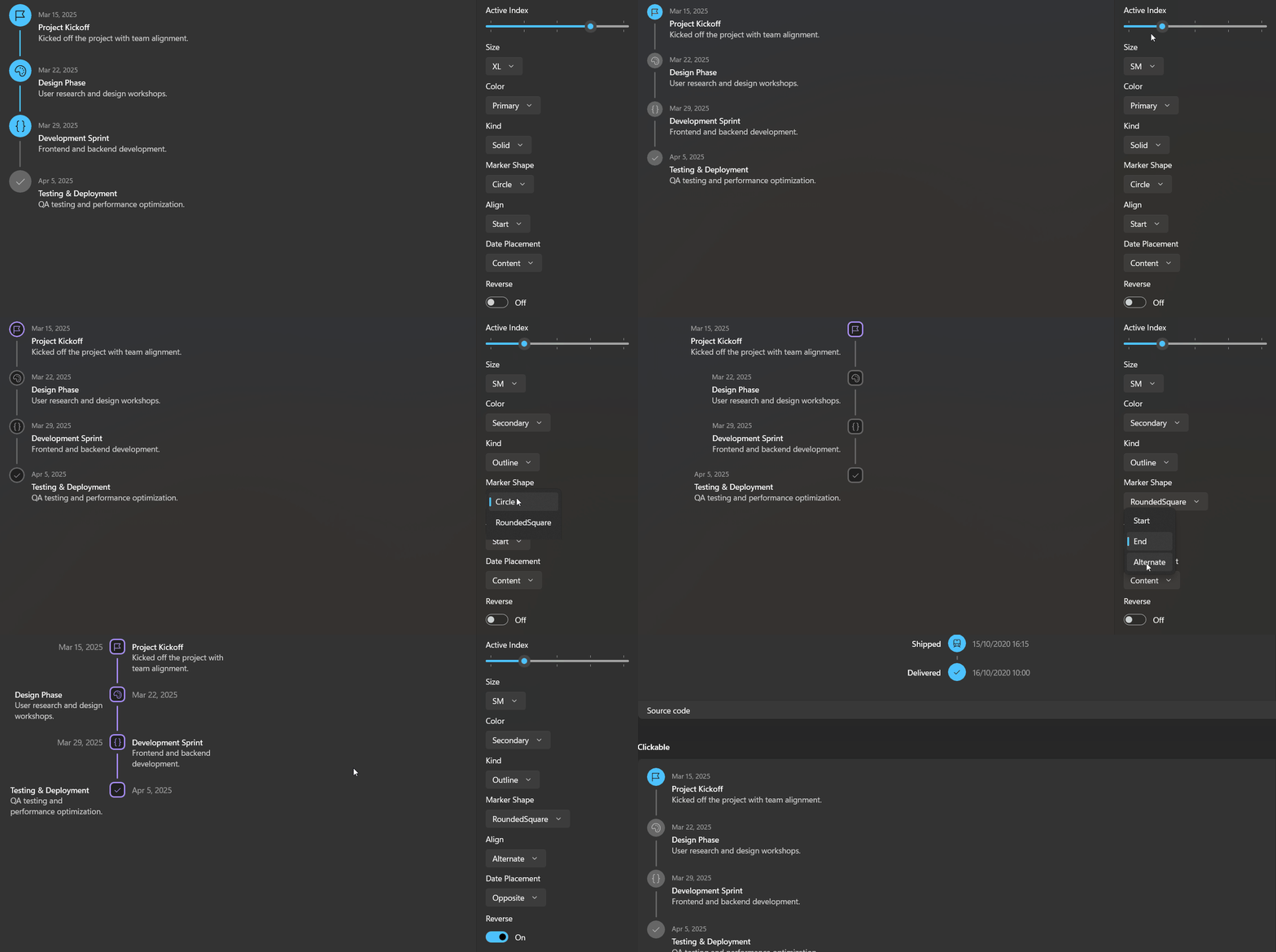
Timeline2 displays a sequence of events along a vertical or horizontal bar. It supports progress state (active and completed items), icon or avatar markers, alternating layouts, and fully templated content.
Basic Usage
Bind ItemsSource to a list of Timeline2Entry objects. Each entry provides a date, title, description, and an optional marker icon.
<dev:Timeline2 Width="384"
               ActiveIndex="2"
ItemsSource="{x:Bind Entries}" />public List<Timeline2Entry> Entries { get; } = new()
{
new() { Date = "Mar 15, 2025", Title = "Project Kickoff", Icon = "\uE7C1", Description = "Kicked off the project with team alignment." },
new() { Date = "Mar 22, 2025", Title = "Design Phase", Icon = "\uE790", Description = "User research and design workshops." },
new() { Date = "Mar 29, 2025", Title = "Development Sprint", Icon = "\uE943", Description = "Frontend and backend development." },
new() { Date = "Apr 5, 2025", Title = "Testing & Deployment", Icon = "\uE73E", Description = "QA testing and performance optimization." },
};Items before ActiveIndex are completed, the item at ActiveIndex is active, and the rest are pending. With the default ActiveIndex of -1, no progress state is shown.
Size, Color and Kind
<dev:Timeline2 Width="384"
               ActiveIndex="2"
               Color="Success"
               ItemsSource="{x:Bind Entries}"
               Size="XS" />

<dev:Timeline2 Width="384"
               ItemsSource="{x:Bind Entries}"
               Size="ThreeXS"
               Kind="Outline" />
Use MarkerShape to switch between Circle, RoundedSquare and Square. Set MarkerSize to override the size preset with an explicit value.
Alignment and Date Placement
Align controls which side of the bar the content sits on. DatePlacement moves the date out of the content and onto the opposite side of the bar.
<dev:Timeline2 ActiveIndex="1"
               Align="Alternate"
               DatePlacement="Opposite"
               ItemsSource="{x:Bind Entries}" />
Horizontal
<dev:Timeline2 ActiveIndex="2"
               ItemsSource="{x:Bind Entries}"
               Orientation="Horizontal" />

<dev:Timeline2 ActiveIndex="2"
               Align="Alternate"
               DatePlacement="Opposite"
               ItemsSource="{x:Bind Entries}"
               Orientation="Horizontal" />
A horizontal timeline divides the available width equally between its items.
Reverse
Reverse runs progress from the last item toward the first, so items after the active one are completed. It changes progress state only, not the order of the items.
<dev:Timeline2 Width="384"
               ActiveIndex="1"
               ItemsSource="{x:Bind Entries}"
               Reverse="True" />
Active Item by Value
Set Timeline2Entry.Value to give an entry a key, then select it with ActiveValue. ActiveIndex and ActiveValue stay in sync. For items that are not Timeline2Entry, the item index is used as the value.
<dev:Timeline2 ActiveValue="design" ItemsSource="{x:Bind Entries}" />Clickable Items
Enable IsItemClickEnabled to make items interactive. Items then respond to tap, Enter and Space, show a hand cursor, and raise ItemClick. Set ActivateOnClick to make the clicked item the active item.
<dev:Timeline2 Width="384"
               ActivateOnClick="True"
               ActiveValue="kickoff"
               IsItemClickEnabled="True"
               ItemClick="OnItemClick"
ItemsSource="{x:Bind Entries}" />private void OnItemClick(object sender, Timeline2ItemClickEventArgs e)
{
if (e.Item is Timeline2Entry entry)
{
SelectionText.Text = $"Selected: {entry.Title}";
}
}Custom Templates
When you bind your own data type, set ItemTemplate for the main content, and optionally MarkerTemplate and OppositeTemplate. Each template receives the data item as its DataContext.
<dev:Timeline2 Align="End" ItemsSource="{x:Bind Orders}">
    <dev:Timeline2.MarkerTemplate>
        <DataTemplate x:DataType="local:OrderEvent">
            <Grid Width="32" Height="32"
                  Background="{ThemeResource AccentFillColorDefaultBrush}"
                  CornerRadius="16">
                <FontIcon FontSize="14"
                          Foreground="{ThemeResource TextOnAccentFillColorPrimaryBrush}"
                          Glyph="{x:Bind Icon}" />
            </Grid>
        </DataTemplate>
    </dev:Timeline2.MarkerTemplate>
    <dev:Timeline2.OppositeTemplate>
        <DataTemplate x:DataType="local:OrderEvent">
            <TextBlock Text="{x:Bind Date}" />
        </DataTemplate>
    </dev:Timeline2.OppositeTemplate>
    <dev:Timeline2.ItemTemplate>
        <DataTemplate x:DataType="local:OrderEvent">
            <TextBlock FontWeight="Medium" Text="{x:Bind Status}" />
        </DataTemplate>
    </dev:Timeline2.ItemTemplate>
</dev:Timeline2>
For Timeline2Entry data, you can replace individual parts instead of the whole item with DateTemplate, TitleTemplate and DescriptionTemplate. These are ignored when ItemTemplate is set.
<dev:Timeline2 ItemsSource="{x:Bind Entries}" Size="XS">
    <dev:Timeline2.TitleTemplate>
        <DataTemplate x:DataType="dev:Timeline2Entry">
            <StackPanel Orientation="Horizontal" Spacing="6">
                <TextBlock Text="{x:Bind Title}" />
                <TextBlock FontWeight="Normal" Opacity="0.65" Text="{x:Bind Description}" />
            </StackPanel>
        </DataTemplate>
    </dev:Timeline2.TitleTemplate>
</dev:Timeline2>
Avatars
Set Timeline2Entry.Avatar or Timeline2Entry.AvatarUrl to show an image in the marker instead of an icon.
new Timeline2Entry { Title = "Jane joined", AvatarUrl = "https://example.com/jane.png" }Timeline2 Properties
| Property | Type | Default | Description |
|---|---|---|---|
ActiveIndex | int | -1 | Index of the active item. Items before it are completed. -1 means none. |
ActiveValue | object | null | Active item selected by Timeline2Entry.Value. |
ActivateOnClick | bool | false | Makes the clicked item the active item. |
Align | Timeline2Align | Start | Side of the bar the content sits on. |
BarSpacing | double | 12 | Distance between the bar and the content. |
Color | Timeline2Color | Primary | Default accent color. |
DatePlacement | Timeline2DatePlacement | Content | Shows the date with the content or on the opposite side. |
IsItemClickEnabled | bool | false | Makes items interactive and raises ItemClick. |
ItemSpacing | double | NaN | Distance between items. NaN derives it from the marker size. |
MarkerShape | Timeline2MarkerShape | Circle | Default marker shape. |
MarkerSize | double | NaN | Explicit marker size. NaN derives it from Size. |
Orientation | Orientation | Vertical | Direction of the bar. |
Reverse | bool | false | Runs progress from the last item toward the first. |
Size | Timeline2Size | MD | Marker size preset. |
Kind | Timeline2Kind | Solid | Filled or outlined markers. |
MarkerTemplate | DataTemplate | null | Replaces the default marker. |
OppositeTemplate | DataTemplate | null | Content on the opposite side of the bar. |
DateTemplate | DataTemplate | null | Template for the date of a Timeline2Entry. |
TitleTemplate | DataTemplate | null | Template for the title of a Timeline2Entry. |
DescriptionTemplate | DataTemplate | null | Template for the description of a Timeline2Entry. |
Timeline2 Events
| Event | Description |
|---|---|
ItemClick | Raised when an item is clicked or invoked while IsItemClickEnabled is true. Timeline2ItemClickEventArgs provides Item and Index. |
Timeline2Entry Properties
| Property | Type | Description |
|---|---|---|
Date | string | Date text. |
Title | string | Title text. |
Description | string | Description text. |
Icon | string | Segoe Fluent Icons glyph shown inside the marker. |
Avatar | ImageSource | Image shown in the marker instead of an icon. |
AvatarUrl | string | Absolute avatar URI. Ignored when Avatar is set. |
Value | object | Key used by ActiveValue. Falls back to the item index when null. |
Color | Timeline2Color? | Overrides Timeline2.Color for this entry. |
Shape | Timeline2MarkerShape? | Overrides Timeline2.MarkerShape for this entry. |
Tag | object | Arbitrary data associated with the entry. |
Enums
| Enum | Values |
|---|---|
Timeline2Size | ThreeXS, TwoXS, XS, SM, MD, LG, XL, TwoXL, ThreeXL |
Timeline2Color | Primary, Secondary, Success, Info, Warning, Error, Neutral |
Timeline2Align | Start, End, Alternate |
Timeline2Kind | Solid, Outline |
Timeline2DatePlacement | Content, Opposite |
Timeline2MarkerShape | Circle, RoundedSquare, Square |
Theming
Colors come from theme resources, so they follow light, dark and high contrast themes. Override any of these keys to restyle the control.
| Resource | Used for |
|---|---|
Timeline2PrimaryBrush | Primary color |
Timeline2SecondaryBrush | Secondary color |
Timeline2SuccessBrush | Success color |
Timeline2InfoBrush | Info color |
Timeline2WarningBrush | Warning color |
Timeline2ErrorBrush | Error color |
Timeline2NeutralBrush | Neutral color |
Timeline2OnColorBrush | Icons on accent-colored markers |
Timeline2OnNeutralBrush | Icons on neutral markers |
Timeline2ElevatedBrush | Pending markers and the uncompleted bar |
Timeline2SurfaceBrush | Marker background in the outline Kind |
Timeline2HighlightedBrush | Titles |
Timeline2MutedBrush | Descriptions |
Timeline2DimmedBrush | Dates and opposite content |
Accessibility
Each item is exposed to assistive technology as a list item named after the entry title, with its position in the set. When IsItemClickEnabled is true, items support the Invoke pattern and can be focused with the keyboard.
Demo
you can run demo and see this feature.