
Property
| Name |
|---|
| Image |
| ImageAlt |
| Cards |
| Tone |
| Size |
| Hint |
| EndLabel |
| Label |
| IsAnimationEnabled |
Enums
| ScrollSplitCardTone |
|---|
| Card |
| Inverse |
| Chart |
| ScrollSplitCardSize |
|---|
| Small |
| Medium |
| Large |
Related Types
| Name | Description |
|---|---|
| ScrollSplitCardItem | Record with Title, Description and Eyebrow. |
Example
xml
<dev:ScrollSplitCard
    Image="ms-appx:///Assets/cover.jpg"
    ImageAlt="Cover image"
    Cards="{x:Bind Cards}"
    Size="Medium" />
csharp
Cards = new List<ScrollSplitCardItem>
{
    new("Design", "Clean and simple.", "Step 1"),
    new("Build", "Fast and reliable.", "Step 2"),
    new("Ship", "Ready for production.", "Step 3")
};
NOTE
The image is split into one slice per card. Scrolling the control separates the slices, flips them over to reveal each card, and shows EndLabel at the end.
NOTE
When IsAnimationEnabled is false, scrolling is disabled and the cards are shown fully revealed.
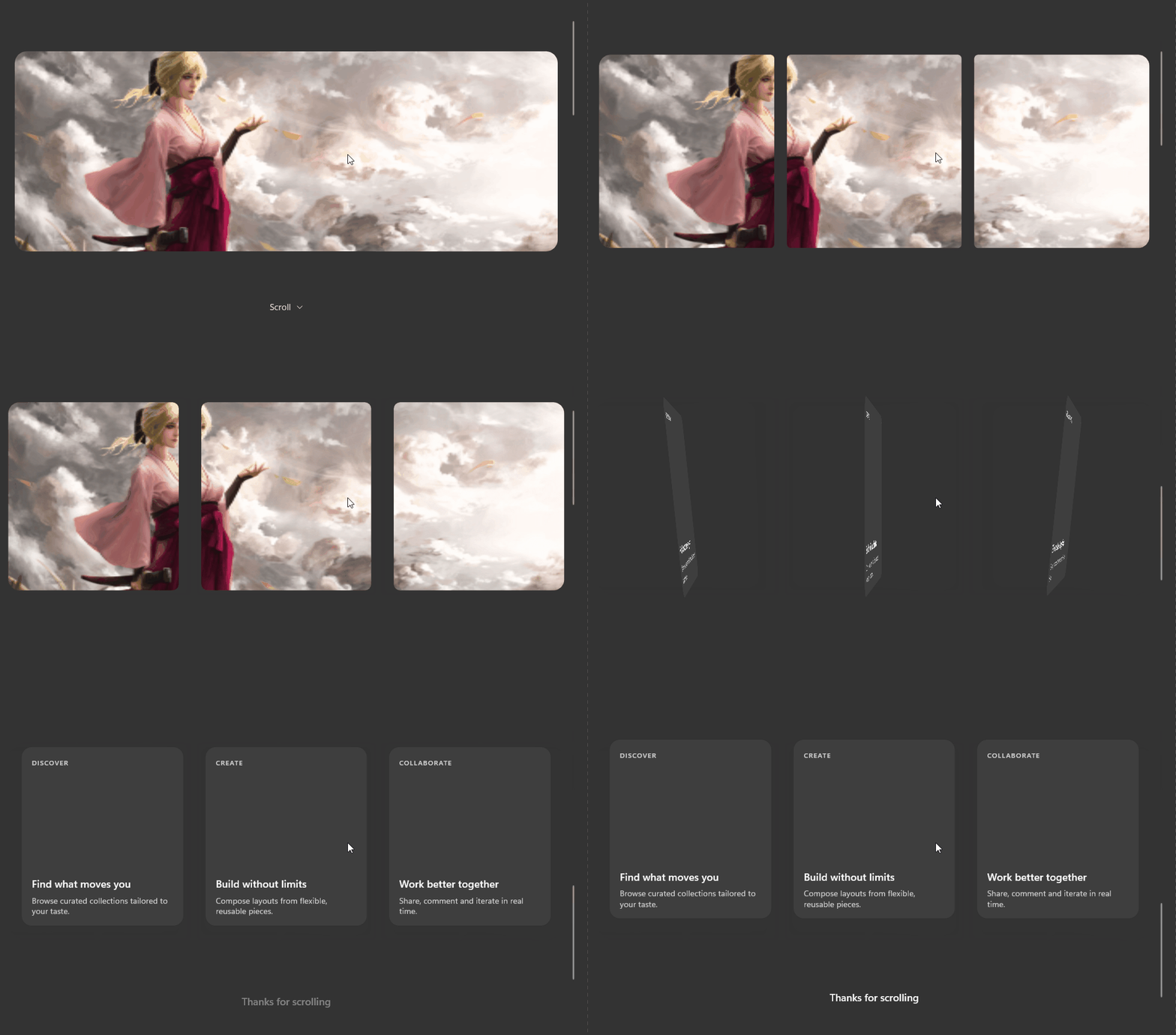
Demo
you can run demo and see this feature.