
A horizontal timeline control. The axis, stems, markers and labels are drawn with Win2D, and each entry's header and content are regular XAML elements, so they can hold any content and use data templates.
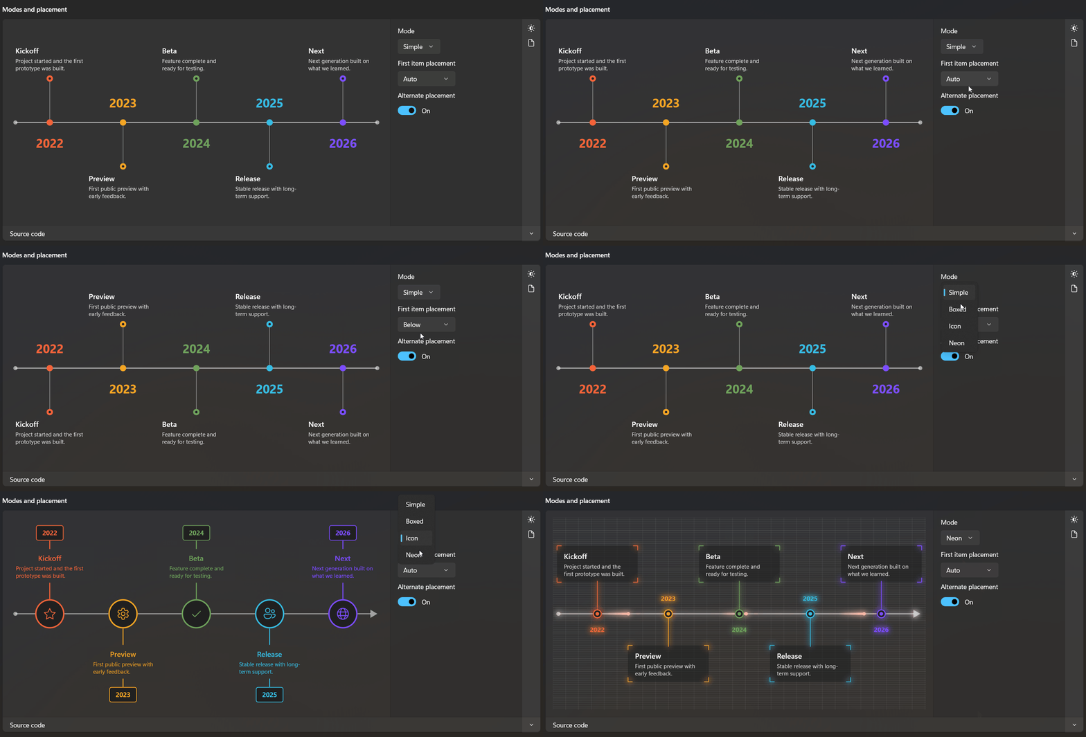
Four visual modes are available (Simple, Boxed, Icon, Neon), along with item status tracking and a set of optional sci-fi effects.
Quick start
<dev:Roadmap Mode="Simple">
    <dev:RoadmapItem Accent="#F4623A" Content="Project started." Header="Kickoff" Label="2022" />
    <dev:RoadmapItem Accent="#F5A623" Content="First public preview." Header="Preview" Label="2023" />
    <dev:RoadmapItem Accent="#35BDE4" Content="Stable release." Header="Release" Label="2024" />
</dev:Roadmap>
The control grows to fit its content. Place it in a ScrollViewer with HorizontalScrollBarVisibility="Auto" to scroll when it is wider than the available space.
Modes
| Mode | Description |
|---|---|
Simple | Small dots on a thin axis, ring end dots, plain text and large coloured labels on the opposite side. |
Boxed | Thick axis with an arrow, larger markers, bordered boxes and labels on the opposite side. |
Icon | Large ring markers with a glyph, coloured stems, centred text and a label badge on the same side. |
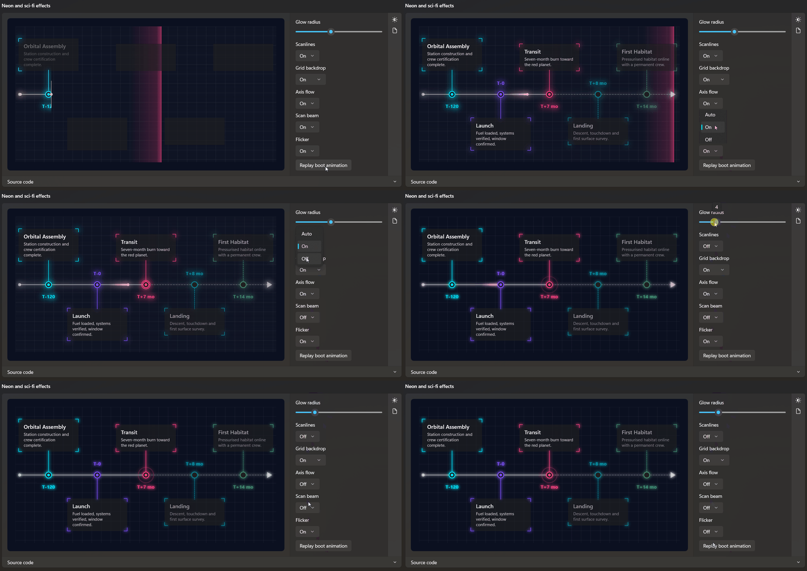
Neon | Glowing axis, stems and markers, translucent panels with corner brackets, scanlines, grid and axis flow. |
Default metrics per mode (all can be overridden with the sizing properties):
| Mode | ItemWidth | MarkerSize | AxisThickness | StemLength | Axis caps (start / end) |
|---|---|---|---|---|---|
Simple | 150 | 14 | 2.5 | 96 | Dot / Dot |
Boxed | 170 | 22 | 5 | 72 | None / Arrow |
Icon | 150 | 64 | 2 | 44 | Dot / Arrow |
Neon | 170 | 20 | 2 | 72 | Dot / Arrow |
Roadmap properties
Layout
| Property | Type | Default | Description |
|---|---|---|---|
Mode | RoadmapMode | Simple | Visual mode. |
FirstItemPlacement | RoadmapPlacement | Auto | Side of the axis for the first item. Auto means above. |
AlternatePlacement | bool | true | Alternate items above and below the axis. |
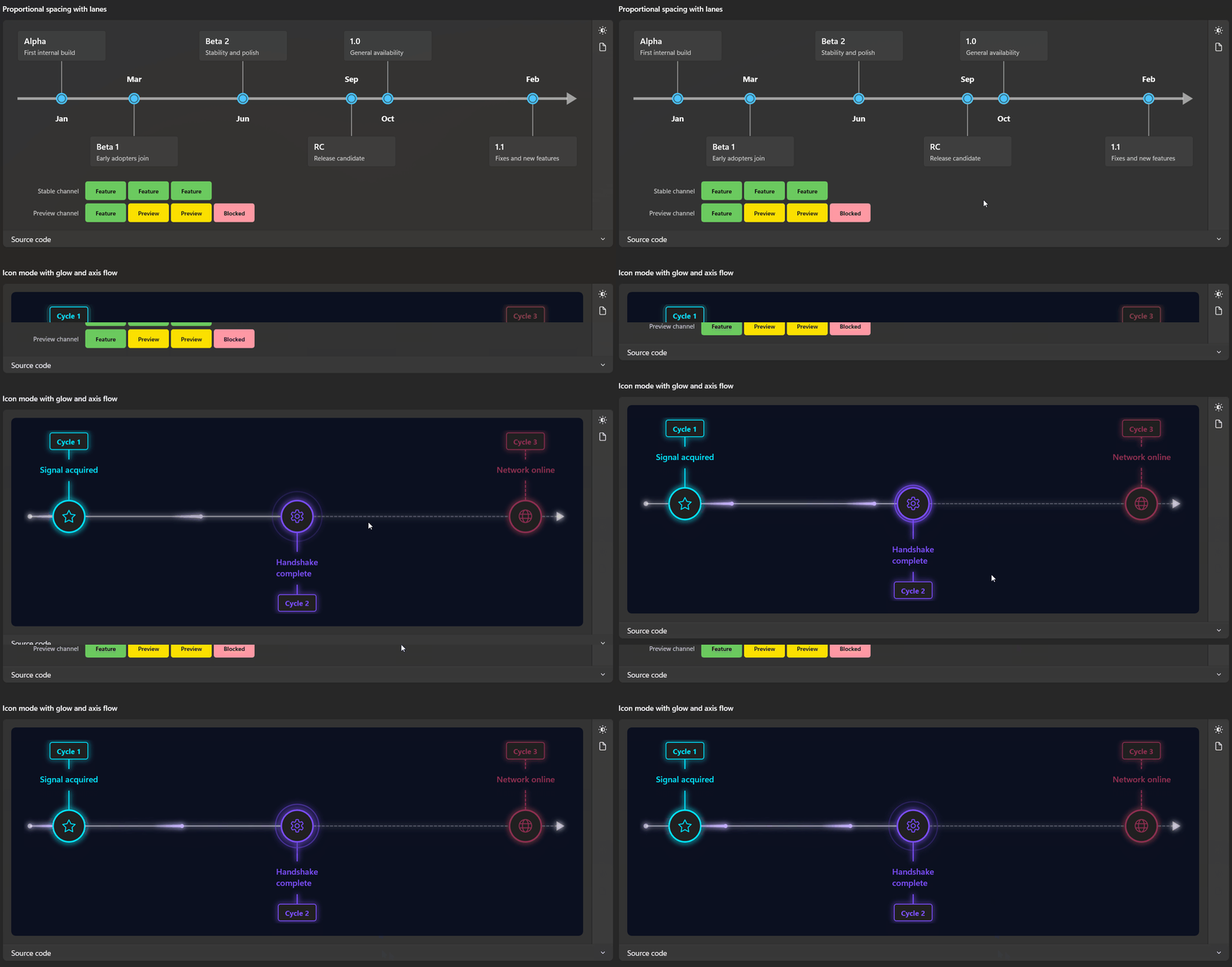
Distribution | RoadmapDistribution | Even | Even spaces items equally. Proportional positions them by RoadmapItem.Value. |
ItemWidth | double | NaN | Width of an item. NaN uses the mode default. |
MarkerSize | double | NaN | Diameter of the axis marker. |
AxisThickness | double | NaN | Axis line thickness. |
StemLength | double | NaN | Distance from the axis to the item content. |
StartCap / EndCap | RoadmapAxisCap | Auto | Auto, None, Dot or Arrow. |
Appearance
| Property | Type | Description |
|---|---|---|
AxisBrush | Brush | Axis colour. |
StemBrush | Brush | Stem colour (Simple and Boxed). |
MarkerFill | Brush | Fill used for hollow markers and badges. |
Foreground | Brush | Label colour in Boxed mode and the base colour of scanlines and grid. |
LabelFontSize | double | Label size. NaN uses the mode default. |
LabelFontWeight | FontWeight | Label weight. Defaults to Bold. |
IconFontFamily | FontFamily | Font used for Glyph. Defaults to the Fluent symbol font. |
Lanes
| Property | Type | Default | Description |
|---|---|---|---|
Lanes | ObservableCollection<RoadmapLane> | empty | Rows of chips shown beneath the axis. |
LaneHeaderWidth | double | 120 | Header width shared by all lanes that do not set their own HeaderWidth. |
LanesMargin | Thickness | 0,24,0,0 | Margin around the lanes. |
Effects
Each toggle accepts Auto, On or Off. Auto resolves from the current mode.
| Property | Type | Auto resolves to | Description |
|---|---|---|---|
GlowRadius | double | 6 in Neon, otherwise 0 | Blur radius of the glow. 0 disables it. Works in every mode. |
Scanlines | RoadmapToggle | On in Neon | Faint horizontal lines over the background. |
GridBackdrop | RoadmapToggle | On in Neon | Faint grid behind the axis. |
AxisFlow | RoadmapToggle | On in Neon | Light packets travelling along the completed part of the axis. |
ScanBeam | RoadmapToggle | Off | A vertical beam sweeping across the control. |
Flicker | RoadmapToggle | Off | Hologram-style brightness flicker. |
BootAnimation | RoadmapToggle | Off | Draws the axis from left to right on load and fades items in. |
BootDuration | double | 1.6 | Length of the boot animation in seconds. |
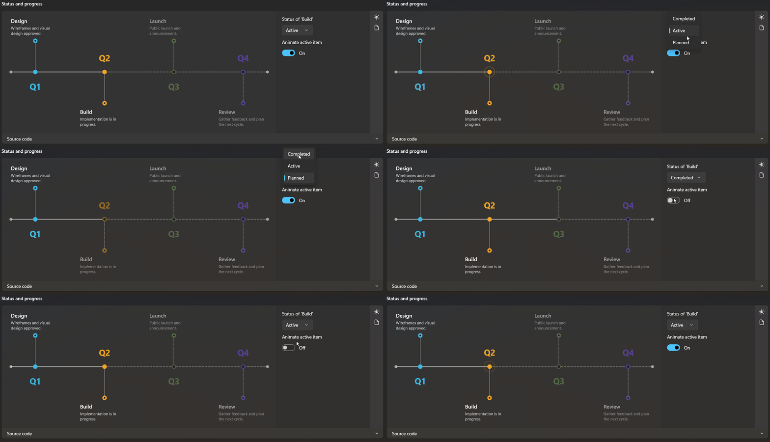
AnimateActive | bool | true | Pulse ring on the marker of an active item. |
Animations run on a timer only while at least one animated effect is active and the control is loaded.
Methods
| Method | Description |
|---|---|
PlayBootAnimation() | Replays the boot animation. |
RoadmapItem properties
RoadmapItem is a ContentControl. Content is shown under the Header.
| Property | Type | Default | Description |
|---|---|---|---|
Header | object | null | Heading shown above the content. |
HeaderTemplate | DataTemplate | null | Template for the header. |
HeaderFontSize | double | 16 | Header size. |
HeaderForeground | Brush | theme | Header colour. |
Label | string | empty | Text drawn on the opposite side of the axis (Simple, Boxed, Neon) or in the end badge (Icon). |
Glyph | string | empty | Icon-font glyph drawn inside the marker (Icon mode). |
Accent | Brush | theme accent | Colour of the marker, stem, end dot and label. |
Placement | RoadmapPlacement | Auto | Forces the item above or below the axis. |
Status | RoadmapItemStatus | Completed | Completed, Active or Planned. |
Value | double | NaN | Position on a numeric scale when Distribution is Proportional. |
Status
| Status | Appearance |
|---|---|
Completed | Normal rendering. |
Active | Pulse ring on the marker. The axis is solid up to this item. |
Planned | Dimmed text, hollow marker and dashed stem. The axis is dashed from the first planned item onwards when no item is active. |
Proportional distribution
With Distribution="Proportional", items are placed according to Value between the smallest and largest value. The control widens itself so items on the same side never overlap, so closely spaced values produce a wider timeline instead of colliding content. Items without a Value fall back to even spacing.
Lanes and segments
A RoadmapLane is a labelled row of RoadmapSegment chips. Set Tone to Neutral, Accent, Success, Caution or Critical.
<dev:Roadmap.Lanes>
    <dev:RoadmapLane Header="Stable channel">
        <dev:RoadmapSegment Content="Feature" Tone="Success" />
        <dev:RoadmapSegment Content="Preview" Tone="Caution" />
    </dev:RoadmapLane>
</dev:Roadmap.Lanes>| Property | Type | Description |
|---|---|---|
RoadmapLane.Header | object | Lane title. |
RoadmapLane.HeaderWidth | double | Header width. Overrides Roadmap.LaneHeaderWidth. |
RoadmapSegment.Tone | RoadmapSegmentTone | Chip colour. |
Neon example
<Border Padding="24" Background="#0B1020" RequestedTheme="Dark">
    <dev:Roadmap BootAnimation="On" Flicker="On" Mode="Neon" ScanBeam="On">
        <dev:RoadmapItem Accent="#00E5FF" Content="Station complete." Header="Assembly" Label="T-120" Status="Completed" />
        <dev:RoadmapItem Accent="#FF4081" Content="Seven-month burn." Header="Transit" Label="T+7 mo" Status="Active" />
        <dev:RoadmapItem Accent="#69F0AE" Content="Descent and touchdown." Header="Landing" Label="T+8 mo" Status="Planned" />
    </dev:Roadmap>
</Border>
Theming
Default colours come from theme resources defined in Themes/Roadmap.xaml and can be overridden in your own resource dictionaries.
| Resource | Used for |
|---|---|
RoadmapForegroundBrush | Roadmap foreground. |
RoadmapAxisBrush, RoadmapStemBrush | Axis and stems. |
RoadmapMarkerFillBrush | Hollow marker and badge fill. |
RoadmapAccentBrush | Default item accent. |
RoadmapItemForeground, RoadmapItemHeaderForeground | Item text. |
RoadmapItemBackground, RoadmapItemBorderBrush | Boxed item card. |
RoadmapLaneForeground | Lane header text. |
RoadmapSegmentBackground, RoadmapSegmentForeground | Neutral segment. |
RoadmapSegmentToneForeground | Text on toned segments. |
RoadmapSegment{Accent,Success,Caution,Critical}Background | Segment tones. |
All resources have a high-contrast variant.
NOTE
- Labels, markers and stems are drawn by Win2D and are not exposed to UI Automation.
HeaderandContentare regular XAML and remain accessible, so put important information there. - In
Neonmode, place the control on a dark background for the best result. SetRequestedTheme="Dark"on a parent so text uses light theme colours. - The Win2D layer reads colours from brushes. For gradient brushes it uses the first gradient stop, and for acrylic brushes it uses the fallback colour.
Demo
you can run demo and see this feature.