
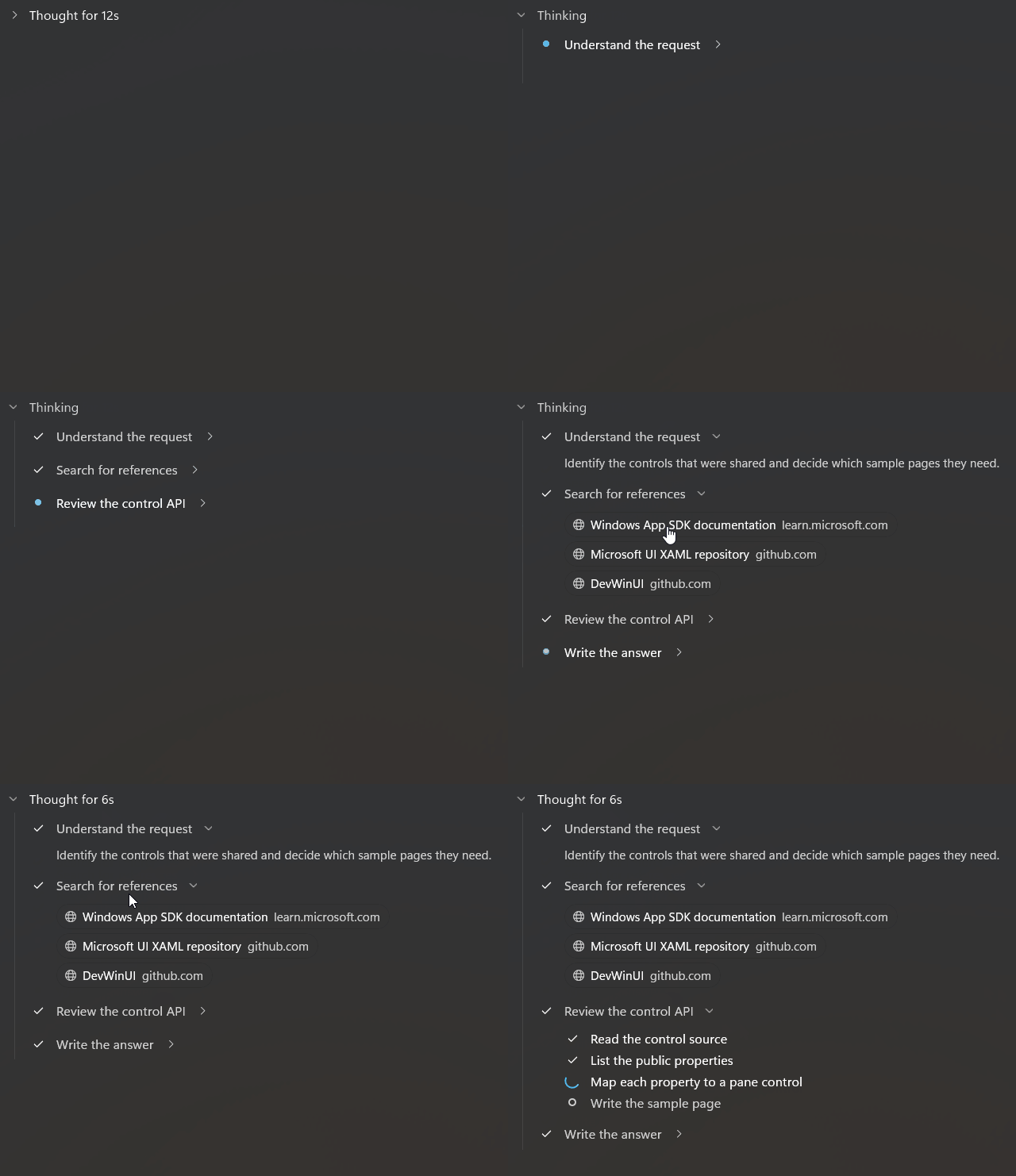
Reasoning
Property
| Name |
|---|
| Thinking |
| Duration |
| Open |
| DefaultOpen |
| Kind |
| ThinkingLabel |
| CompletedLabel |
| CompletedDurationLabel |
| Body |
| FormatDuration |
Events
| Name |
|---|
| OpenChanged |
Enums
| ReasoningKind |
|---|
| Outline |
| Card |
| Inline |
Related Types
| Name | Description |
|---|---|
| ReasoningOptions | Static class. IsAnimationEnabled (default true) turns all Reasoning animations on or off globally. |
| ReasoningSteps | Container for ReasoningStep items, usually used as the Body. |
| ReasoningRows | List of rows (steps, search results or coding files), usually used as the Body. |
Example
<dev:Reasoning Thinking="{x:Bind IsThinking, Mode=OneWay}" Duration="{x:Bind Seconds, Mode=OneWay}">
    <dev:ReasoningSteps>
        <dev:ReasoningStep Label="Reading the question" Status="Done" />
        <dev:ReasoningStep Label="Searching" Status="Active" />
    </dev:ReasoningSteps>
</dev:Reasoning>
NOTE
Body is the content property, so you can place the content directly inside the control.
NOTE
While Thinking is true the header shimmers and the control opens automatically. When it finishes, the header shows CompletedDurationLabel (default "Thought for {0}") if Duration is set, otherwise CompletedLabel. A collapsed control shows the active step as a preview while thinking.
NOTE
Open is nullable. When null, the control manages its own open state (starting from DefaultOpen). When set, it follows your value and only raises OpenChanged on user interaction.
WARNING
Duration is a double in seconds. The default is double.NaN (not set). Set FormatDuration to customize how the value is turned into text (the default shows "42s" or "1m 5s").
ReasoningSteps
Property
| Name |
|---|
| Steps |
| ActiveLabel |
Example
<dev:ReasoningSteps>
    <dev:ReasoningStep Label="Reading the question" Status="Done" />
    <dev:ReasoningStep Label="Writing the answer" Status="Active" />
    <dev:ReasoningStep Label="Reviewing" Status="Pending" />
</dev:ReasoningSteps>
NOTE
ReasoningSteps is an ItemsControl and Steps returns its items. ActiveLabel is read-only and returns the label of the last step whose status is Active. Reasoning uses it for the collapsed preview.
ReasoningStep
Property
| Name |
|---|
| Label |
| Status |
| Details |
Enums
| ReasoningStepStatus |
|---|
| Pending |
| Active |
| Done |
Example
<dev:ReasoningStep Label="Searching the web" Status="Done">
    <dev:ReasoningStepDetails Text="Looked up three sources." />
    <dev:ReasoningStepSources Sources="{x:Bind Sources}" />
</dev:ReasoningStep>
NOTE
ReasoningStep is an ItemsControl and Details returns its items. A step with details can be expanded, a step without details cannot. Steps with the Pending status are hidden until their status changes, and a step plays a small animation when it becomes Done.
ReasoningStepDetails
Property
| Name |
|---|
| Text |
Example
<dev:ReasoningStepDetails Text="Compared the two approaches." />NOTE
Text is the content property. Place it inside a ReasoningStep.
ReasoningStepImage
Property
| Name |
|---|
| Source |
| Alt |
Example
<dev:ReasoningStepImage Source="ms-appx:///Assets/chart.png" Alt="Revenue chart" />NOTE
Alt is used as the automation name of the image. Place it inside a ReasoningStep.
ReasoningStepSources
Property
| Name |
|---|
| Sources |
| ItemTemplate |
Related Types
| Name | Description |
|---|---|
| ReasoningSource | Record with Title and Url. Host returns the host name of the url. |
Example
<dev:ReasoningStepSources Sources="{x:Bind Sources}" />Sources = new List<ReasoningSource>
{
new("DevWinUI", new Uri("https://github.com/Ghost1372/DevWinUI"))
};NOTE
ItemTemplate defaults to the built-in source template. Place the control inside a ReasoningStep.
ReasoningRows
Property
| Name |
|---|
| Rows |
| Kind |
| Query |
| SelectedIndex |
Methods
| Name |
|---|
| Replay |
Events
| Name |
|---|
| SelectionChanged |
Enums
| RowsKind |
|---|
| Steps |
| Search |
| Coding |
| ReasoningStepStatus |
|---|
| Pending |
| Active |
| Done |
Related Types
| Name | Description |
|---|---|
| ReasoningRow | Record with Label, Status (default Done), Url, Added and Removed. |
| ReasoningRowItem | The control used to render each row. |
Example
<dev:ReasoningRows Kind="Search" Query="winui 3 controls" Rows="{x:Bind Rows}" />Rows = new List<ReasoningRow>
{
new("DevWinUI", ReasoningStepStatus.Done, new Uri("https://github.com/Ghost1372/DevWinUI")),
new("Windows App SDK", ReasoningStepStatus.Done, new Uri("https://learn.microsoft.com"))
};NOTE
Query is only shown when Kind is Search. In Search mode, a row with a Url opens it when clicked. In Coding mode a click sets SelectedIndex and Added / Removed are shown as +n / −n. SelectedIndex is -1 (no selection) by default.
NOTE
Replay plays the staggered entrance animation again. It runs automatically when the control loads and when a parent Reasoning opens.
ReasoningRowItem
Property
| Name |
|---|
| Row |
| Kind |
| IsSelected |
Example
<dev:ReasoningRowItem Kind="Coding" Row="{x:Bind Row}" IsSelected="True" />NOTE
ReasoningRowItem is normally created by ReasoningRows. Kind uses the RowsKind enum (Steps, Search, Coding).
CollapsibleGrid
Property
| Name |
|---|
| IsOpen |
Methods
| Name |
|---|
| Set |
Example
<dev:CollapsibleGrid x:Name="Panel">
    <TextBlock Text="Content" />
</dev:CollapsibleGrid>Panel.Set(open: true, animate: true);NOTE
CollapsibleGrid is a Grid that starts collapsed. IsOpen is read-only, use Set to expand or collapse it. The animation is skipped when ReasoningOptions.IsAnimationEnabled is false.
Demo
you can run demo and see this feature.