
A vertical step indicator for WinUI 3 with animated status markers, expandable sub-steps, and theme-aware brushes.
Usage
xml
<controls:ProgressStepper x:Name="Stepper" Align="Left" />csharp
Stepper.Steps = new ObservableCollection<ProgressStep>
{
    new() { Title = "Create account", Description = "Email and password" },
    new()
    {
        Title = "Set up profile",
        Children =
        {
            new ProgressStep { Title = "Upload avatar" },
            new ProgressStep { Title = "Write a short bio" }
        }
    },
    new() { Title = "Verify identity", Status = ProgressStepperStepStatus.Skipped },
    new() { Title = "All done" }
};

Stepper.Next();
Use ObservableCollection<ProgressStep> for Steps and Children so additions and removals are picked up. ProgressStep raises PropertyChanged, so edits to Title, Description and Status update the control.
ProgressStepper
| Member | Type | Default | Description |
|---|---|---|---|
Steps | IList<ProgressStep>? | null | Steps to display. |
Current | int | 0 | Index of the active step. A value equal to the step count means everything is completed. |
CurrentChild | int | 0 | Index of the active sub-step inside the active step. |
Align | ProgressStepperStepperAlign | Right | Right: rail on the right, labels on its left. Left: rail on the left, labels on its right. |
ShowStepLabel | bool | true | Shows the step label when a step has no Description. |
StepLabelFormat | string | "Step {0}" | Format of the step label; {0} is the 1-based step number. Set it to localize. |
TitleTemplate | DataTemplate? | null | Custom title content. The data context is the ProgressStepperStepStatus. |
DescriptionTemplate | DataTemplate? | null | Custom description content. The data context is the ProgressStepperStepStatus. |
Next() | bool | Advances through sub-steps, then steps. Returns false at the end. | |
Previous() | bool | Moves back through sub-steps, then steps. Returns false at the start. | |
Reset() | void | Returns to the first step. |
ProgressStep
| Property | Type | Description |
|---|---|---|
Id | string | Optional identifier for your own use. |
Title | string | Step title. |
Description | string? | Secondary text under the title. |
Status | ProgressStepperStepStatus? | Overrides the status derived from Current and CurrentChild. |
Children | IList<ProgressStep> | Sub-steps, shown while the step is in progress. |
ProgressStepperStepStatus: NotStarted, InProgress, Completed, Skipped.
Theming
Set any of these properties directly, or override the matching theme resource.
| Property | Theme resource |
|---|---|
PrimaryForeground | ProgressStepperPrimaryBrush |
SecondaryForeground | ProgressStepperSecondaryBrush |
TertiaryForeground | ProgressStepperTertiaryBrush |
RailBrush | ProgressStepperRailBrush |
SuccessBrush | ProgressStepperSuccessBrush |
SuccessFillBrush | ProgressStepperSuccessFillBrush |
AccentBrush | ProgressStepperAccentBrush |
AccentTrackBrush | ProgressStepperAccentTrackBrush |
Default, Light and HighContrast dictionaries are included.
Accessibility
Each step exposes its title and state (for example "Set up profile, in progress") to UI Automation, and the active step is reported as current.
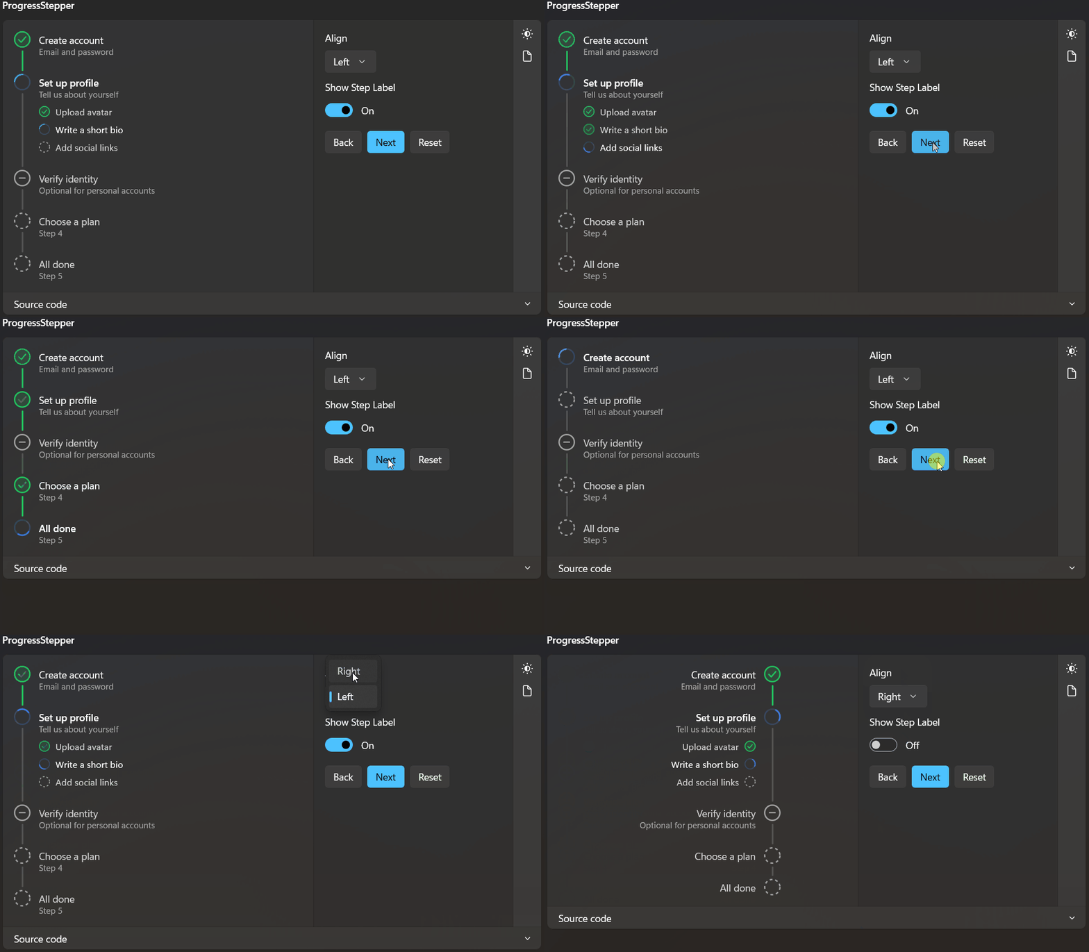
Demo
you can run demo and see this feature.