
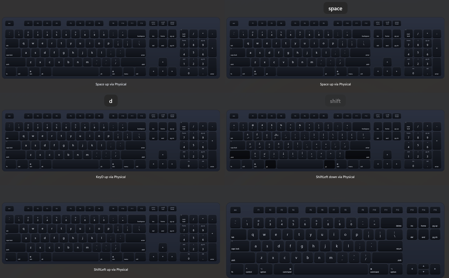
An on-screen keyboard that renders a full or tenkeyless layout, reacts to pointer input, mirrors physical key presses, and follows the active system keyboard layout.
<dev:MagicKeyboard Skin="System"
                   Layout="Ansi"
                   FormFactor="Full"
                   Platform="Windows"
                   IsPreviewVisible="True"
KeyEvent="Keyboard_KeyEvent" />private void Keyboard_KeyEvent(MagicKeyboard sender, MagicKeyEventArgs e)
{
Debug.WriteLine($"{e.Code} {(e.IsDown ? "down" : "up")} via {e.Source}");
}Properties
Appearance
| Property | Type | Default | Description |
|---|---|---|---|
Skin | MagicKeyboardSkin | Silver | Color skin. System picks LightSkin or DarkSkin from the current theme. |
LightSkin | MagicKeyboardSkin | Silver | Skin used in light theme when Skin is System. |
DarkSkin | MagicKeyboardSkin | Midnight | Skin used in dark theme when Skin is System. |
Layout | MagicKeyboardLayout | Ansi | Ansi or Iso key arrangement. |
FormFactor | MagicKeyboardFormFactor | Full | Full or Tenkeyless. |
Platform | MagicKeyboardPlatform | Windows | Windows or Mac legends and bottom row. |
LetterCase | MagicKeyboardKeyCase | Lower | Case of letter legends when Shift and Caps Lock are off. |
IsPreviewVisible | bool | false | Shows a floating preview of the last pressed key. |
Input
| Property | Type | Default | Description |
|---|---|---|---|
ModifierMode | MagicKeyboardKeyModifierMode | Sticky | Hold keeps a modifier down while pressed, Sticky releases it after the next key, Toggle stays latched until pressed again. |
LinkModifierKeys | bool | true | Shows left and right Shift, Control and Alt as pressed together. |
IsPhysicalKeyboardEnabled | bool | true | Mirrors physical key presses on the control. |
IsAlwaysActive | bool | false | Keeps listening to the physical keyboard when the control is scrolled out of view. |
FollowSystemKeyboardLayout | bool | true | Reads key legends from the active Windows keyboard layout and updates when it changes. |
SyncCapsLock | bool | true | Syncs the Caps Lock LED and letter case with the system state. |
SyncNumLock | bool | true | Syncs the Num Lock LED with the system state. |
Sound
| Property | Type | Default | Description |
|---|---|---|---|
IsSoundEnabled | bool | false | Plays key sounds. |
KeyDownSoundUri | string | "" | Absolute URI of the key down sound. |
KeyUpSoundUri | string | "" | Absolute URI of the key up sound. |
SoundVolume | double | 0.5 | Volume from 0 to 1. |
Events
| Event | Arguments | Description |
|---|---|---|
KeyEvent | MagicKeyEventArgs | Raised when a key is pressed or released. |
MagicKeyEventArgs exposes Code (a physical key code such as KeyA or ShiftLeft), Label, IsDown, Source (Pointer or Physical) and Modifiers (MagicKeyboardKeyModifiers).
Skins
| Skin | Description |
|---|---|
Silver | Light aluminum keys. |
SpaceGray | Dark keys on a gray chassis. |
Midnight | Near-black keys on a dark blue chassis. |
Custom | Colors come from the MagicKeyboardCustom* resources and follow the app theme. |
System | Uses LightSkin or DarkSkin by theme, and Custom in high contrast. |
Customizing colors
Every skin is a set of Color resources named MagicKeyboard{Skin}{Part}, for example MagicKeyboardSilverFaceTop. Override any of them in App.xaml, a page, or any parent element. SolidColorBrush values are accepted too.
| Part | Description |
|---|---|
ChassisTop, ChassisBottom | Gradient of the keyboard body. |
ChassisStroke | Body outline. |
FaceTop, FaceBottom | Gradient of a key face. |
PressTop, PressBottom | Key face gradient while pressed. |
Edge | Key side and bottom edge. |
Legend | Primary legend color. |
Dim | Secondary legend color. |
LedActive | Caps Lock and Num Lock LED when on. |
Custom is defined per theme, so it can be overridden in theme dictionaries:
<ResourceDictionary.ThemeDictionaries>
    <ResourceDictionary x:Key="Light">
        <Color x:Key="MagicKeyboardCustomFaceTop">#FFFFFF</Color>
        <Color x:Key="MagicKeyboardCustomLegend">#1B1B1B</Color>
    </ResourceDictionary>
    <ResourceDictionary x:Key="Dark">
        <Color x:Key="MagicKeyboardCustomFaceTop">#2B2B2B</Color>
        <Color x:Key="MagicKeyboardCustomLegend">#FFFFFF</Color>
    </ResourceDictionary>
</ResourceDictionary.ThemeDictionaries><dev:MagicKeyboard Skin="System" LightSkin="Silver" DarkSkin="Custom" />The preview popup uses MagicKeyboardPreviewBackground, MagicKeyboardPreviewBorderBrush and MagicKeyboardPreviewForeground.
NOTE
- Key legends follow the active keyboard layout only for character keys; function and modifier keys keep their fixed labels.
- Physical keys are captured at the window root, so the keyboard reflects typing anywhere in the window while it is loaded and visible.
- Pointer input and physical input raise the same
KeyEvent; useSourceto tell them apart.
Demo
you can run demo and see this feature.