
GlowingBorder inherits from ContentControl and is rendered with Win2D.
Property
| Name |
|---|
| Kind |
| GlowBrush1 |
| GlowBrush2 |
| GlowBrush3 |
| GlowBrush4 |
| Range |
| Spot |
| RingThickness |
| Radius |
| Duration |
| Glow |
| GlowSize |
| InnerGlow |
Enums
GlowingBorderKind
| Name |
|---|
| Cursor |
| Beam |
| Spin |
| Pulse |
Example
xml
<dev:GlowingBorder Kind="Cursor"
                   Radius="16"
                   Padding="24">
    <TextBlock Text="Move your cursor near the border" />
</dev:GlowingBorder>
xml
<dev:GlowingBorder Kind="Spin"
                   GlowBrush1="#FF4F8CFF"
                   GlowBrush2="#FFB05CFF"
                   GlowBrush3="#FFFF5C8A"
                   Glow="0.6"
                   GlowSize="12"
                   Duration="4">
    <TextBlock Text="Animated gradient border" />
</dev:GlowingBorder>
WARNING
Only SolidColorBrush is supported for GlowBrush1 to GlowBrush4. If none is set, Foreground is used. Beam, Spin and Pulse use at most the first three colors.
NOTE
Duration is in seconds. Range and Spot only affect Cursor. Glow and InnerGlow are from 0 to 1. Padding creates an outer frame around the content.
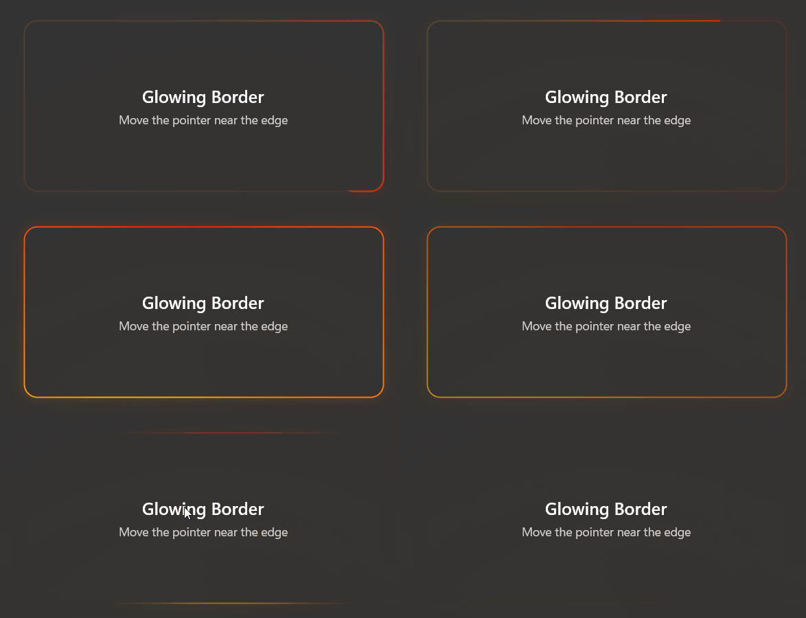
Demo
you can run demo and see this feature.