
Property
| Name |
|---|
| InvertedContent |
| Radius |
| Trigger |
| Pressed |
| Proximity |
| WakeMargin |
| ParticleShape |
| Count |
| Size |
| Variation |
| Drift |
| Spin |
| Crest |
| RestAlpha |
| ActiveAlpha |
| IdleSpeed |
| ActiveSpeed |
| FillDuration |
| InkColor |
| InvertColor |
Example
xml
<dev:FizzyCover Width="200" Height="56" Content="Hover me" />xml
<dev:FizzyCover Width="200"
                Height="56"
                Trigger="Toggle"
                ParticleShape="Circle"
                Count="120"
                Content="Toggle me" />
xml
<dev:FizzyCover Width="220" Height="56" Radius="12">
<dev:FizzyCover.Content>
<StackPanel Orientation="Horizontal" Spacing="8">
<FontIcon Glyph="" />
<TextBlock Text="Add item" />
</StackPanel>
</dev:FizzyCover.Content>
<dev:FizzyCover.InvertedContent>
<StackPanel Orientation="Horizontal" Spacing="8">
<FontIcon Glyph="" />
<TextBlock Text="Add item" />
</StackPanel>
</dev:FizzyCover.InvertedContent>
</dev:FizzyCover>NOTE
The fill is drawn in InkColor and the content that sits over the fill is drawn in InvertColor. If a color is left transparent (the default), it follows the current theme.
NOTE
When Content is text, the inverted copy is created automatically. For non-text content, set InvertedContent to get a correct inverted look inside the fill.
WARNING
FillDuration is in seconds. Proximity and WakeMargin are in pixels and control how far from the control the pointer wakes up the particles.
WARNING
Radius is clamped to half of the control height, so the default value of 999 gives a pill shape.
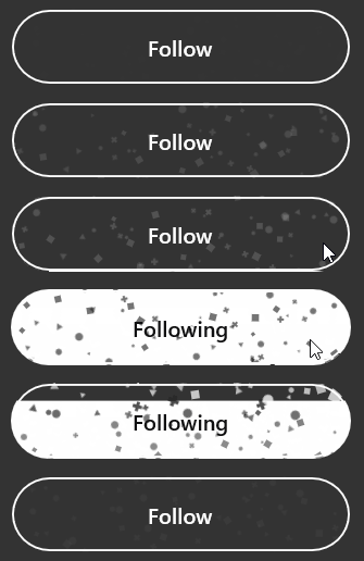
Demo
you can run demo and see this feature.