
FillButton inherits from Button.
Property
| Name |
|---|
| Tone |
| Size |
| Icon |
| NavigateUri |
Enums
FillButtonTone
| Name |
|---|
| Soft |
| Outline |
FillButtonSize
| Name |
|---|
| Small |
| Default |
| Large |
Example
xml
<dev:FillButton Content="Get started" />xml
<dev:FillButton Content="Documentation"
Tone="Outline"
Size="Large"
NavigateUri="https://github.com/Ghost1372/DevWinUI">
<dev:FillButton.Icon>
<FontIcon Glyph="" />
</dev:FillButton.Icon>
</dev:FillButton>WARNING
Content should be text, because it is presented twice: as the label and as its decorative copy on the fill.
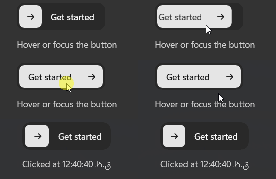
Demo
you can run demo and see this feature.