
Diagram is a WinUI control for displaying and editing workflows and node graphs. It supports nested workflows, explicit edges, typed input/output pins, automatic layered layout, a freeform canvas, selection, zooming and panning, a minimap, and connection conflict reporting.
Hierarchical workflow
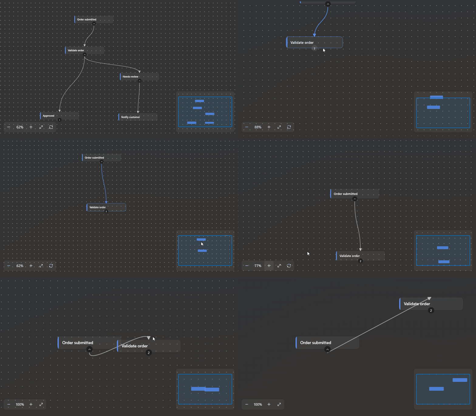
Use Root and nested DiagramNode children to describe a tree. Parent-to-child links are inferred, so no DiagramEdge elements are needed. With Collapsible="True", nodes with children can be expanded or collapsed.
<dev:Diagram Height="460"
			 Layout="Layered"
			 Direction="TopToBottom"
			 Collapsible="True"
			 AutoFit="True"
			 ShowMinimap="True">
	<dev:Diagram.Root>
		<dev:DiagramNode Id="submitted"
						 Title="Order submitted"
						 Subtitle="Online checkout">
			<dev:DiagramNode Id="validate"
							 Title="Validate order"
							 Caption="Check inventory and payment">
				<dev:DiagramNode Id="approved" Title="Approved">
					<dev:DiagramNode Id="ship" Title="Pack and ship" />
				</dev:DiagramNode>
				<dev:DiagramNode Id="review" Title="Needs review">
					<dev:DiagramNode Id="notify" Title="Notify customer" />
				</dev:DiagramNode>
			</dev:DiagramNode>
		</dev:DiagramNode>
	</dev:Diagram.Root>
</dev:Diagram>
Explicit nodes and edges
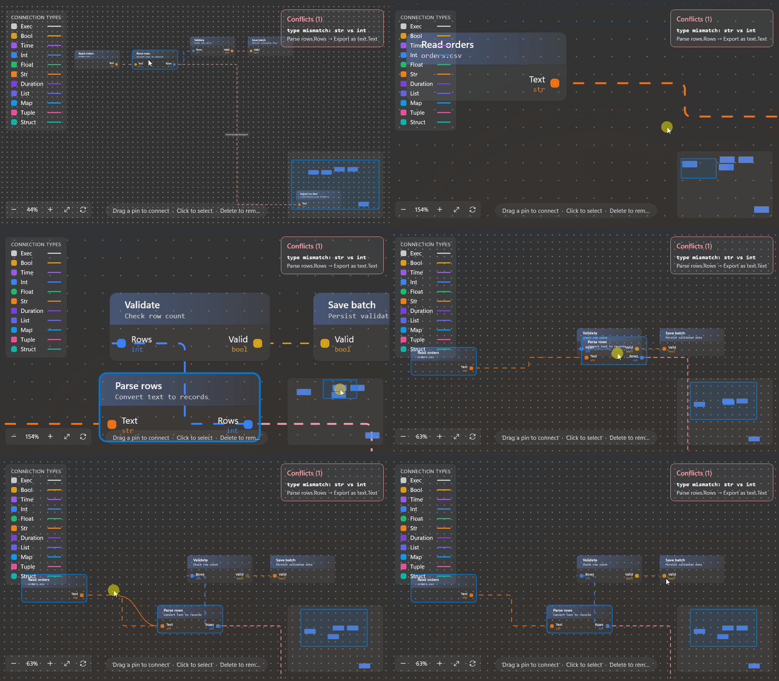
Use Nodes and Edges for a graph whose connections should be specified directly. From and To refer to node IDs. For pin-level links, set FromPin and ToPin to the corresponding pin's Id (or its Name if no ID is set).
<dev:Diagram Height="460"
			 Layout="Layered"
			 Direction="LeftToRight"
			 EdgeStyle="Orthogonal"
			 ShowPinTypes="True"
			 ShowConflicts="True">
	<dev:Diagram.Nodes>
		<dev:DiagramNode Id="read" Title="Read orders">
			<dev:DiagramNode.Outputs>
				<dev:DiagramPin Id="text" Name="Text" Type="str" />
			</dev:DiagramNode.Outputs>
		</dev:DiagramNode>
		<dev:DiagramNode Id="parse" Title="Parse rows">
			<dev:DiagramNode.Inputs>
				<dev:DiagramPin Id="text" Name="Text" Type="str" />
			</dev:DiagramNode.Inputs>
			<dev:DiagramNode.Outputs>
				<dev:DiagramPin Id="rows" Name="Rows" Type="int" />
			</dev:DiagramNode.Outputs>
		</dev:DiagramNode>
		<dev:DiagramNode Id="save" Title="Save batch">
			<dev:DiagramNode.Inputs>
				<dev:DiagramPin Id="rows" Name="Rows" Type="int" />
			</dev:DiagramNode.Inputs>
		</dev:DiagramNode>
	</dev:Diagram.Nodes>
	<dev:Diagram.Edges>
		<dev:DiagramEdge From="read" To="parse"
						 FromPin="text" ToPin="text" />
		<dev:DiagramEdge From="parse" To="save"
						 FromPin="rows" ToPin="rows"
						 Label="validated rows" />
	</dev:Diagram.Edges>
</dev:Diagram>
Nodes and edges can also be added or removed in code through the observable Nodes and Edges collections. Call Refresh() after editing a DiagramPin or DiagramEdge, or changing a node's Inputs, Outputs, or Conditions lists; those model properties and lists do not notify the control when they change.
Freeform board
Set Layout="Free" and give each node canvas coordinates. Edges remain explicit:
<dev:Diagram Height="460"
			 Layout="Free"
			 BackgroundPattern="Grid"
			 EdgeStyle="Bezier"
			 ShowMinimap="True">
	<dev:Diagram.Nodes>
		<dev:DiagramNode Id="design" Title="Design" CanvasX="80" CanvasY="90" />
		<dev:DiagramNode Id="build" Title="Build" CanvasX="360" CanvasY="210" />
		<dev:DiagramNode Id="test" Title="Test" CanvasX="650" CanvasY="90" />
	</dev:Diagram.Nodes>
	<dev:Diagram.Edges>
		<dev:DiagramEdge From="design" To="build" Label="handoff" />
		<dev:DiagramEdge From="build" To="test" IsDashed="True" />
	</dev:Diagram.Edges>
</dev:Diagram>
CanvasX and CanvasY are used by the free layout. In the default Manual layout, X is a horizontal position normalized from 0 to 1 and Row selects a row spaced by RowSpacing. Layered computes positions from the graph connections; Direction controls the flow direction in that layout.
Node and pin models
DiagramNode
| Property | Description |
|---|---|
Id | Node identifier. Keep IDs unique when edges refer to nodes. |
Title | Main display text. If unset, display text falls back to Data.ToString(), then Id. |
Caption | Secondary text under the title for nodes without pins. |
Subtitle | Secondary header text for nodes with pins. |
Data | Optional application data; available to a custom node template and used as a display-text fallback. |
Type | Optional application-defined node type, available to custom templates. |
Glyph | Optional Segoe Fluent Icons glyph shown in the header of a node with pins. |
Hue | Accent color used by the node; defaults to #5B8DEF. |
Children | Nested child nodes. A parent-child relationship creates an implicit edge. |
Inputs, Outputs | Pin collections. Nodes with pins use the built-in pin-node presentation. |
Conditions | Optional choice rows shown in the default presentation of nodes without pins. |
Expanded | Whether the node's children are visible when Collapsible is enabled. Defaults to true. |
Selectable | Whether the node can be selected. Defaults to true. |
W, H | Optional explicit node width and height. Non-positive values use the calculated/default size. |
Row, X | Position hints for Manual layout. X is normalized to the 0–1 range. |
CanvasX, CanvasY | Position for Free layout. |
For nodes without pins, NodeTemplate and NodeTemplateSelector can replace the default body. The template's content is the DiagramNode itself:
<dev:Diagram.NodeTemplate>
	<DataTemplate x:DataType="dev:DiagramNode">
		<Border Padding="12">
			<StackPanel Spacing="4">
				<TextBlock Text="{x:Bind Title}" />
				<TextBlock Text="{x:Bind Caption}" />
			</StackPanel>
		</Border>
	</DataTemplate>
</dev:Diagram.NodeTemplate>
DiagramCondition
Conditions appear as choice controls in the default body of a node without pins. Options is the list of strings shown in the selector; Value is initialized from the selected value and updated when the user changes it.
<dev:DiagramNode.Conditions>
	<dev:DiagramCondition Label="Route" Value="Standard" Placeholder="Select a route">
		<x:String>Standard</x:String>
		<x:String>Express</x:String>
	</dev:DiagramCondition>
</dev:DiagramNode.Conditions>
ConditionChanged reports changes made through the control.
DiagramPin
| Property | Description |
|---|---|
Id | Optional connection key; takes precedence over Name. |
Name | Pin name and fallback connection key. |
Label | Display label; falls back to Name, then Id. |
Type | Data type used for pin coloring and compatibility checking. The special type exec represents an execution pin. |
Pin connections require one output and one input. Type names are matched case-insensitively. An empty type, any, or * is treated as unconstrained. Generic types use square brackets (for example list[int]); var(0) denotes a type variable that can be unified across a node's connections.
Diagram.PinTypes is an observable collection of DiagramPinType values used to configure type colors, glyphs, and optional pin shapes. The control supplies defaults for exec, bool, time, int, float, str, duration, list, map, tuple, and struct. Use ShowPinTypes, ShowLegend, and PinShape to control the related UI.
Each DiagramPinType has a Name, Color, optional Shape, and optional Glyph. Its name matches a pin's resolved type; its shape and glyph override the diagram-wide PinShape for that type.
DiagramEdge
| Property | Description |
|---|---|
From, To | IDs of the source and destination nodes. |
FromPin, ToPin | Optional output/input pin keys for a typed connection. |
Label | Optional edge label. |
IsDashed | Draw the edge with a dashed line. |
IsAnimated | Animate the edge's dashed line. |
Conflict | Read-only diagnostic text set by the control when a typed connection is incompatible. |
If both pin keys resolve to pins, the edge participates in pin type checking. If either pin key is omitted or does not resolve, the edge is treated as a node-to-node connection.
Layout and interaction properties
The following are dependency properties and can be set in XAML or through bindings. Defaults are shown where useful.
| Property | Default | Description |
|---|---|---|
Root | null | Optional hierarchical root node. |
Layout | Manual | Manual, Layered, or Free. |
Direction | TopToBottom | Flow direction for Layered: TopToBottom, LeftToRight, BottomToTop, or RightToLeft. |
EdgeStyle | Bezier | Edge routing: Bezier, Orthogonal, or Straight. |
EdgeCornerRadius | 8 | Corner radius for orthogonal edges. |
ShowArrows | false | Draw direction arrows on edges. |
Collapsible | false | Enable expansion/collapse of hierarchical nodes. |
SelectionMode | None | None, Single, or Multiple. |
AllowDrag | true | Allow users to drag nodes. |
SnapToGrid | false | Snap dragged nodes to multiples of SnapSize (8 by default). |
AutoFit | false | Fit the content when the graph is first laid out or its layout changes. |
ShowControls | true | Show the built-in zoom, fit, and arrange controls. The arrange control is available for Layered layout. |
ShowMinimap | true | Show the minimap. |
BackgroundPattern | Dots | Dots, Grid, None, Cross, Lines, or Diamonds. |
RowSpacing | 150 | Vertical spacing for rows in Manual layout. |
LevelSpacing | 56 | Spacing between layers in Layered layout. |
SiblingSpacing | 32 | Spacing between sibling nodes in Layered layout. |
DefaultNodeWidth | 220 | Width used when a node does not specify W. |
WorldWidth | 0 | Optional world width used to calculate Manual layout positions; zero uses the control width. |
MinZoom, MaxZoom | 0.2, 2.5 | Limits for interactive zooming. |
EnableCulling | true | Create only the nodes and edges near the visible viewport. |
CullMargin | 400 | Extra world-space margin around the viewport for culling. |
HighlightText | empty | Highlight nodes whose title, caption, or data string contains this text. |
NodeTemplate | null | Data template for nodes without pins. |
NodeTemplateSelector | null | Select a template for nodes without pins; falls back to NodeTemplate. |
Connections, panels, and appearance
| Property | Default | Description |
|---|---|---|
AllowConnect | true | Allow users to connect output pins to input pins by dragging. |
AllowConflictingConnections | false | Allow interactive connections that fail type compatibility checks. |
AllowDelete | true | Enable deletion of selected nodes and edges. |
ShowConflicts | true | Show the built-in panel when typed edge conflicts are detected. |
ShowLegend | false | Show the connection-type legend. |
ShowHint | false | Show the instructional hint panel. |
HintText | Built-in hint | Text shown when ShowHint is enabled. |
ShowNodeIds | true | Show shortened node IDs in pin-node headers when no subtitle is provided. |
ShowPinTypes | true | Show data types next to pins. |
PinShape | Square | Default pin shape; individual DiagramPinType definitions can override it. |
AnimateEdges | false | Animate eligible edges. Individual edges can also set IsAnimated. |
ColorEdgesByType | true | Color typed edges by their resolved pin type. |
ConflictBrush | Theme brush | Brush used for conflicts and the conflict panel. |
BackgroundSpacing | 24 | Spacing between background pattern cells. |
PatternSize, PatternOpacity | Automatic | Mark size and opacity; NaN selects values based on the background pattern. |
PatternThickness | 1 | Stroke thickness for line-based background patterns. |
MajorEvery | 0 | Set a value greater than one to draw major pattern lines/marks periodically. |
BackgroundScalesWithZoom | true | Scale background pattern spacing with zoom. |
PatternBrush | Theme brush | Brush for the background pattern. |
ConnectorBrush | Theme brush | Default brush for edges. |
NodeBackground, NodeBorderBrush, NodeCaptionForeground | Theme brushes | Default node fill, border, and secondary text brushes. |
SelectedNodeBackground, SelectedNodeBorderBrush | Theme brushes | Selected-node fill and border. |
TogglerBackground, TogglerBorderBrush, TogglerForeground | Theme brushes | Appearance of the expand/collapse button. |
ViewportStroke, ViewportFill | Theme brushes | Minimap viewport outline and fill. |
ControlsPlacement, MinimapPlacement, HintPlacement, LegendPlacement, ConflictsPlacement | See below | Place each built-in panel. |
Panel placements use DiagramPanelPlacement: TopLeft, TopCenter, TopRight, BottomLeft, BottomCenter, or BottomRight. Defaults are BottomLeft for controls, BottomRight for the minimap, BottomCenter for the hint, TopLeft for the legend, and TopRight for conflicts.
Brush defaults come from the control's theme style. Override them directly on Diagram to customize its appearance.
Selection, editing, and view controls
- Click a node to select it when
SelectionModeis notNone.Multipleallows multiple selected nodes. - Drag a node to move it when
AllowDragis enabled. WithSnapToGrid, its position snaps toSnapSizeincrements. - Drag from an output pin to an input pin to request a connection. Pin direction and types are checked before the connection is committed.
- Pan by dragging the empty canvas with the left button or by dragging with the middle button. Use the mouse wheel to pan; hold
Shiftto pan horizontally orControlto zoom at the pointer. - Press
Deleteto remove selected nodes/edges whenAllowDeleteis enabled. PressEscapeto cancel a pin drag or clear the selected edge. - The built-in controls and public methods provide zoom, fit, reset, and arrange operations.
Useful public members include:
| Member | Description |
|---|---|
SelectedNodes, SelectedEdge | Current node selection and selected edge. |
Conflicts | Observable collection of detected typed-edge conflicts. |
Zoom, LoadedNodeCount | Current zoom and number of node visuals currently attached to the control. |
Refresh() | Rebuild the graph after model changes not observed by the control. |
ArrangeAll() | Recompute positions for the current layout. |
ExpandAll(), CollapseAll() | Expand or collapse all nodes. |
ClearSelection(), SelectEdge(edge) | Change selection. |
DeleteSelected(), RemoveNode(node) | Remove selected items or a node and its connected edges. |
ZoomBy(factor), FitToContent(margin), ResetView() | Change the viewport. |
CenterOn(node), FocusNode(node) | Center or focus a node. |
Events
| Event | Event data | When it is raised |
|---|---|---|
NodeMoved | DiagramNodeEventArgs.Node | A user moves a node. |
NodeSelect, NodeUnselect | DiagramNodeEventArgs.Node | A node is selected or unselected. |
NodeExpand, NodeCollapse | DiagramNodeEventArgs.Node | A node's expansion state changes. |
NodeRemoved | DiagramNodeEventArgs.Node | RemoveNode removes a node. |
ConnectionRequested | DiagramConnectEventArgs | Before an interactive connection is added. Set Cancel = true to reject it. |
EdgeAdded, EdgeRemoved, EdgeSelect | DiagramEdgeEventArgs.Edge | An interactive connection is added, an edge is removed through the control, or an edge is selected. |
ConflictsChanged | EventArgs | The detected conflict collection changes. |
ConditionChanged | DiagramConditionEventArgs.Node, .Condition | A condition choice changes. |
DiagramConnectEventArgs provides SourceNode, SourcePin, TargetNode, and TargetPin for application validation. For example:
private void Diagram_ConnectionRequested(object? sender, DiagramConnectEventArgs e)
{
	if (!CanConnect(e.SourceNode, e.SourcePin, e.TargetNode, e.TargetPin))
	{
		e.Cancel = true;
	}
}
These events are raised by control interactions and control methods. Direct edits to Nodes, Edges, or SelectedNodes update the graph/selection but do not necessarily raise the corresponding node or edge events.
Demo
you can run demo and see this feature.