
Property
| Name |
|---|
| SelectedValue |
| Items |
| DefaultOpen |
| DefaultActive |
| InkBrush |
| AccentBrush |
| LineBrush |
| MenuMaxWidth |
| RowHeight |
| Indent |
| Trunk |
| Radius |
| LineWidth |
| DrawDuration |
| FoldDuration |
Methods
| Name |
|---|
| Select |
| SetOpen |
Events
| Name |
|---|
| ItemSelected |
| SectionToggled |
Example
<dev:BranchedMenu x:Name="Menu"
                  DefaultOpen="0"
                  DefaultActive="home"
ItemSelected="Menu_ItemSelected" />Menu.Items = new ObservableCollection<BranchedMenuItem>
{
new BranchedMenuItem
{
Label = "General",
Children =
{
new BranchedMenuChild { Value = "home", Label = "Home", Glyph = "\uE80F" },
new BranchedMenuChild { Value = "profile", Label = "Profile", Glyph = "\uE77B" }
}
},
new BranchedMenuItem
{
Label = "Settings",
Children =
{
new BranchedMenuChild { Value = "appearance", Label = "Appearance", Glyph = "\uE771" },
new BranchedMenuChild { Value = "about", Label = "About", Glyph = "\uE946" }
}
},
new BranchedMenuItem { Label = "Help", Value = "help" }
};
private void Menu_ItemSelected(object sender, BranchedMenuSelectedEventArgs e)
{
var value = e.Value;
}Menu.Select("about");
Menu.SetOpen(1, true);NOTE
A BranchedMenuItem with children works as an expandable section. A BranchedMenuItem without children works as a regular item, and its Value (or Label if Value is empty) is used as the selected value.
NOTE
If Items is an ObservableCollection<BranchedMenuItem>, the menu rebuilds automatically when items are added or removed. The open sections and the selected item are preserved.
NOTE
DefaultOpen is an array of section indexes that are open initially, and DefaultActive is the Value of the item selected initially. If DefaultActive is empty, the first child of the first open section is selected.
NOTE
Select(value, raiseEvent) selects an item by value and raises ItemSelected only when raiseEvent is true.
WARNING
Value of each BranchedMenuChild should be unique, because it is used to find the item.
WARNING
DrawDuration and FoldDuration are in milliseconds. Set them to 0 to disable the animations.
WARNING
Glyph is displayed with Segoe Fluent Icons, falling back to Segoe MDL2 Assets.
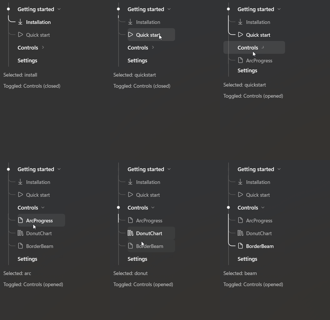
Demo
you can run demo and see this feature.