
Property
| Name |
|---|
| Items |
| SelectedIndex |
| RowHeight |
| Indent |
| Title |
| RailBrush |
| ProgressBrush |
Events
| Name |
|---|
| ItemInvoked |
AnimatedTocItem
| Name |
|---|
| Label |
| Depth |
| Href |
Example
xml
<dev:AnimatedToc Title="On this page"
                 SelectedIndex="0">
    <dev:AnimatedTocItem Label="Introduction" Depth="0" Href="#introduction" />
    <dev:AnimatedTocItem Label="Installation" Depth="0" Href="#installation" />
    <dev:AnimatedTocItem Label="Requirements" Depth="1" Href="#requirements" />
    <dev:AnimatedTocItem Label="Usage" Depth="0" Href="#usage" />
</dev:AnimatedToc>
csharp
toc.ItemInvoked += (s, index) =>
{
    var item = toc.Items[index];
};
NOTE
Items is the content property, so AnimatedTocItem elements can be placed directly inside AnimatedToc.
NOTE
Depth controls the indentation level of an item. Indent sets the horizontal distance between levels.
NOTE
Href is not used by the control itself. Use it in ItemInvoked to navigate or scroll to the matching section.
WARNING
SelectedIndex is an int and is clamped to the range of Items. ItemInvoked passes the index of the clicked item.
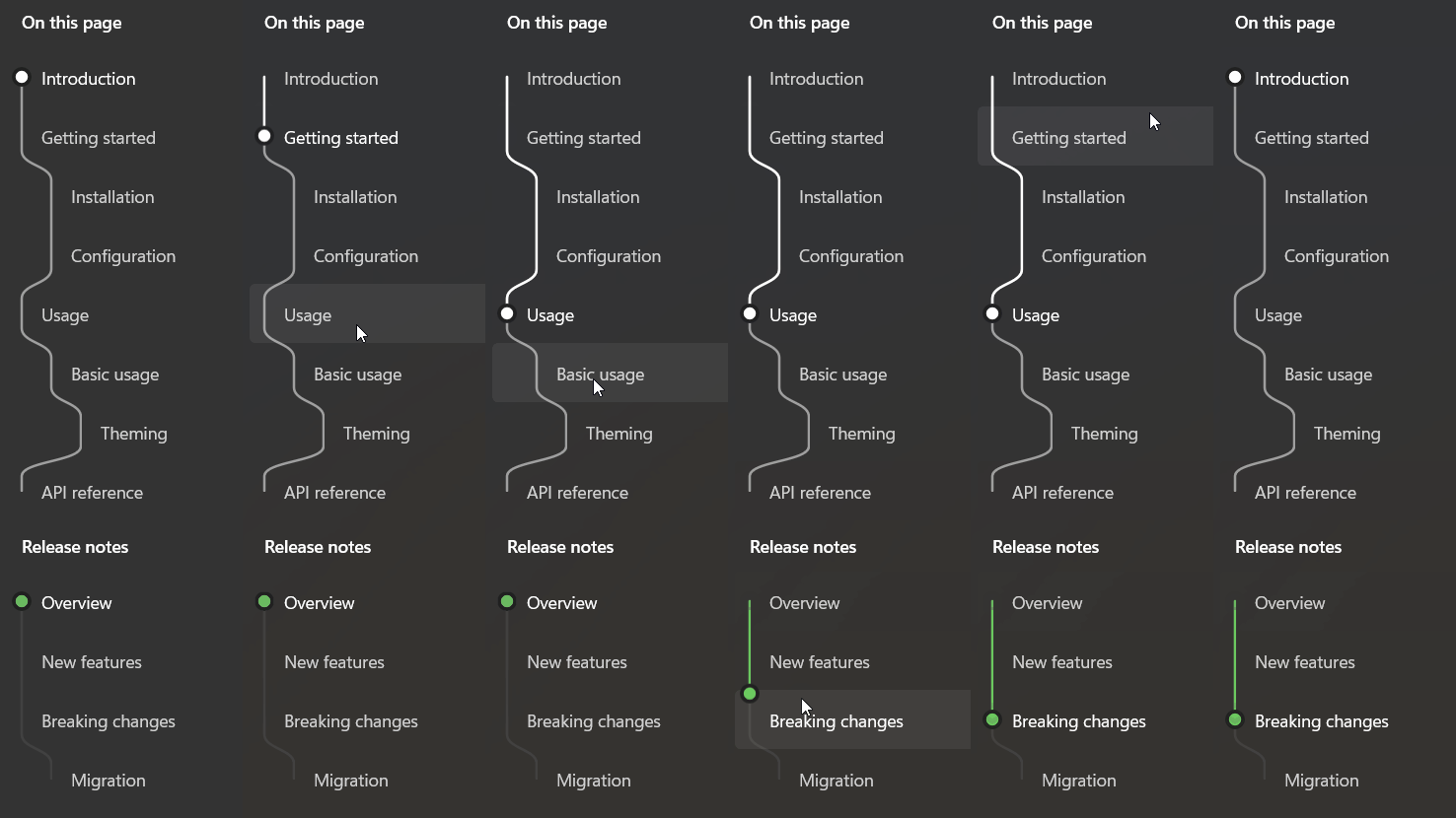
Demo
you can run demo and see this feature.