
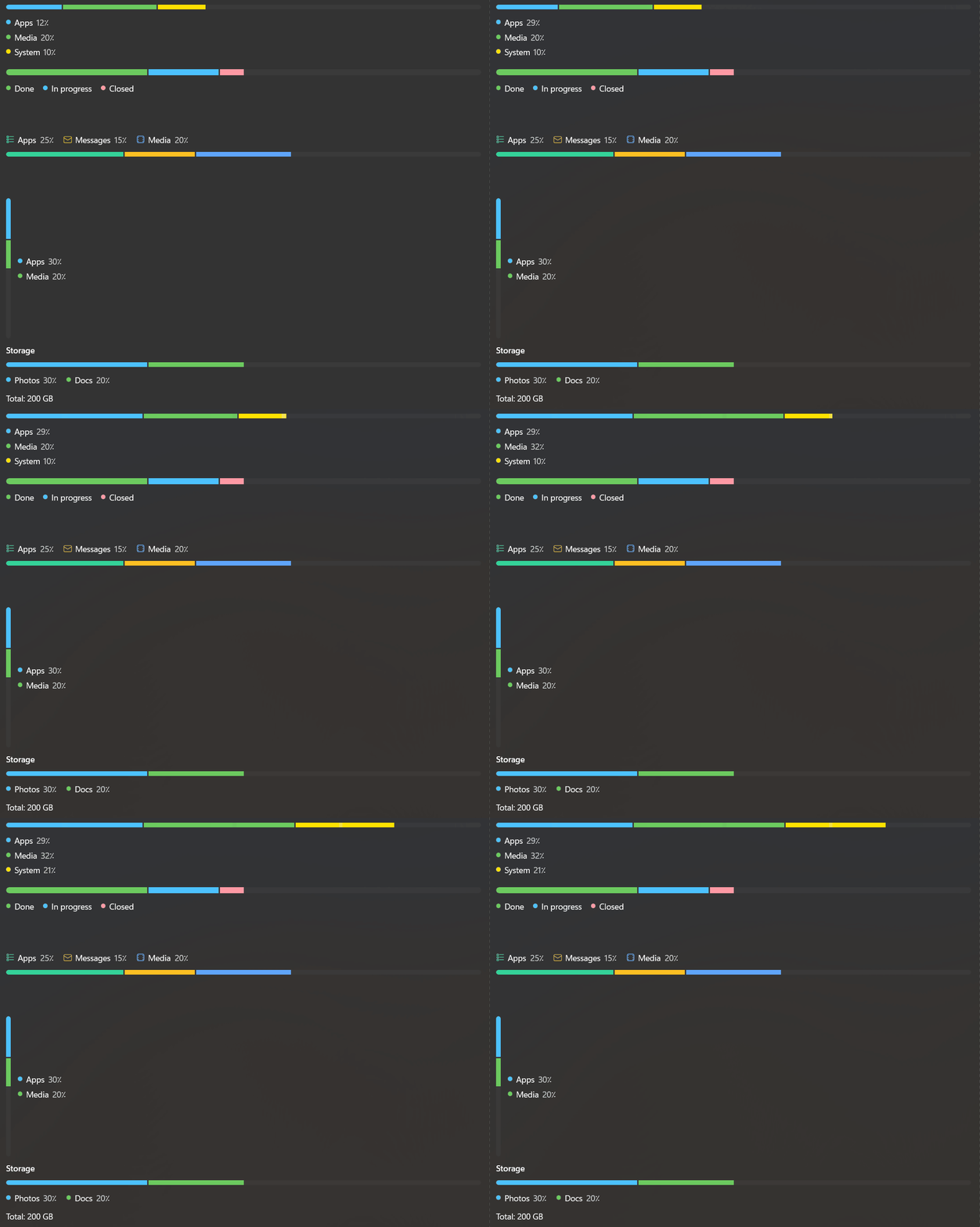
A segmented meter that shows how a whole is divided into parts, as a horizontal or vertical bar with an optional legend.
Property
| Name |
|---|
| Segments |
| Minimum |
| Maximum |
| Orientation |
| BarSize |
| BarThickness |
| Gap |
| ShowLegend |
| ShowValue |
| LegendPosition |
| LegendOrientation |
| Animated |
| StartContent |
| EndContent |
MeterSegment
| Name |
|---|
| Value |
| Label |
| Kind |
| Fill |
| Icon |
Enums
MeterBarSize
| Name |
|---|
| Small |
| Default |
| Large |
MeterLegendPosition
| Name |
|---|
| Start |
| End |
MeterSegmentKind
| Name |
|---|
| Auto |
| Accent |
| Success |
| Attention |
| Danger |
| Neutral |
Example
xml
<dev:SegmentedMeter>
    <dev:MeterSegment Label="Documents" Value="30" />
    <dev:MeterSegment Label="Photos" Value="25" Kind="Success" />
    <dev:MeterSegment Label="Apps" Value="15" Kind="Attention" />
</dev:SegmentedMeter>
xml
<dev:SegmentedMeter Orientation="Vertical"
                    BarSize="Large"
                    LegendPosition="Start"
                    LegendOrientation="Vertical"
                    Maximum="512">
    <dev:MeterSegment Label="System" Value="120" Kind="Neutral" />
    <dev:MeterSegment Label="Games" Value="200" Kind="Danger" />
</dev:SegmentedMeter>
NOTE
Each segment is drawn as a share of the range from Minimum to Maximum. Segments are clamped so their total never exceeds the range, and the unused part stays empty. With Kind="Auto", segments use the kinds Accent, Success, Attention, Danger and Neutral in that order.
NOTE
Icon is a glyph string and is shown in the legend instead of the color marker. When BarThickness is not set, BarSize decides the thickness.
Demo
you can run demo and see this feature.