The TimePicker control allows the user to select the time by typing the time in the text box or using the drop-down calendar control.
1 | [] |
Create TimePicker
1 | <hc:TimePicker /> |
1 | var timePicker = new TimePicker(); |
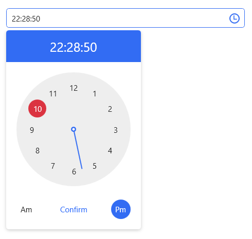
The generated TimePicker is shown below:

Selection period
You can enter the time through the text box, or click the button to the right of the text box to open the drop-down clock control to select the time.
You can also set the date like this in a XAML clock or code.
1 | <hc:TimePicker SelectedTime="{x:Static system:DateTime.Now}"/> |
1 | timePicker.SelectedTime = DateTime.Now; |
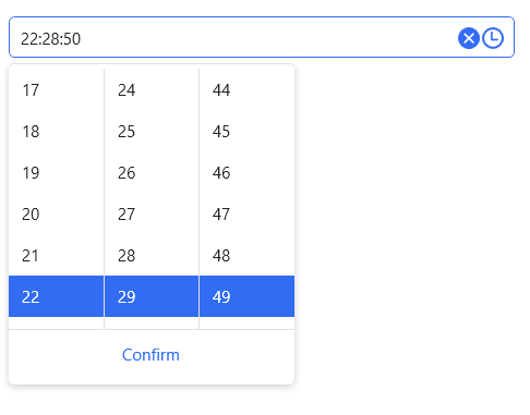
Change the clock style
By changing the Clock property, TimePicker can change the style of the clock.
1 | <hc:TimePicker ShowClearButton="True" Style="{StaticResource TimePickerPlus}"> |
Set title and placeholder text
You can add Headers and Placeholders to the DatePicker to indicate to the user what they do. To use these two properties, you first need to apply the TimePickerExtend or TimePickerPlus styles.
1 | <hc:TimePicker hc:InfoElement.Placeholder="Please enter the content" |
Styles
| Available Styles |
|---|
| TimePicker.Small |
| TimePickerExtend |
| TimePickerExtend.Small |
| TimePickerPlus |
| TimePickerPlus.Small |
Attributes
| Property | Description |
|---|---|
| SelectedTime | Get or set the currently selected time |
| Clock | Get or set the drop-down clock |
| TimeFormat | Get or set the format used to display the selected time |
| DisplayTime | Get or set the time to be displayed |
| IsDropDownOpen | Gets or sets a value that indicates whether the pull-down clock is turned on or off |
| Text | Get the text displayed by ** TimePicker ** or set the selected time |
| SelectionTextBrush | |
| SelectionOpacity | |
| SelectionBrush | |
| CaretBrushProperty |