The NumericUpDown control looks like a pair of arrow buttons and a TextBox that the user can click to adjust the value. The control displays and sets a value. The user can change the Value by clicking the up and down arrows, or by typing a number in the TextBox section of the control.
1
2
[TemplatePart(Name = ElementTextBox, Type = typeof(DatePickerTextBox))] publicclassNumericUpDown : Control
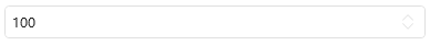
Create NumericUpDown and set Value
1
<hc:NumericUpDownValue="100"/>
1
2
var numericUpDown = new NumericUpDown();
numericUpDown.Value = 100;
The generated NumericUpDown is shown below:
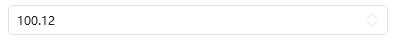
Setting DecimalPlaces
If you need to change the number of decimal places displayed by Value, you can change DecimalPlaces. DecimalPlaces is a **int? ** Type, it does not limit the number of decimal places displayed when it is null, otherwise the displayed number of decimal places is the value of DecimalPlaces.
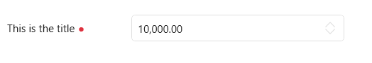
You can add Headers and Placeholders to NumericUpDown to indicate to users what they do. To use these two additional attributes, you need to apply the NumericUpDownPlus style first.
1
<hc:NumericUpDownValueFormat="N2"Maximum="100000"Value="10000"Width="380"hc:InfoElement.TitleWidth="140"hc:InfoElement.Placeholder="Please enter the content"hc:InfoElement.TitlePlacement="Left"hc:InfoElement.Title="This is the title"Style="{StaticResource NumericUpDownExtend}"hc:InfoElement.Necessary="True"Margin="0,32,0,0"/>
Attributes
Property
Description
Value
Get or set the current value
Maximum
Get or Set the Maximum Allowed Value
Minimum
Get or set the minimum allowable value
Increment
Gets or sets the value that the digital display box (also known as an up-down control) increments or decrements when the up or down button is clicked.
DecimalPlaces
Gets or sets the decimal digits to be displayed in NumericUpDown. This property does not affect the Value property.
SelectionTextBrush
SelectionOpacity
SelectionBrush
CaretBrushProperty
ValueFormat
ShowUpDownButton
Event
Event
Description
ValueChanged
Occurs after the Value property has been changed in some way.
Style
name
NumericUpDown.Small
NumericUpDownExtend
NumericUpDownExtend.Small
NumericUpDownPlus
NumericUpDownPlus.Small
Validation
for validation follow instructions: create a Class and inherit from ValidationRule