1
2
3
4
5
6
7
8
9
10
11
12
13
14
15
16
17
18
19
20
21
22
23
24
25
26
27
28
29
30
31
32
33
34
35
36
37
38
39
40
41
42
43
44
45
46
47
48
49
50
51
52
53
54
55
56
57
58
59
60
61
62
63
64
65
66
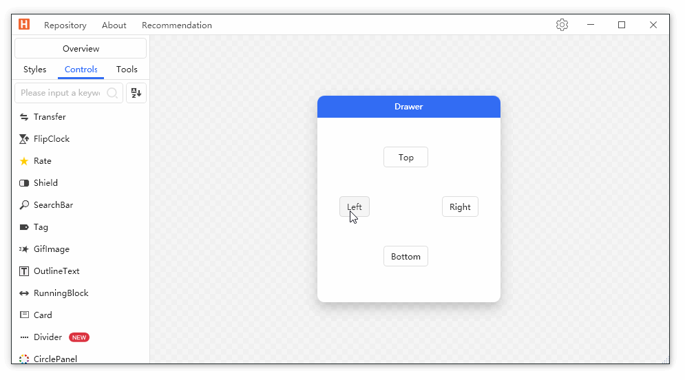
| <hc:SimplePanel Margin="22">
<Grid>
<Grid.RowDefinitions>
<RowDefinition/>
<RowDefinition/>
<RowDefinition/>
</Grid.RowDefinitions>
<Grid.ColumnDefinitions>
<ColumnDefinition/>
<ColumnDefinition/>
<ColumnDefinition/>
</Grid.ColumnDefinitions>
<ToggleButton Margin="10" HorizontalAlignment="Stretch" Grid.Row="1" Grid.Column="0" Content="Left" IsChecked="{Binding IsOpen,ElementName=DrawerLeft}"/>
<ToggleButton Margin="10" HorizontalAlignment="Stretch" Grid.Row="0" Grid.Column="1" Content="Top" IsChecked="{Binding IsOpen,ElementName=DrawerTop}"/>
<ToggleButton Margin="10" HorizontalAlignment="Stretch" Grid.Row="1" Grid.Column="2" Content="Right" IsChecked="{Binding IsOpen,ElementName=DrawerRight}"/>
<ToggleButton Margin="10" HorizontalAlignment="Stretch" Grid.Row="2" Grid.Column="1" Content="Bottom" IsChecked="{Binding IsOpen,ElementName=DrawerBottom}"/>
</Grid>
<hc:Drawer Name="DrawerLeft" Dock="Left" ShowMode="Push">
<Border Background="{DynamicResource RegionBrush}" Width="300" BorderThickness="0,1,0,0" BorderBrush="{DynamicResource BorderBrush}">
<Grid>
<Grid.RowDefinitions>
<RowDefinition Height="Auto"/>
<RowDefinition/>
</Grid.RowDefinitions>
<TextBlock Margin="10,0,0,0" Text="Header" Style="{StaticResource TextBlockTitle}" HorizontalAlignment="Left"/>
<Button Command="hc:ControlCommands.Close" Grid.Row="0" HorizontalAlignment="Right" Foreground="{DynamicResource PrimaryTextBrush}" Style="{StaticResource ButtonIcon}" hc:IconElement.Geometry="{StaticResource DeleteFillCircleGeometry}"/>
</Grid>
</Border>
</hc:Drawer>
<hc:Drawer Name="DrawerTop" Dock="Top" ShowMode="Press">
<Border Background="{DynamicResource RegionBrush}" Height="300" BorderThickness="0,1,0,0" BorderBrush="{DynamicResource BorderBrush}">
<Grid>
<Grid.RowDefinitions>
<RowDefinition Height="Auto"/>
<RowDefinition/>
</Grid.RowDefinitions>
<TextBlock Margin="10,0,0,0" Text="Header" Style="{StaticResource TextBlockTitle}" HorizontalAlignment="Left"/>
<Button Command="hc:ControlCommands.Close" Grid.Row="0" HorizontalAlignment="Right" Foreground="{DynamicResource PrimaryTextBrush}" Style="{StaticResource ButtonIcon}" hc:IconElement.Geometry="{StaticResource DeleteFillCircleGeometry}"/>
</Grid>
</Border>
</hc:Drawer>
<hc:Drawer Name="DrawerRight" MaskCanClose="False">
<Border Background="{DynamicResource RegionBrush}" Width="300" BorderThickness="0,1,0,0" BorderBrush="{DynamicResource BorderBrush}">
<Grid>
<Grid.RowDefinitions>
<RowDefinition Height="Auto"/>
<RowDefinition/>
</Grid.RowDefinitions>
<TextBlock Margin="10,0,0,0" Text="Header" Style="{StaticResource TextBlockTitle}" HorizontalAlignment="Left"/>
<Button Command="hc:ControlCommands.Close" Grid.Row="0" HorizontalAlignment="Right" Foreground="{DynamicResource PrimaryTextBrush}" Style="{StaticResource ButtonIcon}" hc:IconElement.Geometry="{StaticResource DeleteFillCircleGeometry}"/>
</Grid>
</Border>
</hc:Drawer>
<hc:Drawer Name="DrawerBottom" Dock="Bottom" ShowMask="False">
<Border Background="{DynamicResource RegionBrush}" Height="300" BorderThickness="0,1,0,0" BorderBrush="{DynamicResource BorderBrush}">
<Grid>
<Grid.RowDefinitions>
<RowDefinition Height="Auto"/>
<RowDefinition/>
</Grid.RowDefinitions>
<TextBlock Margin="10,0,0,0" Text="Header" Style="{StaticResource TextBlockTitle}" HorizontalAlignment="Left"/>
<Button Command="hc:ControlCommands.Close" Grid.Row="0" HorizontalAlignment="Right" Foreground="{DynamicResource PrimaryTextBrush}" Style="{StaticResource ButtonIcon}" hc:IconElement.Geometry="{StaticResource DeleteFillCircleGeometry}"/>
</Grid>
</Border>
</hc:Drawer>
</hc:SimplePanel>
|