1
2
3
4
5
6
7
8
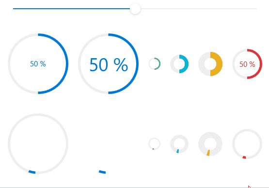
| <StackPanel Orientation="Horizontal" Margin="0,32,0,0">
<hc:CircleProgressBar Value="{Binding Value,ElementName=SliderDemo}"/>
<hc:CircleProgressBar Value="{Binding Value,ElementName=SliderDemo}" FontSize="30" Margin="16,0,0,0"/>
<hc:CircleProgressBar Value="{Binding Value,ElementName=SliderDemo}" Margin="16,0,0,0" ShowText="False" Width="20" Height="20" ArcThickness="2" Style="{StaticResource ProgressBarSuccessCircle}"/>
<hc:CircleProgressBar Value="{Binding Value,ElementName=SliderDemo}" Margin="16,0,0,0" ShowText="False" Width="30" Height="30" ArcThickness="6" Style="{StaticResource ProgressBarInfoCircle}"/>
<hc:CircleProgressBar Value="{Binding Value,ElementName=SliderDemo}" Margin="16,0,0,0" ShowText="False" Width="40" Height="40" ArcThickness="10" Style="{StaticResource ProgressBarWarningCircle}"/>
<hc:CircleProgressBar Value="{Binding Value,ElementName=SliderDemo}" Margin="16,0,0,0" Width="50" Height="50" Style="{StaticResource ProgressBarDangerCircle}"/>
</StackPanel>
|