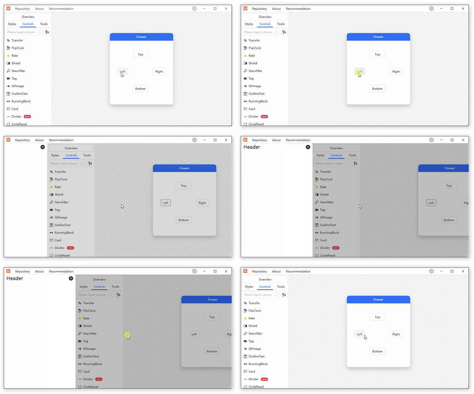
When the Dialog component cannot meet our needs (for example, to display some documents), you can use Drawer.
cs
[ContentProperty("Content")]
public class Drawer : FrameworkElement
Attributes
| Property | Description | Default Value | Remarks |
|---|---|---|---|
| IsOpen | Is it closed | ||
| MaskCanClose | Click whether the mask layer can be closed Drawer | true | |
| ShowMask | Whether to show the mask layer | true | |
| Dock | Location | Dock.Left | |
| ShowMode | Display Mode | DrawerShowMode.Cover | |
| MaskBrush | Mask layer color | ||
| Content | Content |
Events
| Name | Description |
|---|---|
| Opened | Triggered when the drawer is opened |
| Closed | Triggered when the drawer is closed |
Case
xml
<hc:SimplePanel Margin="22">
    <Grid>
        <Grid.RowDefinitions>
            <RowDefinition/>
            <RowDefinition/>
            <RowDefinition/>
        </Grid.RowDefinitions>
        <Grid.ColumnDefinitions>
            <ColumnDefinition/>
            <ColumnDefinition/>
            <ColumnDefinition/>
        </Grid.ColumnDefinitions>
        <ToggleButton Margin="10" HorizontalAlignment="Stretch" Grid.Row="1" Grid.Column="0" Content="Left" IsChecked="{Binding IsOpen,ElementName=DrawerLeft}"/>
        <ToggleButton Margin="10" HorizontalAlignment="Stretch" Grid.Row="0" Grid.Column="1" Content="Top" IsChecked="{Binding IsOpen,ElementName=DrawerTop}"/>
        <ToggleButton Margin="10" HorizontalAlignment="Stretch" Grid.Row="1" Grid.Column="2" Content="Right" IsChecked="{Binding IsOpen,ElementName=DrawerRight}"/>
        <ToggleButton Margin="10" HorizontalAlignment="Stretch" Grid.Row="2" Grid.Column="1" Content="Bottom" IsChecked="{Binding IsOpen,ElementName=DrawerBottom}"/>
    </Grid>
    <hc:Drawer Name="DrawerLeft" Dock="Left" ShowMode="Push">
        <Border Background="{DynamicResource RegionBrush}" Width="300" BorderThickness="0,1,0,0" BorderBrush="{DynamicResource BorderBrush}">
            <Grid>
                <Grid.RowDefinitions>
                    <RowDefinition Height="Auto"/>
                    <RowDefinition/>
                </Grid.RowDefinitions>
                <TextBlock Margin="10,0,0,0" Text="Header" Style="{StaticResource TextBlockTitle}" HorizontalAlignment="Left"/>
                <Button Command="hc:ControlCommands.Close" Grid.Row="0" HorizontalAlignment="Right" Foreground="{DynamicResource PrimaryTextBrush}" Style="{StaticResource ButtonIcon}" hc:IconElement.Geometry="{StaticResource DeleteFillCircleGeometry}"/>
            </Grid>
        </Border>
    </hc:Drawer>
    <hc:Drawer Name="DrawerTop" Dock="Top" ShowMode="Press">
        <Border Background="{DynamicResource RegionBrush}" Height="300" BorderThickness="0,1,0,0" BorderBrush="{DynamicResource BorderBrush}">
            <Grid>
                <Grid.RowDefinitions>
                    <RowDefinition Height="Auto"/>
                    <RowDefinition/>
                </Grid.RowDefinitions>
                <TextBlock Margin="10,0,0,0" Text="Header" Style="{StaticResource TextBlockTitle}" HorizontalAlignment="Left"/>
                <Button Command="hc:ControlCommands.Close" Grid.Row="0" HorizontalAlignment="Right" Foreground="{DynamicResource PrimaryTextBrush}" Style="{StaticResource ButtonIcon}" hc:IconElement.Geometry="{StaticResource DeleteFillCircleGeometry}"/>
            </Grid>
        </Border>
    </hc:Drawer>
    <hc:Drawer Name="DrawerRight" MaskCanClose="False">
        <Border Background="{DynamicResource RegionBrush}" Width="300" BorderThickness="0,1,0,0" BorderBrush="{DynamicResource BorderBrush}">
            <Grid>
                <Grid.RowDefinitions>
                    <RowDefinition Height="Auto"/>
                    <RowDefinition/>
                </Grid.RowDefinitions>
                <TextBlock Margin="10,0,0,0" Text="Header" Style="{StaticResource TextBlockTitle}" HorizontalAlignment="Left"/>
                <Button Command="hc:ControlCommands.Close" Grid.Row="0" HorizontalAlignment="Right" Foreground="{DynamicResource PrimaryTextBrush}" Style="{StaticResource ButtonIcon}" hc:IconElement.Geometry="{StaticResource DeleteFillCircleGeometry}"/>
            </Grid>
        </Border>
    </hc:Drawer>
    <hc:Drawer Name="DrawerBottom" Dock="Bottom" ShowMask="False">
        <Border Background="{DynamicResource RegionBrush}" Height="300" BorderThickness="0,1,0,0" BorderBrush="{DynamicResource BorderBrush}">
            <Grid>
                <Grid.RowDefinitions>
                    <RowDefinition Height="Auto"/>
                    <RowDefinition/>
                </Grid.RowDefinitions>
                <TextBlock Margin="10,0,0,0" Text="Header" Style="{StaticResource TextBlockTitle}" HorizontalAlignment="Left"/>
                <Button Command="hc:ControlCommands.Close" Grid.Row="0" HorizontalAlignment="Right" Foreground="{DynamicResource PrimaryTextBrush}" Style="{StaticResource ButtonIcon}" hc:IconElement.Geometry="{StaticResource DeleteFillCircleGeometry}"/>
            </Grid>
        </Border>
    </hc:Drawer>
</hc:SimplePanel>