We moved all namespaces into a single namespace. No matter which (WinUICommunity) library you use, the namespace is always as follows For use in the Xaml: xmlns:wuc="using:WinUICommunity" For use in the Csharp: using WinUICommunity;
Attributes
Name
Header
Description
HeaderIcon
ActionIcon
ActionIconToolTip
IsClickEnabled
ContentAlignment
IsActionIconVisible
Example
1
2
3
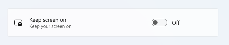
<wuc:SettingsCardHeader="Keep screen on"Description="Keep your screen on"HeaderIcon=""> <ToggleSwitch/> </wuc:Setting>
SettingsPage
This example uses SettingsCard and SettingsExpander to showcase a complete Windows 11 style settings page.
<Page.Resources> <!-- These styles can be referenced to create a consistent SettingsPage layout -->
<!-- Spacing between cards --> <x:Doublex:Key="SettingsCardSpacing">3</x:Double>
<!-- Style (inc. the correct spacing) of a section header --> <Stylex:Key="SettingsSectionHeaderTextBlockStyle" BasedOn="{StaticResource BodyStrongTextBlockStyle}" TargetType="TextBlock"> <Style.Setters> <SetterProperty="Margin"Value="1,29,0,5" /> </Style.Setters> </Style> </Page.Resources> <ScrollViewerMargin="20"> <Grid> <StackPanelMaxWidth="1000"HorizontalAlignment="Stretch"Spacing="{StaticResource SettingsCardSpacing}"> <StackPanel.ChildrenTransitions> <EntranceThemeTransitionFromVerticalOffset="50" /> <RepositionThemeTransitionIsStaggeringEnabled="False" /> </StackPanel.ChildrenTransitions> <TextBlockStyle="{StaticResource SettingsSectionHeaderTextBlockStyle}" Text="Section 1" /> <wuc:SettingsCardDescription="This is a default card, with the Header, HeaderIcon, Description and Content set" Header="This is the Header"> <wuc:SettingsCard.HeaderIcon> <FontIconGlyph="" /> </wuc:SettingsCard.HeaderIcon> <ToggleSwitchIsOn="True" /> </wuc:SettingsCard>
<wuc:SettingsExpanderDescription="The SettingsExpander has the same properties as a SettingsCard" Header="SettingsExpander"> <wuc:SettingsExpander.HeaderIcon> <FontIconGlyph="" /> </wuc:SettingsExpander.HeaderIcon> <ButtonContent="Content" Style="{StaticResource AccentButtonStyle}" />
<wuc:SettingsExpander.Items> <wuc:SettingsCardHeader="A basic SettingsCard within an SettingsExpander"> <ButtonContent="Button" /> </wuc:SettingsCard> <wuc:SettingsCardDescription="SettingsCard within an Expander can be made clickable too!" Header="This item can be clicked" IsClickEnabled="True" />
<wuc:SettingsCardContentAlignment="Left"> <CheckBoxContent="Here the ContentAlignment is set to Left. This is great for e.g. CheckBoxes or RadioButtons" /> </wuc:SettingsCard> </wuc:SettingsExpander.Items> </wuc:SettingsExpander>
<TextBlockStyle="{StaticResource SettingsSectionHeaderTextBlockStyle}" Text="Section 2" /> <wuc:SettingsCardDescription="Another card to show grouping of cards" Header="Another SettingsCard"> <wuc:SettingsCard.HeaderIcon> <FontIconGlyph="" /> </wuc:SettingsCard.HeaderIcon> <ComboBoxSelectedIndex="0"> <ComboBoxItem>Option 1</ComboBoxItem> <ComboBoxItem>Option 2</ComboBoxItem> <ComboBoxItem>Option 3</ComboBoxItem> </ComboBox> </wuc:SettingsCard>
<wuc:SettingsCardDescription="Another card to show grouping of cards" Header="Yet another SettingsCard"> <wuc:SettingsCard.HeaderIcon> <FontIconGlyph="" /> </wuc:SettingsCard.HeaderIcon> <ButtonContent="Content" /> </wuc:SettingsCard>
<!-- Example 'About' section --> <TextBlockStyle="{StaticResource SettingsSectionHeaderTextBlockStyle}" Text="About" />
<wuc:SettingsCardx:Name="settingsCard2" Description="A SettingsCard can be made clickable and you can leverage the Command property or Click event." Header="A clickable SettingsCard" IsClickEnabled="True" Click="OnCardClicked" IsEnabled="{x:Bind IsCardEnabled, Mode=OneWay}"> <wuc:SettingsCard.HeaderIcon> <FontIconGlyph="" /> </wuc:SettingsCard.HeaderIcon> </wuc:SettingsCard>
<wuc:SettingsCardActionIconToolTip="Open in new window" Description="You can customize the ActionIcon and ActionIconToolTip." Header="Customizing the ActionIcon" IsClickEnabled="True" Click="OnCardClicked" IsEnabled="{x:Bind IsCardEnabled, Mode=OneWay}"> <wuc:SettingsCard.HeaderIcon> <FontIconGlyph="" /> </wuc:SettingsCard.HeaderIcon> <wuc:SettingsCard.ActionIcon> <FontIconGlyph="" /> </wuc:SettingsCard.ActionIcon> </wuc:SettingsCard> </StackPanel>
SettingsCard
SettingsCard is a control that can be used to display settings in your experience. It uses the default styling found in Windows 11 and is easy to use, meets all accesibility standards and will make your settings page look great! You can set the Header, Description, HeaderIcon and Content properties to create an easy to use experience.
SettingsCard can also be turned into a button, by setting the IsClickEnabled property. This can be useful whenever you want your settings component to navigate to a detail page or open an external link.
<StackPanelSpacing="3"> <TextBlockMargin="1,0,0,4" Style="{StaticResource BodyStrongTextBlockStyle}" Text="Group of settings" /> <wuc:SettingsCardx:Name="settingsCard" Description="This is a default card, with the Header, HeaderIcon, Description and Content set." Header="This is the Header" IsEnabled="{x:Bind IsCardEnabled, Mode=OneWay}"> <wuc:SettingsCard.HeaderIcon> <FontIconGlyph="" /> </wuc:SettingsCard.HeaderIcon> <ComboBoxSelectedIndex="0"> <ComboBoxItem>Option 1</ComboBoxItem> <ComboBoxItem>Option 2</ComboBoxItem> <ComboBoxItem>Option 3</ComboBoxItem> </ComboBox> </wuc:SettingsCard>
<wuc:SettingsCardDescription="You can use a FontIcon, SymbolIcon or BitmapIcon to set the cards HeaderIcon." Header="Icon options" IsEnabled="{x:Bind IsCardEnabled, Mode=OneWay}"> <wuc:SettingsCard.HeaderIcon> <BitmapIconShowAsMonochrome="False" UriSource="ms-appx:///Assets/AppTitleBar.scale-200.png" /> </wuc:SettingsCard.HeaderIcon> <ToggleSwitch /> </wuc:SettingsCard>
<wuc:SettingsCardHeader="A card with custom objects as its Description" IsEnabled="{x:Bind IsCardEnabled, Mode=OneWay}"> <wuc:SettingsCard.Description> <HyperlinkButtonContent="Learn more about Phone Link" /> </wuc:SettingsCard.Description> <ButtonContent="Open Phone Link" Style="{StaticResource AccentButtonStyle}" /> </wuc:SettingsCard>
<wuc:SettingsCardDescription="When resizing a SettingsCard, the Content will wrap vertically. You can override this breakpoint by setting the SettingsCardWrapThreshold resource. For edge cases, you can also hide the icon by setting SettingsCardWrapNoIconThreshold." Header="Adaptive layouts" IsEnabled="{x:Bind IsCardEnabled, Mode=OneWay}"> <wuc:SettingsCard.HeaderIcon> <FontIconGlyph="" /> </wuc:SettingsCard.HeaderIcon> <wuc:SettingsCard.Resources> <x:Doublex:Key="SettingsCardWrapThreshold">800</x:Double> <x:Doublex:Key="SettingsCardWrapNoIconThreshold">600</x:Double> </wuc:SettingsCard.Resources> <ButtonContent="This control will wrap vertically!" Style="{StaticResource AccentButtonStyle}" /> </wuc:SettingsCard> </StackPanel>
publicclassMyDataModel { publicstring? Name { get; set; }
publicstring? Info { get; set; }
publicstring? LinkDescription { get; set; }
publicstring? Url { get; set; } }
public ObservableCollection<MyDataModel> MyDataSet = new() { new() { Name = "First Item", Info = "More about first item.", LinkDescription = "Click here for more on first item.", Url = "https://microsoft.com/", }, new() { Name = "Second Item", Info = "More about second item.", LinkDescription = "Click here for more on second item.", Url = "https://xbox.com/", }, new() { Name = "Third Item", Info = "More about third item.", LinkDescription = "Click here for more on third item.", Url = "https://toolkitlabs.dev/", }, }; ```xml <wuc:SettingsExpander Description="The SettingsExpander can use ItemsSource to define its Items." Header="Settings Expander with ItemsSource" ItemsSource="{x:Bind MyDataSet}"> <wuc:SettingsExpander.HeaderIcon> <FontIcon Glyph="" /> </wuc:SettingsExpander.HeaderIcon> <wuc:SettingsExpander.ItemTemplate> <DataTemplate x:DataType="local:MyDataModel"> <wuc:SettingsCard Description="{x:Bind Info}" Header="{x:Bind Name}"> <HyperlinkButton Content="{x:Bind LinkDescription}" NavigateUri="{x:Bind Url}" /> </wuc:SettingsCard> </DataTemplate> </wuc:SettingsExpander.ItemTemplate> <wuc:SettingsExpander.ItemsHeader> <InfoBar Title="This is the ItemsHeader" BorderThickness="0" CornerRadius="0" IsIconVisible="False" IsOpen="True" Severity="Success"> <InfoBar.ActionButton> <HyperlinkButton Content="It can host custom content" /> </InfoBar.ActionButton> </InfoBar> </wuc:SettingsExpander.ItemsHeader> <wuc:SettingsExpander.ItemsFooter> <InfoBar Title="This is the ItemsFooter" BorderThickness="0" CornerRadius="0,0,4,4" IsIconVisible="False" IsOpen="True" Severity="Informational"> <InfoBar.ActionButton> <HyperlinkButton Content="It can host custom content" /> </InfoBar.ActionButton> </InfoBar> </wuc:SettingsExpander.ItemsFooter> </wuc:SettingsExpander>
SettingsExpander
The SettingsExpander can be used to group multiple SettingsCards into a single collapsable group.
A SettingsExpander can have it’s own content to display a setting on the right, just like a SettingsCard, but in addition can have any number of extra Items to include as additional settings. These items are SettingsCards themselves, which means you can easily move a setting into or out of Expanders just by cutting and pasting their XAML! You can easily override certain properties to create custom experiences. For instance, you can customize the ContentAlignment of a SettingsCard, to align your content to the Right (default), Left (hiding the HeaderIcon, Header and Description) or Vertically (usually best paired with changing the HorizontalContentAlignment to Stretch).
SettingsExpander is also an ItemsControl, so its items can be driven by a collection and the ItemsSource property. You can use the ItemTemplate to define how your data object is represented as a SettingsCard, as shown below. The ItemsHeader and ItemsFooter property can be used to host custom content at the start or end of the items list.
<ScrollViewer> <wuc:SettingsExpanderx:Name="settingsCard" Description="The SettingsExpander has the same properties as a Card, and you can set SettingsCard as part of the Items collection." Header="SettingsExpander" IsEnabled="{x:Bind IsCardEnabled, Mode=OneWay}" IsExpanded="{x:Bind IsCardExpanded, Mode=OneWay}"> <!-- TODO: This should be TwoWay bound but throws compile error in Uno. --> <wuc:SettingsExpander.HeaderIcon> <FontIconGlyph="" /> </wuc:SettingsExpander.HeaderIcon> <ComboBoxSelectedIndex="0"> <ComboBoxItem>Option 1</ComboBoxItem> <ComboBoxItem>Option 2</ComboBoxItem> <ComboBoxItem>Option 3</ComboBoxItem> </ComboBox>
<wuc:SettingsExpander.Items> <wuc:SettingsCardHeader="A basic SettingsCard within an SettingsExpander"> <ButtonContent="Button" /> </wuc:SettingsCard> <wuc:SettingsCardDescription="SettingsCard within an Expander can be made clickable too!" Header="This item can be clicked" IsClickEnabled="True" />
<wuc:SettingsCardContentAlignment="Left"> <CheckBoxContent="Here the ContentAlignment is set to Left. This is great for e.g. CheckBoxes or RadioButtons." /> </wuc:SettingsCard>
<wuc:SettingsCardHorizontalContentAlignment="Left" ContentAlignment="Vertical" Description="You can also align your content vertically. Make sure to set the HorizontalAlignment to Left when you do!" Header="Vertically aligned"> <GridViewSelectedIndex="1"> <GridViewItem> <BorderWidth="64" Height="64" Background="#0078D4" CornerRadius="4" /> </GridViewItem> <GridViewItem> <BorderWidth="64" Height="64" Background="#005EB7" CornerRadius="4" /> </GridViewItem> <GridViewItem> <BorderWidth="64" Height="64" Background="#003D92" CornerRadius="4" /> </GridViewItem> <GridViewItem> <BorderWidth="64" Height="64" Background="#001968" CornerRadius="4" /> </GridViewItem> </GridView> </wuc:SettingsCard> <wuc:SettingsCardDescription="You can override the Left indention of a SettingsCard by overriding the SettingsCardLeftIndention" Header="Customization"> <wuc:SettingsCard.Resources> <x:Doublex:Key="SettingsCardLeftIndention">40</x:Double> </wuc:SettingsCard.Resources> </wuc:SettingsCard> </wuc:SettingsExpander.Items> </wuc:SettingsExpander> </ScrollViewer>