1
2
3
4
5
6
7
8
9
10
11
12
13
14
15
16
17
18
19
20
21
22
23
24
25
26
27
28
29
30
31
32
33
34
35
36
37
38
39
40
41
42
43
44
45
46
47
48
49
50
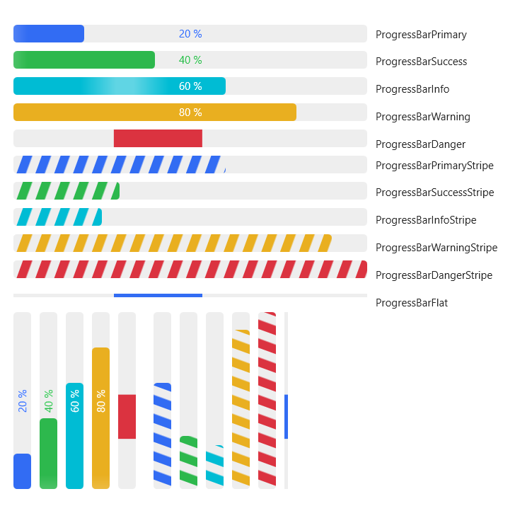
| <WrapPanel Margin="32" ItemWidth="600">
<StackPanel Orientation="Horizontal">
<StackPanel Width="400">
<ProgressBar Value="20" Margin="0,0,0,10"/>
<ProgressBar Style="{StaticResource ProgressBarSuccess}" Margin="0,0,0,10" Value="40"/>
<ProgressBar Style="{StaticResource ProgressBarInfo}" Margin="0,0,0,10" Value="60"/>
<ProgressBar Style="{StaticResource ProgressBarWarning}" Margin="0,0,0,10" Value="80"/>
<ProgressBar Style="{StaticResource ProgressBarDanger}" Margin="0,0,0,10" Value="100" Maximum="200" IsIndeterminate="True"/>
</StackPanel>
<StackPanel Margin="10,0,0,0" Width="200" HorizontalAlignment="Left">
<TextBlock Padding="0,2,0,3" Style="{StaticResource TextBlockDefault}" Text="ProgressBarPrimary" HorizontalAlignment="Left"/>
<TextBlock Padding="0,12,0,3" Style="{StaticResource TextBlockDefault}" Text="ProgressBarSuccess" HorizontalAlignment="Left"/>
<TextBlock Padding="0,12,0,3" Style="{StaticResource TextBlockDefault}" Text="ProgressBarInfo" HorizontalAlignment="Left"/>
<TextBlock Padding="0,12,0,3" Style="{StaticResource TextBlockDefault}" Text="ProgressBarWarning" HorizontalAlignment="Left"/>
<TextBlock Padding="0,12,0,3" Style="{StaticResource TextBlockDefault}" Text="ProgressBarDanger" HorizontalAlignment="Left"/>
</StackPanel>
</StackPanel>
<StackPanel Orientation="Horizontal">
<StackPanel Width="400">
<ProgressBar Style="{StaticResource ProgressBarPrimaryStripe}" Margin="0,0,0,10" Value="120" Maximum="200" />
<ProgressBar Style="{StaticResource ProgressBarSuccessStripe}" Margin="0,0,0,10" Value="60" Maximum="200" />
<ProgressBar Style="{StaticResource ProgressBarInfoStripe}" Margin="0,0,0,10" Value="50" Maximum="200" />
<ProgressBar Style="{StaticResource ProgressBarWarningStripe}" Margin="0,0,0,10" Value="180" Maximum="200" />
<ProgressBar Style="{StaticResource ProgressBarDangerStripe}" Margin="0,0,0,10" IsIndeterminate="True" Maximum="200" />
<ProgressBar Style="{StaticResource ProgressBarFlat}" Margin="0,8,0,10" Value="110" Maximum="200" IsIndeterminate="True"/>
</StackPanel>
<StackPanel Margin="10,0,0,0" Width="200" HorizontalAlignment="Left">
<TextBlock Padding="0,2,0,3" Style="{StaticResource TextBlockDefault}" Text="ProgressBarPrimaryStripe" HorizontalAlignment="Left"/>
<TextBlock Padding="0,12,0,3" Style="{StaticResource TextBlockDefault}" Text="ProgressBarSuccessStripe" HorizontalAlignment="Left"/>
<TextBlock Padding="0,12,0,3" Style="{StaticResource TextBlockDefault}" Text="ProgressBarInfoStripe" HorizontalAlignment="Left"/>
<TextBlock Padding="0,12,0,3" Style="{StaticResource TextBlockDefault}" Text="ProgressBarWarningStripe" HorizontalAlignment="Left"/>
<TextBlock Padding="0,12,0,3" Style="{StaticResource TextBlockDefault}" Text="ProgressBarDangerStripe" HorizontalAlignment="Left"/>
<TextBlock Padding="0,12,0,3" Style="{StaticResource TextBlockDefault}" Text="ProgressBarFlat" HorizontalAlignment="Left"/>
</StackPanel>
</StackPanel>
<StackPanel Orientation="Horizontal" Height="200">
<ProgressBar Value="20" Margin="0,0,10,0" Orientation="Vertical" Width="20"/>
<ProgressBar Style="{StaticResource ProgressBarSuccess}" Margin="0,0,10,0" Value="40" Orientation="Vertical" Width="20"/>
<ProgressBar Style="{StaticResource ProgressBarInfo}" Margin="0,0,10,0" Value="60" Orientation="Vertical" Width="20"/>
<ProgressBar Style="{StaticResource ProgressBarWarning}" Margin="0,0,10,0" Value="80" Orientation="Vertical" Width="20"/>
<ProgressBar Style="{StaticResource ProgressBarDanger}" Margin="0,0,10,0" Value="100" Maximum="200" IsIndeterminate="True" Width="20" Orientation="Vertical"/>
<ProgressBar Style="{StaticResource ProgressBarPrimaryStripe}" Margin="10,0,10,0" Value="120" Maximum="200" Orientation="Vertical" Width="20" />
<ProgressBar Style="{StaticResource ProgressBarSuccessStripe}" Margin="0,0,10,0" Value="60" Maximum="200" Orientation="Vertical" Width="20" />
<ProgressBar Style="{StaticResource ProgressBarInfoStripe}" Margin="0,0,10,0" Value="50" Maximum="200" Orientation="Vertical" Width="20" />
<ProgressBar Style="{StaticResource ProgressBarWarningStripe}" Margin="0,0,10,0" Value="180" Maximum="200" Orientation="Vertical" Width="20" />
<ProgressBar Style="{StaticResource ProgressBarDangerStripe}" Margin="0,0,10,0" IsIndeterminate="True" Maximum="200" Orientation="Vertical" Width="20"/>
<ProgressBar Style="{StaticResource ProgressBarFlat}" Margin="0,0,10,0" Value="110" Maximum="200" IsIndeterminate="True" Orientation="Vertical" Width="4"/>
</StackPanel>
</WrapPanel>
|