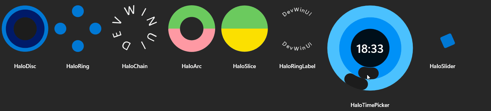
The Halo is a set of interconnected UI components for circular or arc-based interfaces.
HaloPanel : Panel
Attached Properties
Example
1
2
3
| <dev:HaloPanel>
</dev:HaloPanel>
|
HaloArc : Path
Property
| Name |
| Angle |
| Spread |
| Offset |
| Tension |
Example
1
2
3
4
5
6
7
8
9
10
11
| <dev:HaloPanel Height="150" Margin="5">
<dev:HaloArc Spread="180"
Stroke="{ThemeResource SystemFillColorSuccessBrush}"
StrokeThickness="30"
Tension="0.5" />
<dev:HaloArc Angle="180"
Spread="180"
Stroke="{ThemeResource SystemFillColorCriticalBrush}"
StrokeThickness="30"
Tension="0.5" />
</dev:HaloPanel>
|
HaloChain : HaloRingPanel
Property
| Name |
| Angle |
| Spacing |
| Offset |
| Tension |
Example
1
2
3
4
5
6
7
8
9
10
11
12
13
14
15
16
17
18
19
20
21
22
| <dev:HaloPanel Height="150"
Margin="5">
<dev:HaloChain Spacing="10"
Tension="0.5">
<TextBlock FontSize="30"
Text="D" />
<TextBlock FontSize="30"
Text="E" />
<TextBlock FontSize="30"
Text="V" />
<TextBlock FontSize="30"
Text="W" />
<TextBlock FontSize="30"
Text="I" />
<TextBlock FontSize="30"
Text="N" />
<TextBlock FontSize="30"
Text="U" />
<TextBlock FontSize="30"
Text="I" />
</dev:HaloChain>
</dev:HaloPanel>
|
HaloDisc : Path
Example
1
2
3
4
5
6
7
8
9
10
11
| <dev:HaloPanel Height="150"
Margin="5">
<dev:HaloDisc dev:Halo.Band="2"
dev:Halo.Thickness="10"
Fill="{ThemeResource SystemAccentColor}" />
<dev:HaloDisc dev:Halo.Band="1"
dev:Halo.Thickness="20"
Fill="{ThemeResource SystemAccentColorDark3}" />
<dev:HaloDisc dev:Halo.Thickness="10"
Fill="{ThemeResource CardStrokeColorDefaultSolidBrush}" />
</dev:HaloPanel>
|
HaloRingPanel : Panel
Attached Properties
Example
1
2
3
4
5
6
7
8
9
10
11
12
13
14
15
16
17
18
19
20
| <dev:HaloPanel Height="150"
Margin="5">
<dev:HaloRingPanel>
<Ellipse Width="30"
Height="30"
Fill="{ThemeResource SystemAccentColor}" />
<Ellipse Width="30"
Height="30"
dev:HaloRingPanel.Angle="90"
Fill="{ThemeResource SystemAccentColor}" />
<Ellipse Width="30"
Height="30"
dev:HaloRingPanel.Angle="180"
Fill="{ThemeResource SystemAccentColor}" />
<Ellipse Width="30"
Height="30"
dev:HaloRingPanel.Angle="270"
Fill="{ThemeResource SystemAccentColor}" />
</dev:HaloRingPanel>
</dev:HaloPanel>
|
HaloRingLabel : HaloChain
Property
Example
1
2
3
4
5
6
7
8
9
10
| <dev:HaloPanel Height="150"
Margin="5">
<dev:HaloRingLabel dev:Halo.Band="1"
FontSize="30"
Text="DevWinUI" />
<dev:HaloRingLabel dev:Halo.Band="1"
Flip="True"
FontSize="25"
Text="DevWinUI" />
</dev:HaloPanel>
|
HaloSlice : Path
Property
Example
1
2
3
4
5
6
7
8
9
| <dev:HaloPanel Margin="5">
<dev:HaloSlice Fill="White"
Spread="180"
Offset="90" />
<dev:HaloSlice Angle="180"
Fill="Black"
Spread="180"
Offset="90" />
</dev:HaloPanel>
|
HaloSlider : Control
Property
Example
1
2
3
4
5
6
7
8
9
10
11
12
13
| <dev:HaloPanel Margin="5">
<dev:HaloSlider Angle="10">
<dev:HaloSlider.Thumb>
<ControlTemplate>
<Rectangle Width="30"
Height="30"
Fill="{ThemeResource SystemAccentColor}"
RadiusX="4"
RadiusY="4" />
</ControlTemplate>
</dev:HaloSlider.Thumb>
</dev:HaloSlider>
</dev:HaloPanel>
|
HaloArcSlider : HaloSlider
Example
1
2
3
| <dev:HaloPanel Margin="5">
<dev:HaloArcSlider/>
</dev:HaloPanel>
|
HaloTimePicker : Control
Property
| Name |
| MinutesArcBrush |
| HoursArcBrush |
| MinutesBand |
| HoursBand |
| MinutesBrush |
| HoursBrush |
| Time |
Events
Example
1
2
3
4
| <dev:HaloPanel Height="250" Width="150"
Margin="5">
<dev:HaloTimePicker />
</dev:HaloPanel>
|
Demo
you can run demo and see this feature.