Normal Usage
Easily implement a NavigationView With Json file (we read navigationview items from a json file)
First Add a NavigationView:
1 | <NavigationView x:Name="NavView"> |
then Create a new IJsonNavigationService:
1 | IJsonNavigationService jsonNavigationService; |
now you should call Initialize method with a NavigationView, Frame and PageDictionary
1 | public Dictionary<string, Type> PageDictionary { get; } = new Dictionary<string, Type> |
Json File
For a complete list of available properties and the full JSON structure, please refer to the JSON File Structure Documentation.
This is just an example:
The UniqueId must exactly match the full namespace (including file name) of your .xaml view file (e.g., DevWinUIGallery.Views.HomeLandingPage).
1 | { |
NavigateToCommand
You can use a predefined command for navigating between pages. To do this, define a CommandParameter using the NavigationParameter markup extension, specifying the target page and the BreadCrumbNavigator header (if using ConfigureBreadCrumbNavigator). Additionally, you can set a NavigationTransitionInfo to customize the transition effect.
1 | <Button Content="Navigate" Command="{x:Bind local:App.Current.NavService.NavigateToCommand}" |
Source Generator
You can simplify creating PageDictionary by installing our DevWinUI.SourceGenerator nuget package.
1.Install nuget packageInstall-Package DevWinUI.SourceGenerator
2.Just add an AdditionalFiles entry to your csproj.
1 | <ItemGroup> |
Configs
there are some configure methods:
ConfigureDefaultPage
set Default page for NavigationView
1 | Initializ(...).ConfigureDefaultPage(typeof(HomeLandingsPage)); |
ConfigureSettingsPage
set Settings page for NavigationView
1 | Initializ(...).ConfigureSettingsPage(typeof(GeneralPage)); |
ConfigureAutoSuggestBox
You can search in the autosuggestbox and be navigated to the results page
1 | Initializ(...).ConfigureAutoSuggestBox(autoSuggestBox); |
ConfigureBreadcrumbBar
You should have a PageDictionary like this, which you can define your pages:
1 | public Dictionary<Type, BreadcrumbPageConfig> PageDictionary = new() |
it is better to place BreadcrumbNavigator in NavigationView.Header
1 | <NavigationView.Header> |
Now Call ConfigureBreadcrumbBar method:
1 | Initializ(...).ConfigureBreadcrumbBar(BreadCrumbNav, NavigationPageMappings.PageDictionary); |
use dev:BreadcrumbNavigator.PageTitle and dev:BreadcrumbNavigator.IsHeaderVisible attached properties on your pages, for Title and Header visiblity.
Source Generator
You can simplify creating PageDictionary by installing our DevWinUI.SourceGenerator nuget package.
1.Install nuget packageInstall-Package DevWinUI.SourceGenerator
2.Just add an AdditionalFiles entry to your csproj.
1 | <ItemGroup> |
ConfigureSectionPage
if you want to click on a group and see list of items, you can use SectionPage:
1 | Initializ(...).ConfigureSectionPage(typeof(DemoSectionPage)); |
more details about SectionPage
ConfigureTitleBar
you can use ConfigureTitleBar to automatically handle BackButton and PaneToggleButton
1 | Initializ(...).ConfigureTitleBar(AppTitleBar); |
Complete Codes
1 | IJsonNavigationService jsonNavigationService; |
Make sure to call ConfigureJsonFile method after ConfigureDefaultPage, this will ensure the default page loads properly in initial load.
MVVM Patern
first register a IJsonNavigationService service:
1 | services.AddSingleton<IJsonNavigationService, JsonNavigationService>(); |
then:
1 | public MainPage() |
Make sure to call ConfigureJsonFile method after ConfigureDefaultPage, this will ensure the default page loads properly in initial load.
INavigationAwareEx
you can use INavigationAwareEx in your ViewModel and you can access to OnNavigatedFrom and OnNavigatedTo methods.
1 | public partial class myViewModel : INavigationAwareEx |
you should set DataContext, otherwise you cant use this interface.
1 | public myViewModel ViewModel {get;} |
Notes
If you want to use Frame.GoBack to navigate back in the frame while maintaining the correct NavigationViewItem selection, you should use JsonNavigationService.GoBack instead. This ensures that the NavigationView stays in sync with the current page.
Localize Strings
you can use our built-in ResourceManager/ResourceContext or you can define your specific ResourceManager/ResourceContext in ConfigureJsonFile.
step1:
add "UsexUid": true for every item you want in json file.
step2:
add some resources in your resw files. you should follow WinUI resource naming.
for example:
| Key | Value |
|---|---|
| Nav_HomeTitle.Title | Home |
| Nav_HomeTitle.SecondaryTitle | My Home |
| Nav_HomeTitle.Subtitle | First Page |
| Nav_HomeTitle.Description | See Whats new! |
step3:
use your key in LocalizeId field in json file.
"LocalizeId": "Nav_HomeTitle"
- Set BuildAction for
AppData.jsontoContentand if you are in a Unpackaged app, also setCopyToOutputtoAlways
this is a json file content:
1 | { |
UniqueId
this is your pages full address, for example:DevWinUI.DemoApp.Pages.ApplicationDataContainerPageApiNamespace
this is your apps namespace, for example:DevWinUI.DemoApp
for Navigating to a Page we used UniqueId.
if you need dynamic changes, you can call ReInitialize() method.
ReInitialize
Reset everything and ReInitialize it.
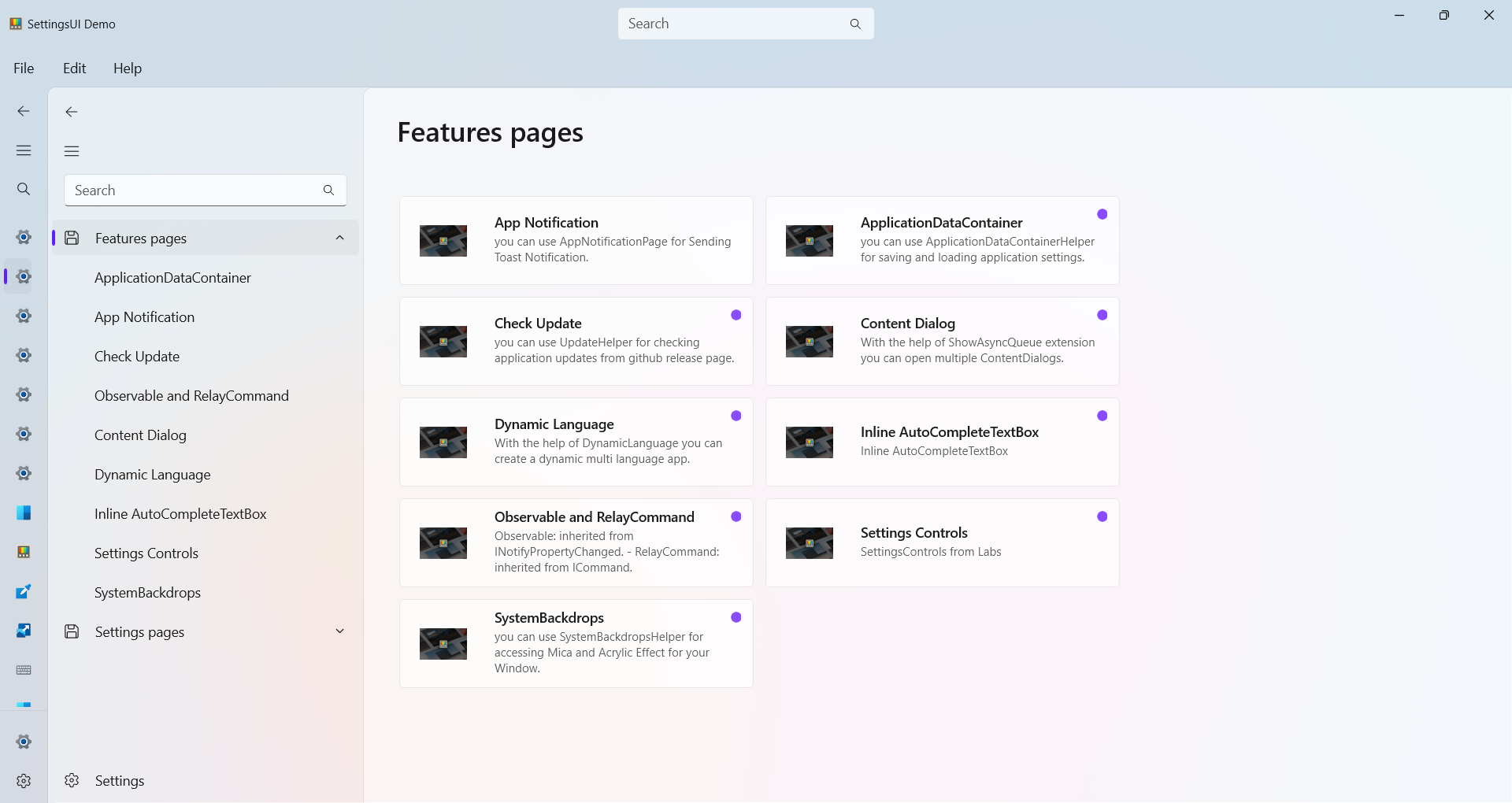
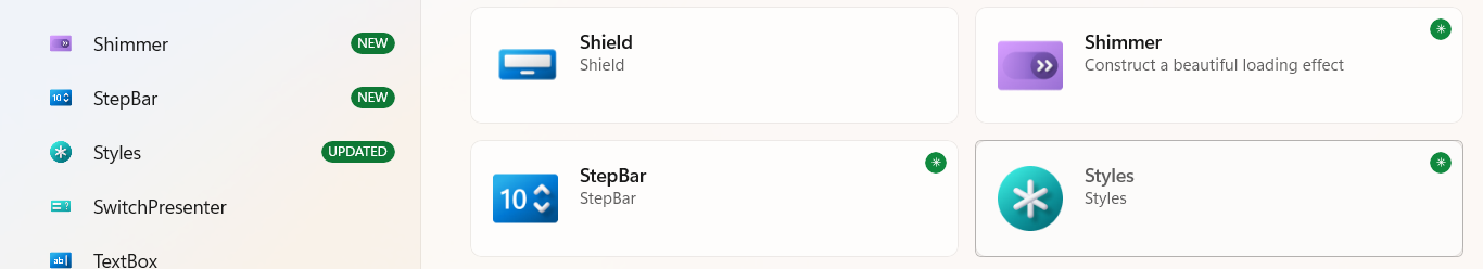
InfoBadge
The InfoBadge feature allows you to visually mark items or groups using a small badge indicator (such as “NEW”, “1”, or an icon). This is useful for highlighting updates, status changes, or important items in your app’s navigation or landing page.
Each DataGroup and DataItem can display InfoBadges using either custom styles or built-in styles.
Group Level Properties
| Name | Remark |
|---|---|
| UseBuiltInNavigationViewInfoBadgeStyle | If set to true, the group will use the DefaultBuiltInNavigationViewInfoBadgeStyle for badges in the NavigationView. |
| UseBuiltInLandingPageInfoBadgeStyle | If set to true, the group will use the DefaultBuiltInLandingPageInfoBadgeStyle for badges on the landing page. |
| DefaultBuiltInNavigationViewInfoBadgeStyle | Name of the built-in style used for NavigationView InfoBadges. |
| DefaultBuiltInLandingPageInfoBadgeStyle | Name of the built-in style used for landing page InfoBadges. |
Item Level Properties
| Name | Remark |
|---|---|
| NavigationViewInfoBadgeStyle | Custom style name for the InfoBadge shown in the NavigationView. |
| LandingPageInfoBadgeStyle | Custom style name for the InfoBadge shown on the landing page. |
| IsLandingPageInfoBadgeHidden | Hides the InfoBadge on the landing page when set to true. |
| IsNavigationViewInfoBadgeHidden | Hides the InfoBadge in the NavigationView when set to true. |
| InfoBadgeValue | Text value displayed in the InfoBadge. Used by styles like StringInfoBadgeStyle. this value will be injected to InfoBadge.Tag property |
Example
1 | { |
Demo
you can run demo and see this feature.